9 React Range Sliders
This “React Range Sliders” collection focuses on modern techniques for building sliders in React. The examples demonstrate how to use hooks to manage values and how to work effectively with asynchronous events (e.g., sending data on mouse-up). Both basic and advanced variations are presented here: from simple volume sliders to complex multi-value filters. This is a relevant set of practical solutions for implementing sliders of any complexity.
Examples
React Range Slider with State Management
The classic “Lifting State Up” pattern in React: the parent component App stores the state rangeVal and passes both the value and a callback function updateRange to a pure child component Range, creating a controlled input.
See the Pen React Range Slider with State Management.

React Number Range Slider with GSAP
This demo is an animated counter built with React and GSAP that synchronizes a range slider with a smooth, scrolling digit display. This approach makes value manipulation both intuitive and visually appealing.
See the Pen React Number Range Slider with GSAP.
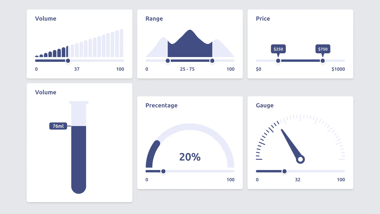
Diverse Custom Range Sliders in React with SVG and Tailwind
A showcase of diverse, custom range input styling achieved by hiding the native thumb and track, and then overlaying React/Tailwind elements and SVG graphics controlled by the component’s state.

Simple React Range Slider Component
A modern React component utilizing useState for value management and inline styles with background-size to visually track the slider’s progress without relying on vendor-prefixed hacks or extra elements.
See the Pen Simple React Range Slider Component.
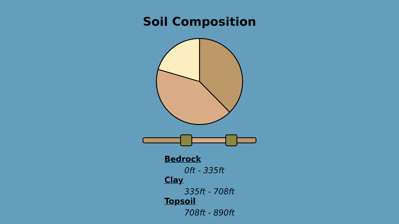
Custom Dual Range Slider with Keyboard Navigation (React)
Custom Dual Range Slider in React supporting dragging and keyboard navigation (ArrowUp/ArrowDown, etc.), which automatically normalizes values even if the user swaps Min and Max.
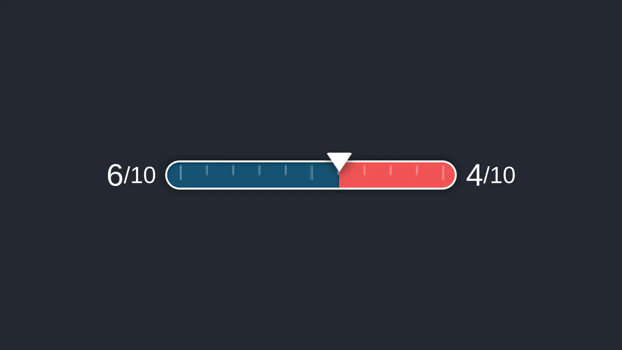
Custom Styled React Range Slider
A functional React component utilizing the external ReactRangeslider library as a controlled element, suppressing the default tooltip to display the value using custom elements and useState.
See the Pen Custom Styled React Range Slider.
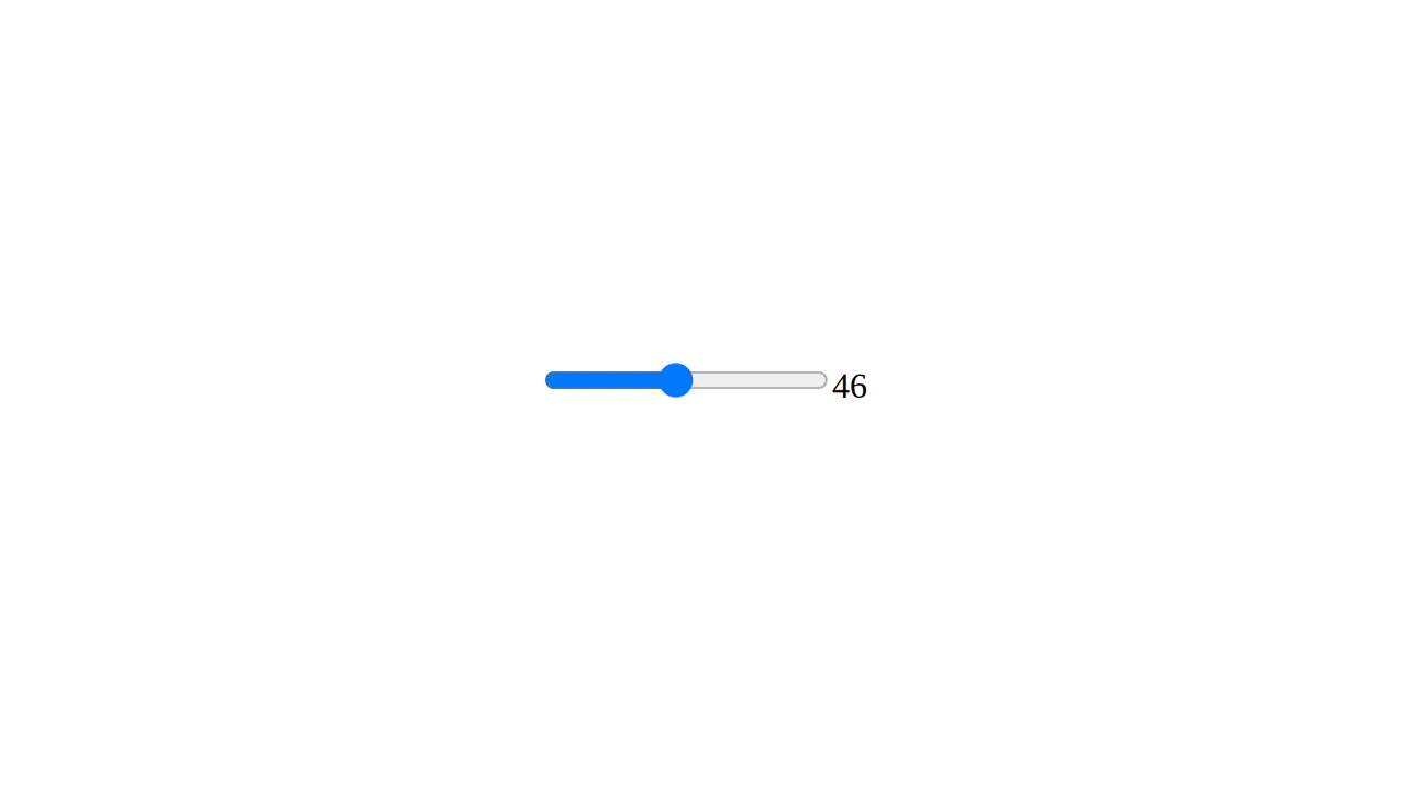
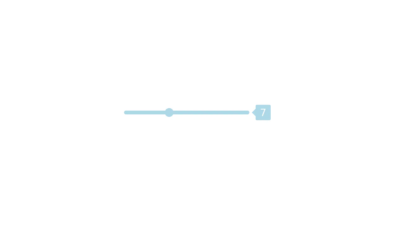
React Output Range Slider
A simple yet clear implementation of an interactive slider using a foundational React component and the modern HTML5 <input type="range"> element.
See the Pen React Output Range Slider.

React Range Slider with D3 Tick Marks
A technical focus: utilizing D3.js to create a custom time axis and rendering it within SVG, where the React component solely provides the slider interface and dynamically updates the year value via setState.
See the Pen React Range Slider with D3 Tick Marks.
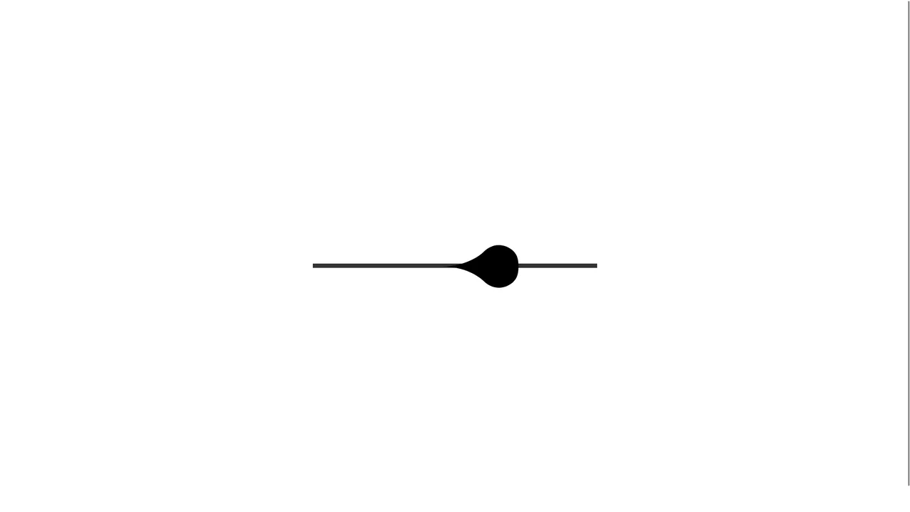
Input Range with Morphing Knob
A modern, tactile slider component demonstrating premium UX through gesture control and state-of-the-art animation. It leverages react-use-gesture for dragging and react-spring to map drag velocity directly to expressive SVG shape changes.
See the Pen Input Range with Morphing Knob.