20+ swiper.js Examples
Build beautiful, touch-friendly sliders with Swiper.js - one of the most powerful mobile-first slider libraries out there. This collection features interactive carousels, image galleries, hero sliders, and scrollable sections, complete with smooth transitions, autoplay, and custom navigation controls.
Examples

Interactive 3D Pricing Card Slider
This is an Interactive 3D Pricing Card Slider. It integrates WebGL geometric renders into a standard product tier UI. Its function is to convert static pricing options into an engaging, tactile spatial experience. (Requires: three.js, swiper.js)
 Chrome 60+
 Edge 79+
 Firefox 55+
 Safari 11+
See the Pen Interactive 3D Pricing Card Slider.

Effect Cube
Three card variations where content (text, photo, or combined) rotates like faces of a 3D cube when swiped or dragged.
See the Pen Effect Cube.

Profile Card with 3D Hover Animation
A collection of interactive profile cards that flip in 3D to reveal more information, powered by Swiper.js for seamless navigation.
See the Pen Profile Card with 3D Hover Animation.

Responsive Dashboard with Sliders and Music Player
A fully-featured modern music app web interface featuring glassmorphic panels, smooth animations, and functional music playback with a rotating vinyl-style cover art.
See the Pen Responsive Dashboard with Sliders and Music Player.

Spine Layout
A unique “book spine” layout gallery combining a fixed vertical sidebar with a horizontal content slider.
See the Pen Spine Layout.

Swiper Center Thumbnail Slider
A dual-slider gallery implemented with Swiper.js, featuring a main view synced with a thumbnail carousel via the controller module.
See the Pen Swiper Center Thumbnail Slider.
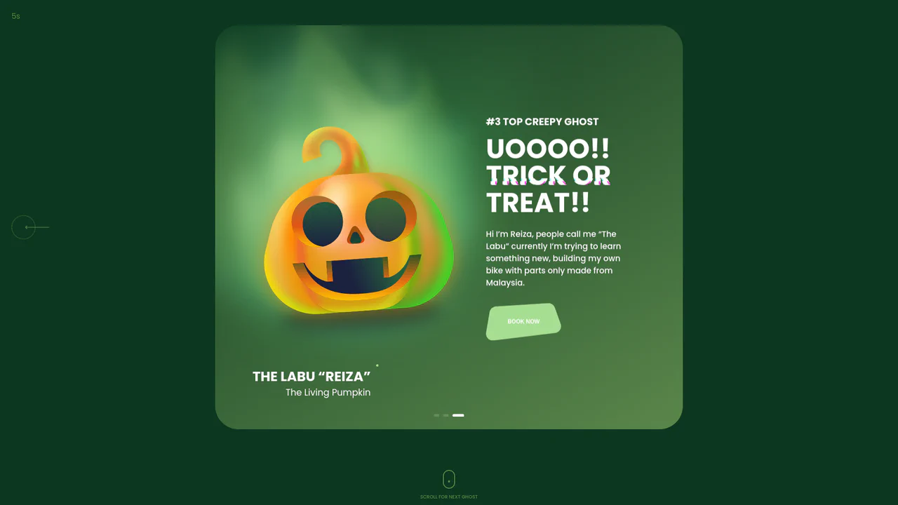
Halloween Ghost Carousel with Swiper.js
A striking, responsive 3D-slider, built on Swiper.js with a coverflow effect and lazy loading, showcases deep customization: slide transitions dynamically update the background and theme color via the changeBackground JS function and data-bg-color attributes, while complex autoplayTimeLeft logic ensures precise visual representation of the autoplay progress within custom CSS/SVG UI elements.
See the Pen Halloween Ghost Carousel with Swiper.js.

Responsive Image Slider with Swiper
A current component built with HTML/CSS/JS utilizing the Swiper library to create a high-speed, responsive card carousel.
See the Pen Responsive Image Slider with Swiper.

Swiper Slider Abstract Art Gallery
A ready-made frontend solution for creating a dynamic art gallery or product catalog, leveraging the advanced Swiper library. The focus is on current technical practices, including keyboard navigation and adaptive spacing changes upon screen resize.
See the Pen Swiper Slider Abstract Art Gallery.

Cube Effect Slider (Swiper JS and tsParticles)
a stylish full-screen layout where the functional Swiper 3D slider is enhanced by a particle-effect gradient background, ensuring maximum visual engagement without complex frameworks.
See the Pen Cube Effect Slider (Swiper JS and tsParticles).

Horizontal Parallax Sliding Slider with Swiper.js
A horizontal parallax slider built on Swiper.js, featuring a unique navigation system where a vertical preview slider is fully synchronized with the main one, providing a comfortable and stylish viewing experience.
See the Pen Horizontal Parallax Sliding Slider with Swiper.js.

Card Slider
An interactive, responsive content component built on vanilla JavaScript (Swiper), highlighting CSS transitions for the slide change effect, complete with custom navigation and modular styling via SCSS for easy customization.
See the Pen Card Slider.
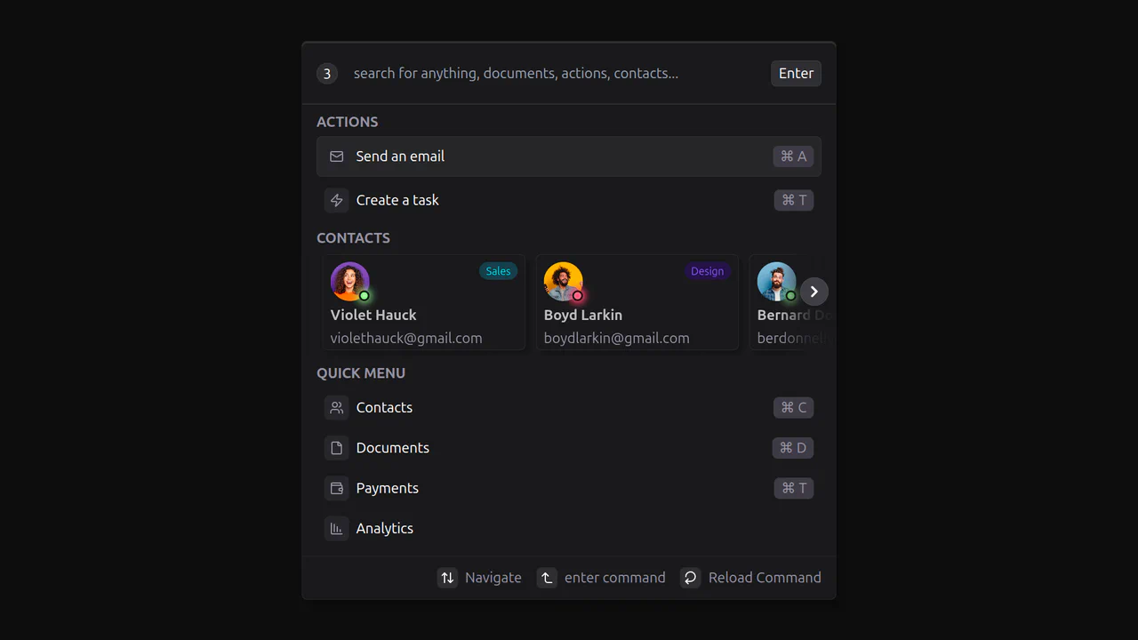
React Command Menu
Technically, this is a great example of a React component that manages state and displays dynamic data from a static array. The demo uses CSS variables and conditional classes with clsx for styling, along with the third-party library lucide-react for icons, which keeps the code clean and readable.
See the Pen React Command Menu.

Autoplay Slider with Pause Control (Swiper.js)
This is an advanced slider implementation using JavaScript and the Swiper library, with a key feature being its custom autoplay functionality. The automatic slide transition is synchronized with a progress bar in the pagination, which can be paused and resumed.
See the Pen Autoplay Slider with Pause Control (Swiper.js).

Bootstrap 5 Carousel
A cinematic slider orchestrating Swiper for state management and GSAP for synchronized motion.
See the Pen Bootstrap 5 Carousel.
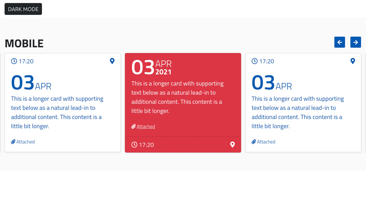
Bootstrap 5 Mobile Card Slider with Swiper.js and Dark Mode
A fully functional agenda widget that beautifully presents events in a carousel format while offering user control over the theme.

HTML5 Bootstrap Slider with Swiper and Animate.css
A cinematic fullscreen slider powered by Swiper.js with a cross-fade effect.
See the Pen HTML5 Bootstrap Slider with Swiper and Animate.css.

Slider with Thumbnails: Glide.js and Bootstrap 5
A functional gallery where the user can preview all available images at once and quickly jump to the desired one without scrolling sequentially.
See the Pen Slider with Thumbnails: Glide.js and Bootstrap 5.