20+ Tailwind Alerts
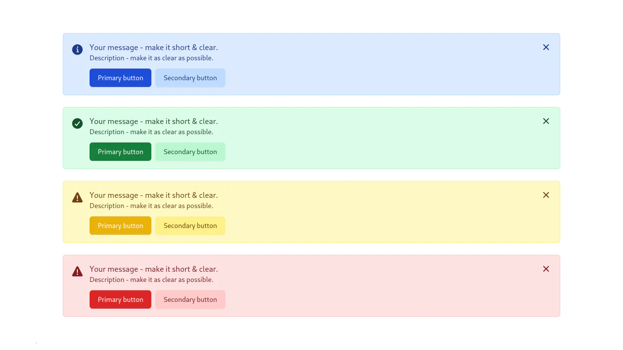
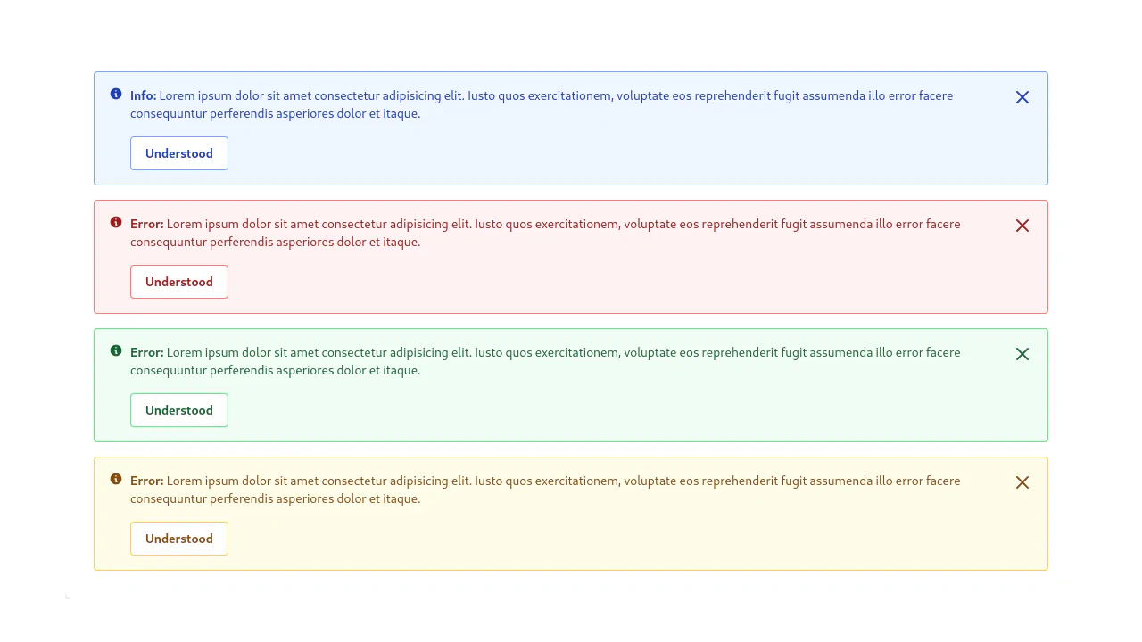
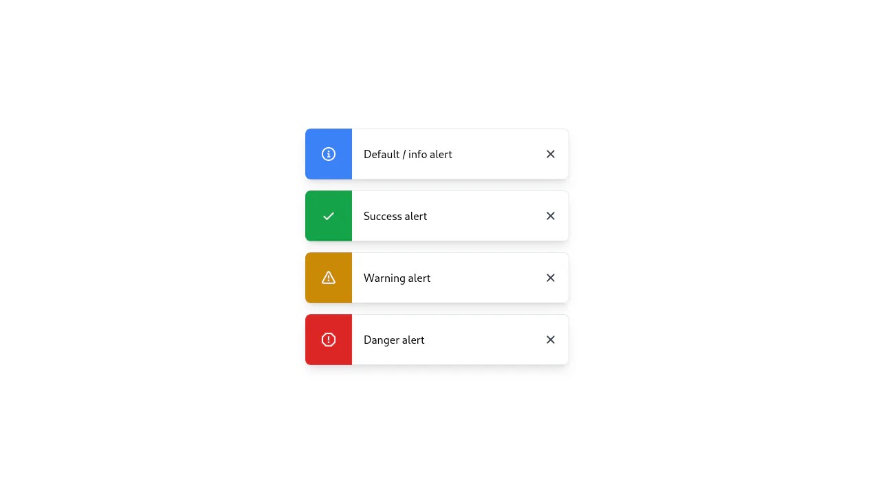
This collection is a toolkit for creating modern and functional alerts with Tailwind CSS. It covers building base components with variations (success, error) and perfect alignment using Flexbox. To enhance UX, “toast” notifications positioned with fixed and smooth fade-in/out animations controlled via transition are demonstrated. Examples include implementing dismissible close buttons, making these components production-ready.
Examples
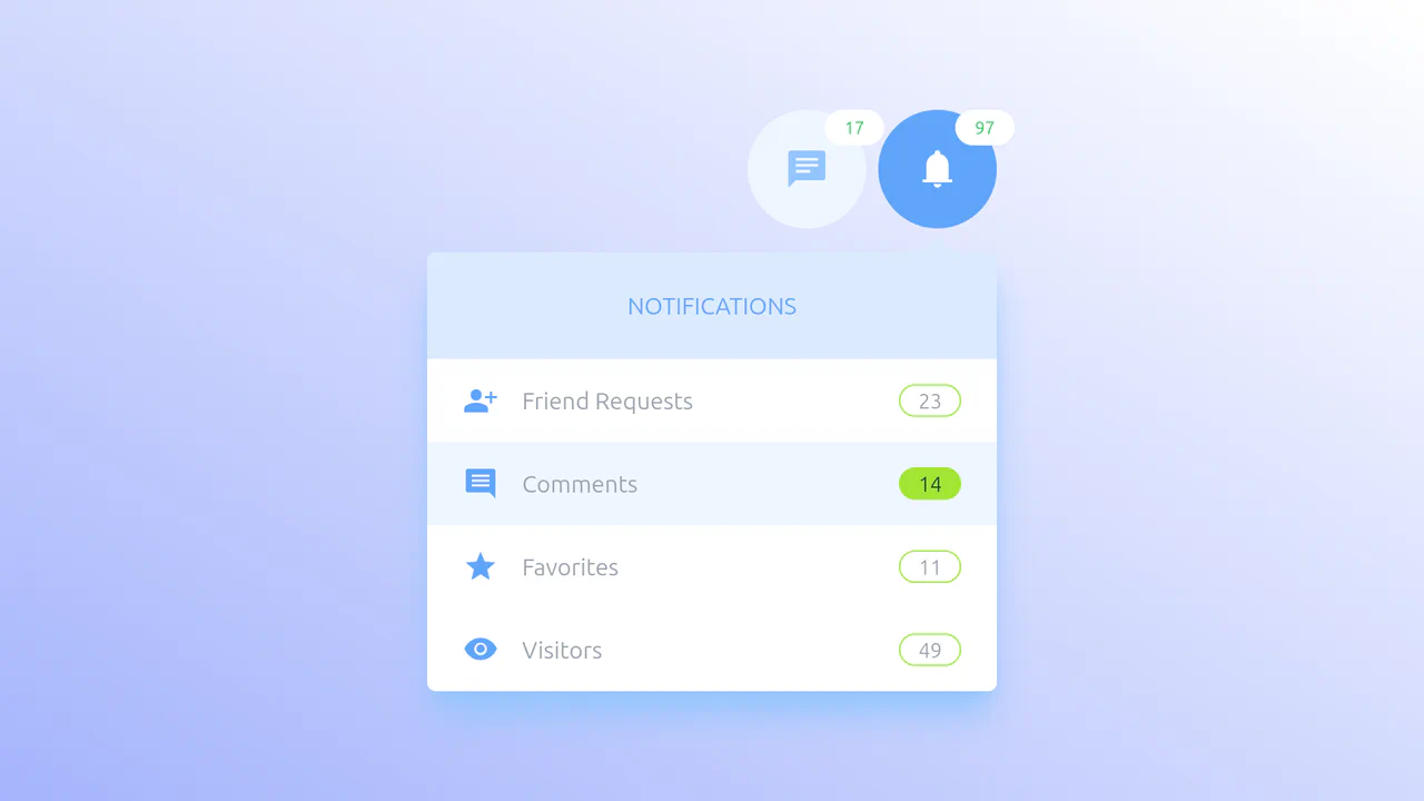
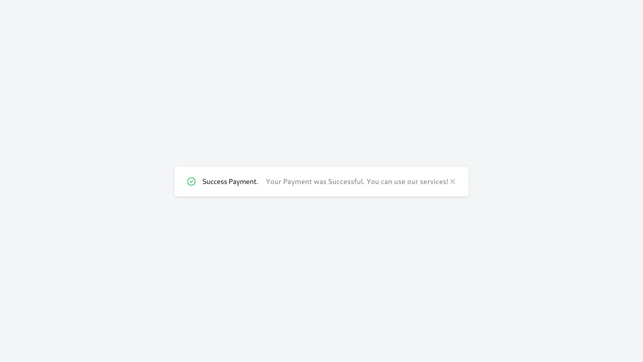
Tailwind Notifications and Messages
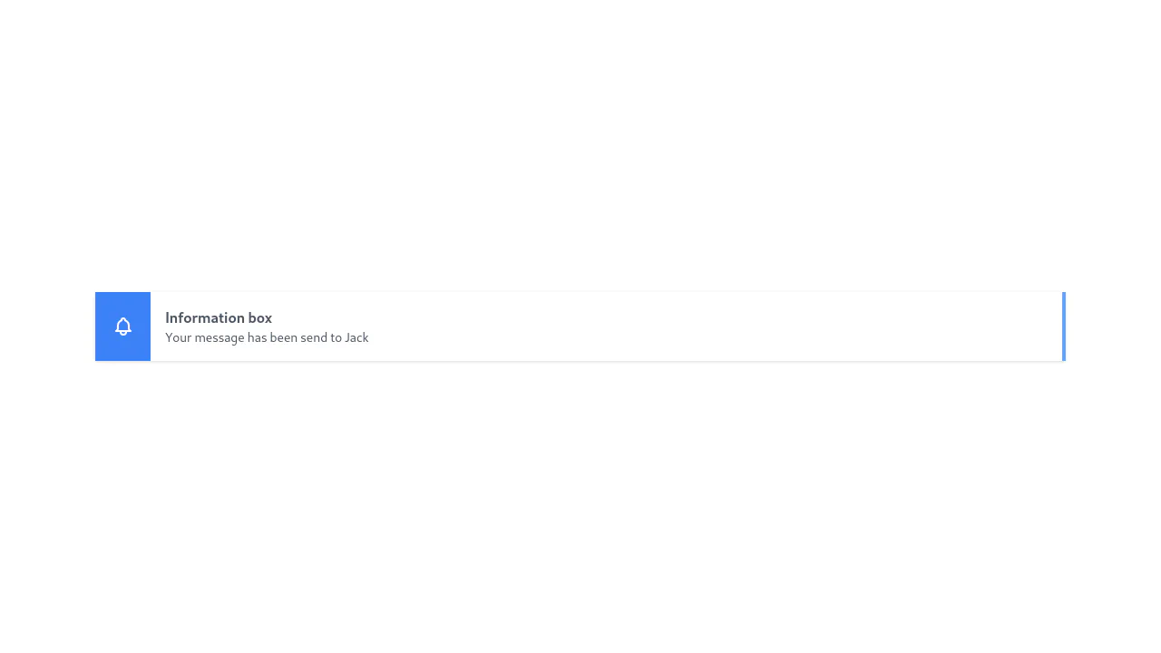
A pure CSS tab panel leveraging the “Radio Hack” and Tailwind’s peer modifier. Hidden inputs drive the logic, triggering staggered transition-delay effects for a smooth, cascading content entry without JavaScript.
See the Pen Tailwind Notifications and Messages.
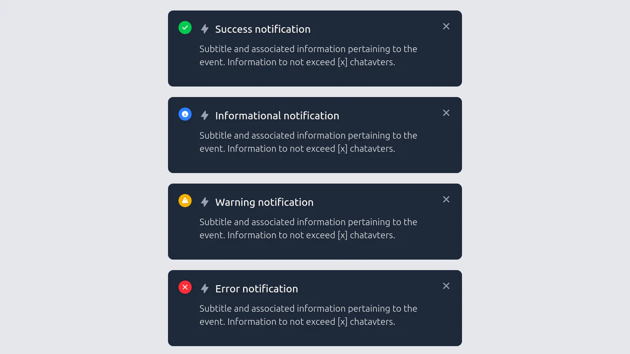
Alert Cards with Tailwind CSS
A set of dark-themed notification components styled with Tailwind CSS, featuring a consistent flexbox layout with color-coded status icons (success, info, warning, error).
See the Pen Alert Cards with Tailwind CSS.
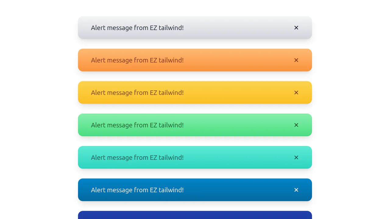
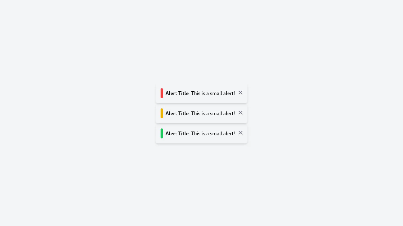
Gradient Tailwind CSS Alerts
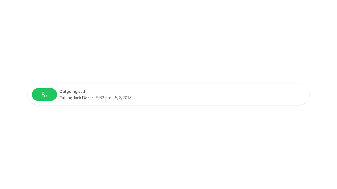
A collection of visually appealing, ready-to-use notification templates that look volumetric and professional thanks to the clever use of gradients and shadows.
See the Pen Gradient Tailwind CSS Alerts.
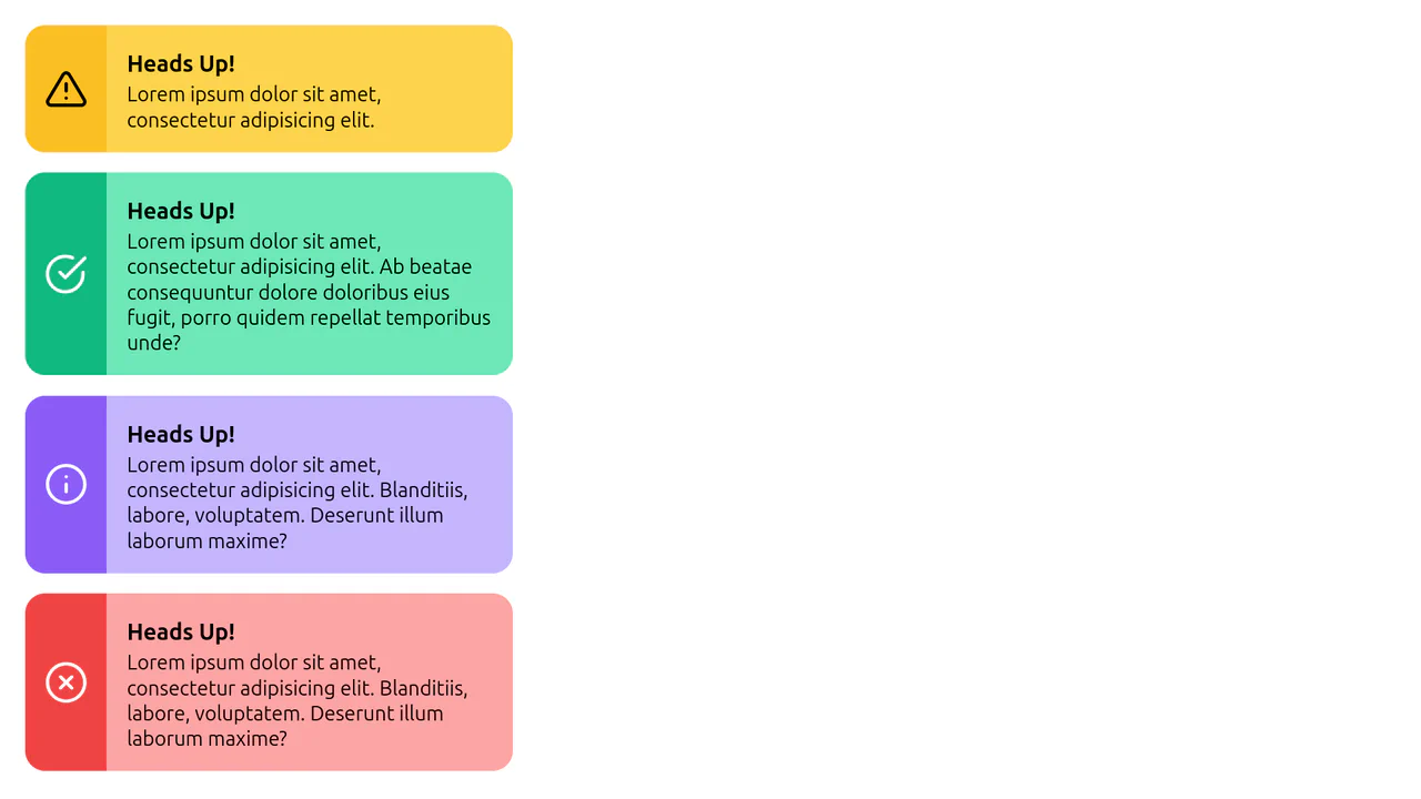
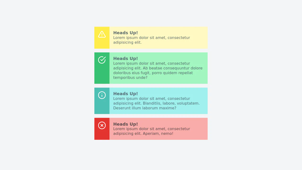
Tailwind Alert Component
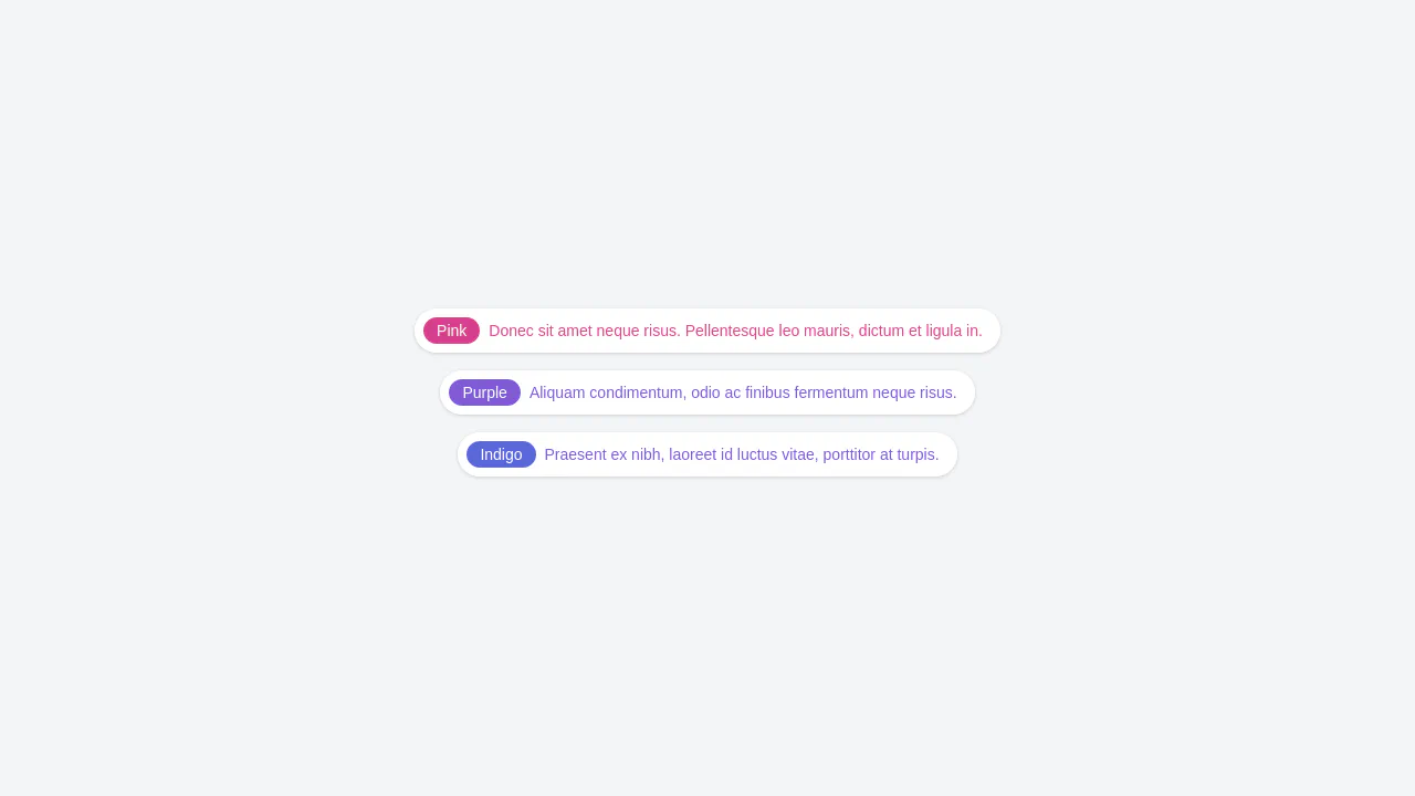
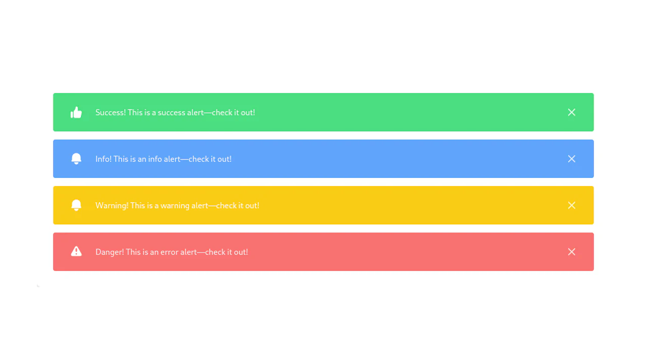
A set of vibrant, friendly UI components ready for displaying statuses, featuring a clean and accessible design.
See the Pen Tailwind Alert Component.

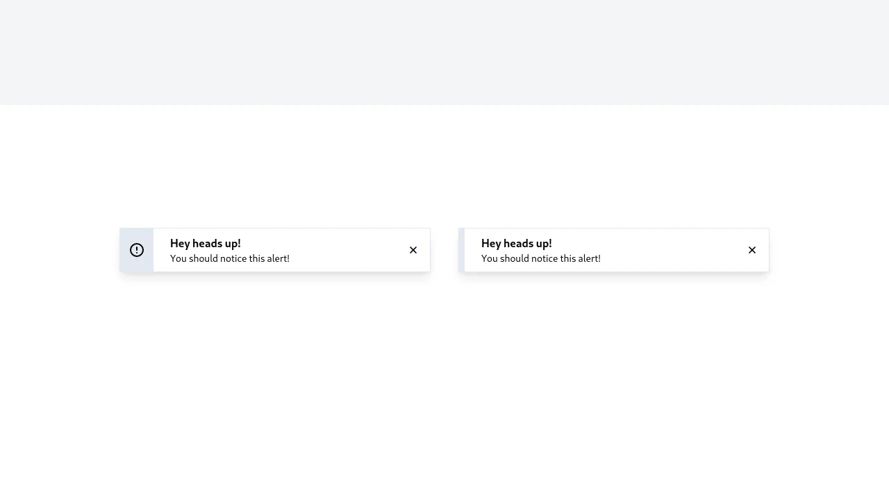
Tailwind CSS Alert - Sailboat UI
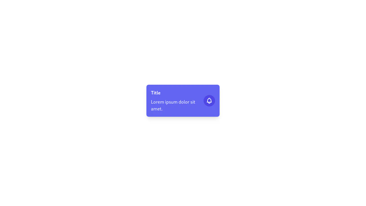
A versatile set of notification toast components styled with a custom Tailwind CSS color palette.
See the Pen Tailwind CSS Alert - Sailboat UI.