40+ Tailwind Buttons
This collection is a toolkit for building modern and accessible buttons with Tailwind CSS. A utility-first approach is used for rapid styling of variants (primary, secondary, outline) and their interactive states. To enhance UX and accessibility, clear focus highlighting with focus:ring and proper styling of the disabled state are demonstrated. For buttons with icons, Flexbox is applied, ensuring perfect alignment and making these components ready for integration into any design system.
Examples

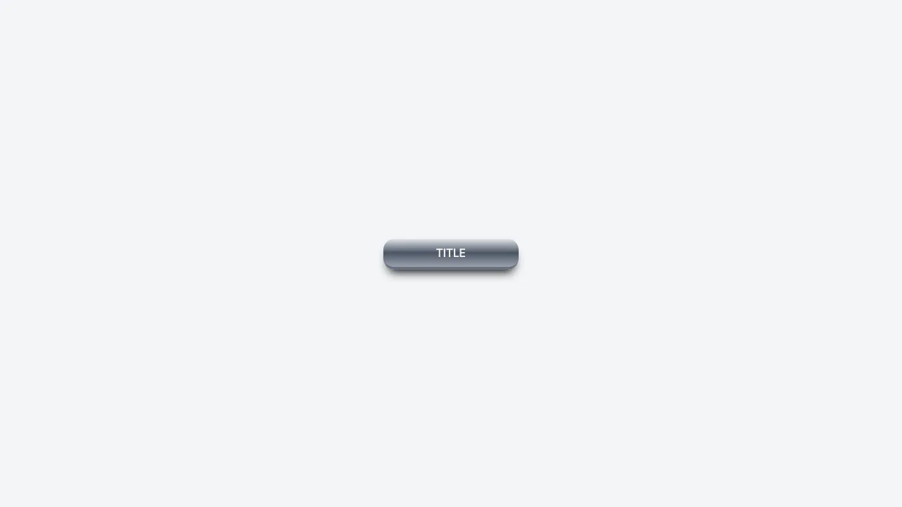
Mouse-Tracking Linear Shine Button
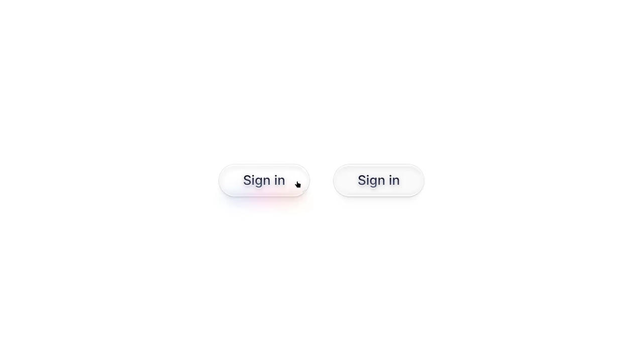
This Mouse-Tracking Linear Shine Button adds a high-end, tactile feel to your UI. Unlike standard hover effects that simply swap colors, this component tracks the user’s cursor position to drag a realistic light reflection across the button’s surface. Built with React and Tailwind CSS, it utilizes reactive CSS variables to control gradient positions, creating a dynamic lighting effect that feels physical and responsive. (Requires: React, React DOM, Tailwind CSS)
 Chrome 49+
 Edge 79+
 Firefox 32+
 Safari 8+
See the Pen Mouse-Tracking Linear Shine Button.
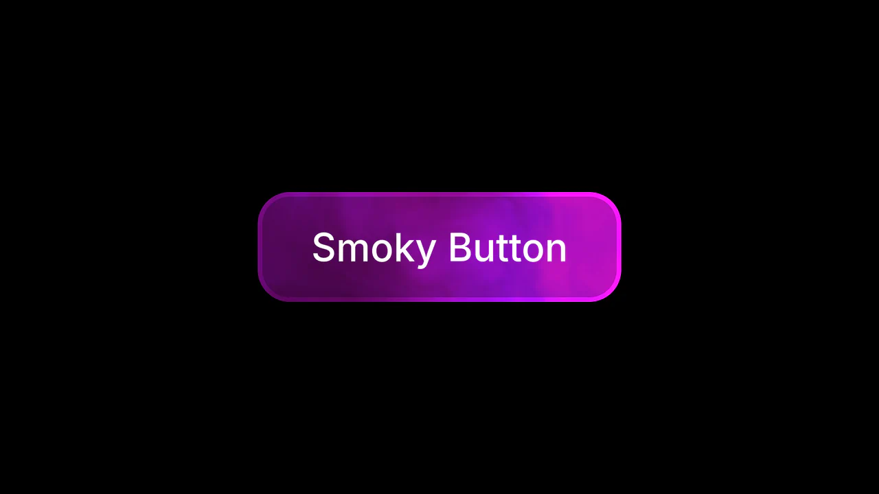
WebGL Fluid Smoke Button
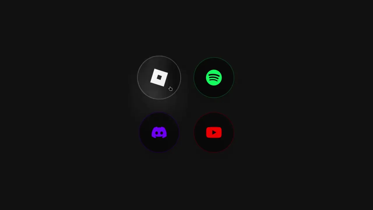
This WebGL Fluid Smoke Button elevates standard UI interactions by embedding a real-time generative shader directly into the interface. Instead of using a heavy video file, it calculates complex fluid dynamics on the fly using Fractional Brownian Motion (fBM). The result is a mesmerizing, never-repeating smoky background that reacts to hover states with a smooth scale and rotation effect, styled effortlessly via Tailwind CSS. (Requires: fragment-canvas, Tailwind CSS)
Chrome 90+
Edge 90+
Firefox 90+
Safari 15+See the Pen WebGL Fluid Smoke Button.
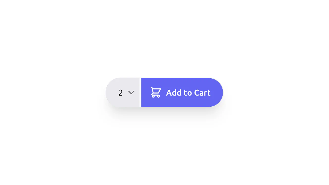
"Buy Now" Button with Quantity Select (Tailwind CSS)
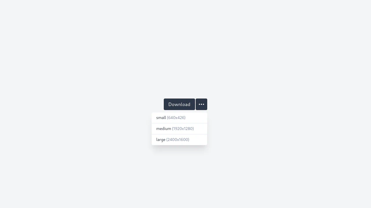
A compact “Add to Cart” component designed as a unified capsule using Tailwind CSS. It combines a quantity selector with a custom SVG dropdown arrow and an action button, seamlessly merged within a rounded-full container with shadow effects for a sleek, modern look.
See the Pen "Buy Now" Button with Quantity Select (Tailwind CSS).
Alpine.js Like Button
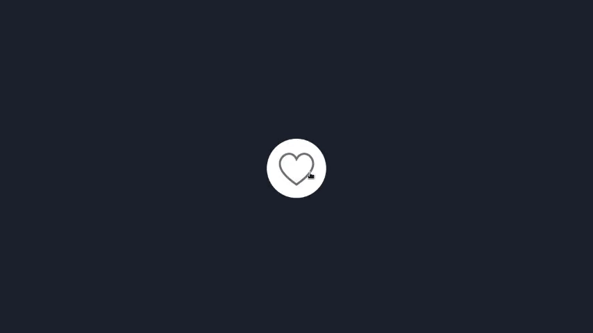
A simple yet functional like widget that instantly responds to user actions by toggling the icon and updating the count without a page reload.
See the Pen Alpine.js Like Button.
Animated Button with Hover Effects (Tailwind CSS)
A stylish, futuristic button with a “neon spin” border effect on hover, creating a premium interface feel.
See the Pen Animated Button with Hover Effects (Tailwind CSS).
App Store and Google Play Download Buttons
A polished set of “Download on App Store” and “Get it on Google Play” buttons, styled with Tailwind CSS and custom CSS enhancements.
See the Pen App Store and Google Play Download Buttons.
Lo-Fi Tailwind CSS Icon Button Group
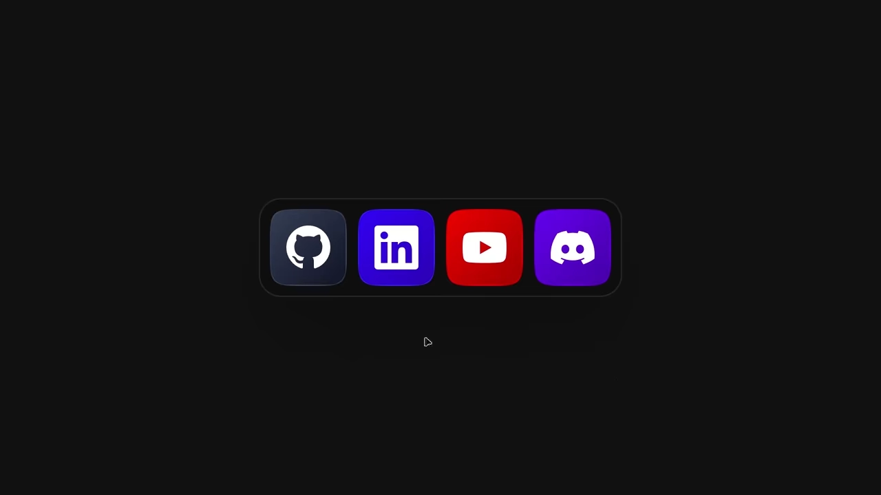
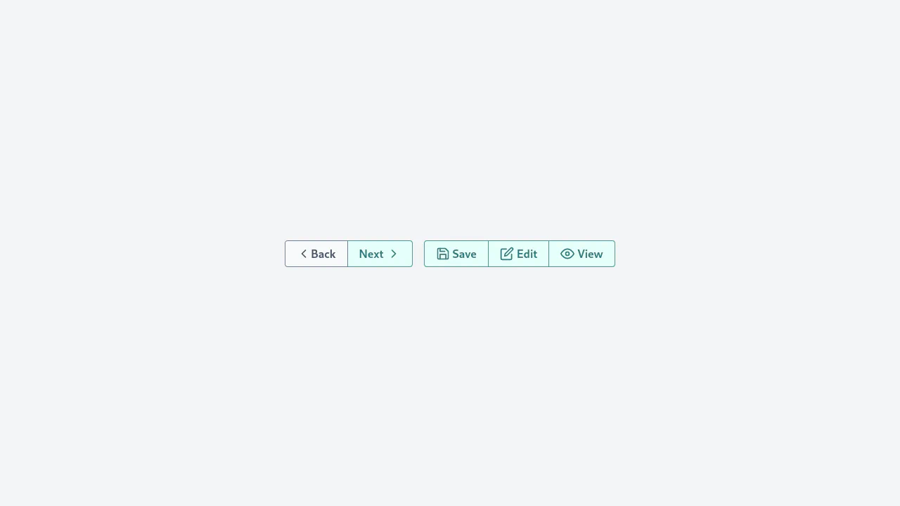
A minimalist icon button group styled with Tailwind CSS, featuring a unified border design.
See the Pen Lo-Fi Tailwind CSS Icon Button Group.
Shiny Buttons on Hover with Tailwind CSS
A polished button component featuring a sleek “shine” hover effect created entirely with Tailwind CSS.
See the Pen Shiny Buttons on Hover with Tailwind CSS.
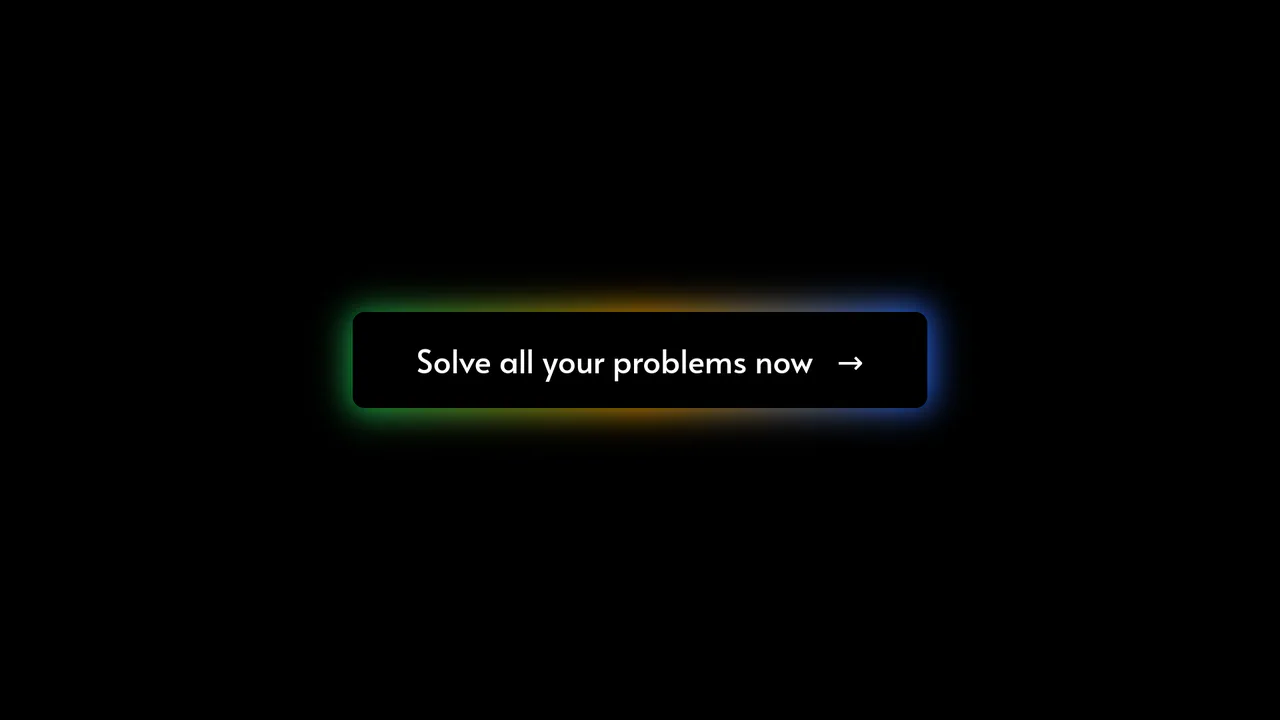
Tailwind CSS Glowing Button
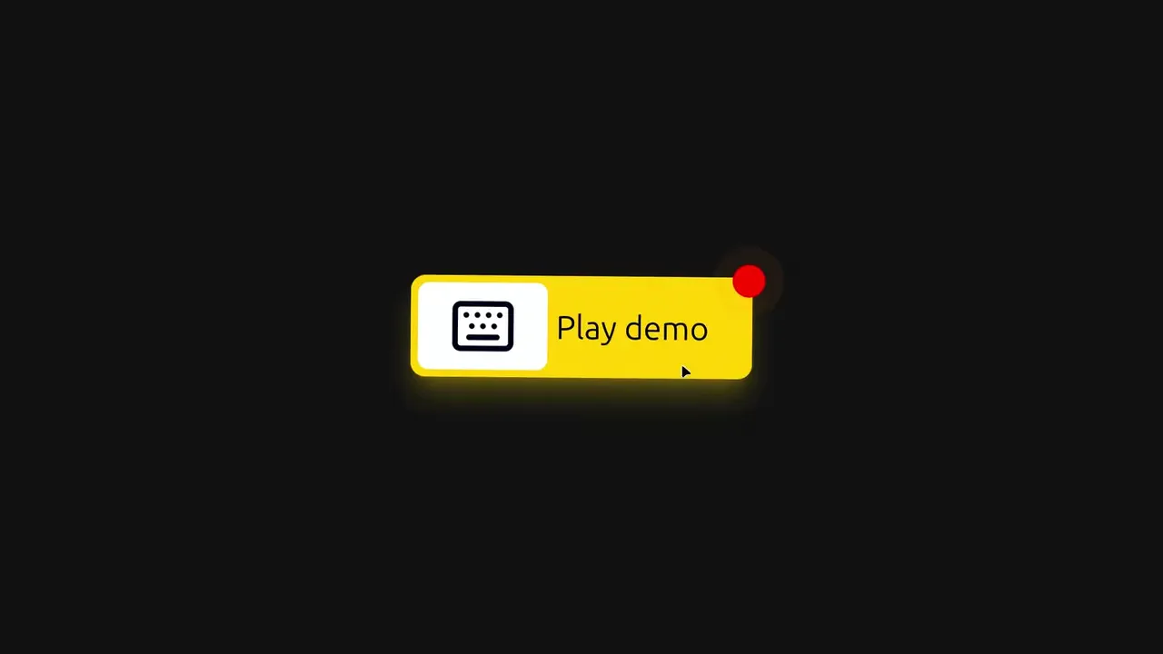
A futuristic call-to-action button featuring a multi-colored, glowing gradient border created by layering a blurred, absolute-positioned div behind the main element.
See the Pen Tailwind CSS Glowing Button.
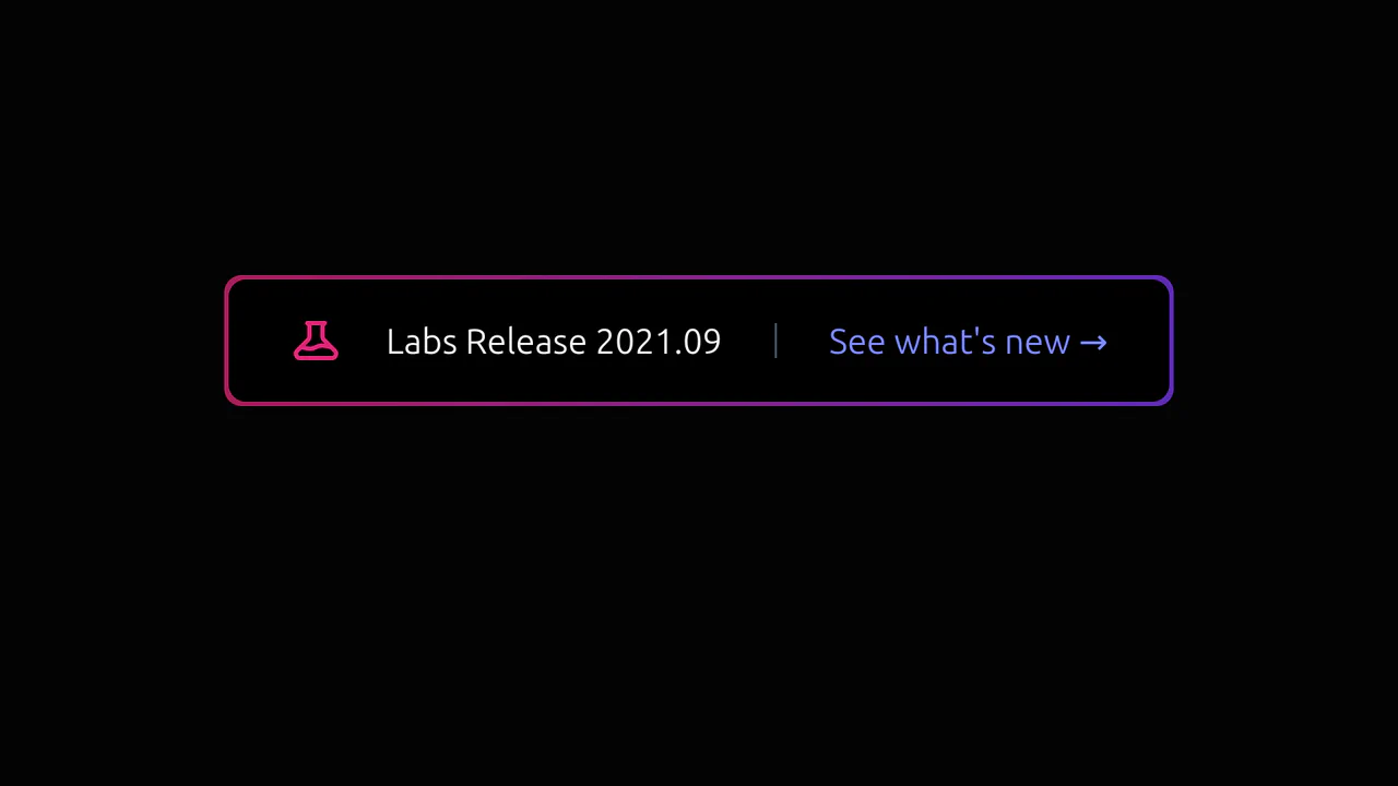
Tailwind Glowing CTA
A futuristic button with a dynamic, pulsating glow that actively responds to hover, drawing user attention to the product update.
See the Pen Tailwind Glowing CTA.
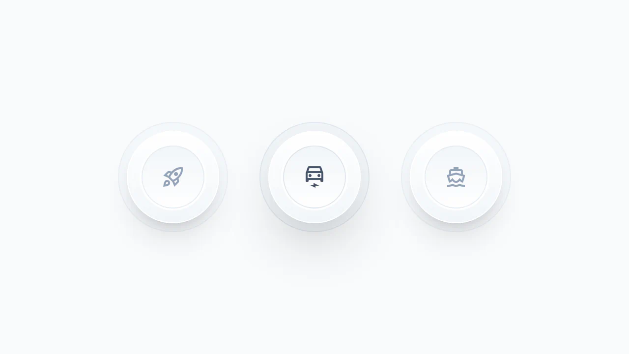
Tailwind Icon Buttons
Realistic, “clickable” buttons with pleasant tactile feedback, perfect for control panels or action triggers.
See the Pen Tailwind Icon Buttons.

Tailwind OAuth Buttons
A set of responsive social login buttons for Google, GitHub, and Facebook, styled with Tailwind CSS.
See the Pen Tailwind OAuth Buttons.