3 Tailwind Checkboxes
Style checkboxes with Tailwind CSS using these examples, ranging from simple to fully custom. For quick branding, accent-* utilities are used to change the native element’s color. For full design control, the classic pattern with peer and peer-checked is demonstrated, where a hidden input controls the style of a custom icon. Special attention is paid to UX and accessibility: smooth transitions and clear focus highlighting make the component production-ready.
Examples
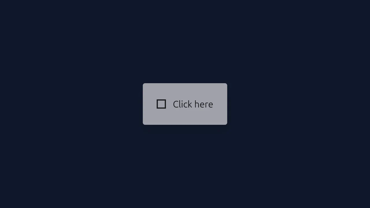
Tailwind Animated Checkbox
A custom animated checkbox featuring an abstract geometric transformation (square to bar) instead of a classic checkmark.
See the Pen Tailwind Animated Checkbox.
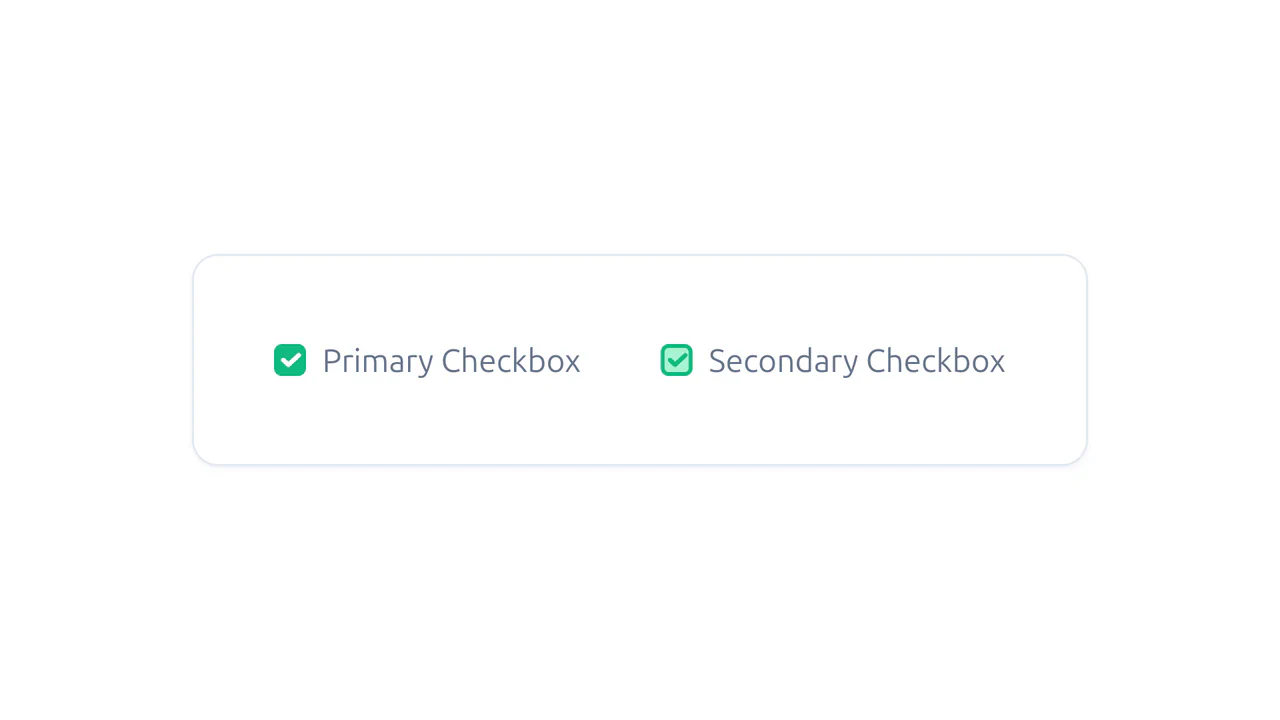
Tailwind CSS Checkboxes - WindUI
Aesthetic, keyboard-accessible, and animated checkboxes that significantly outperform standard browser elements in visual appeal.
See the Pen Tailwind CSS Checkboxes - WindUI.
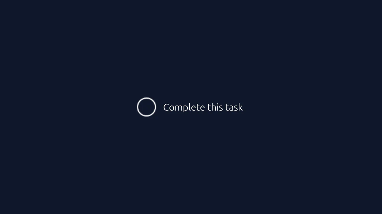
Tailwind Custom Checkbox
A playful checkbox interaction powered by CSS Sprites and Tailwind CSS.
See the Pen Tailwind Custom Checkbox.