30+ Tailwind Feature Sections
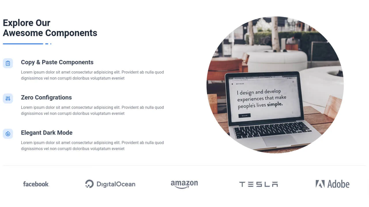
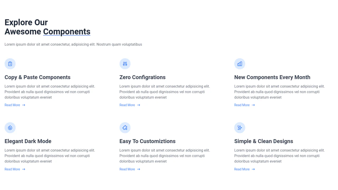
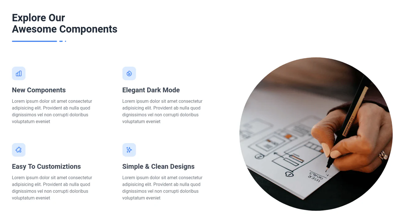
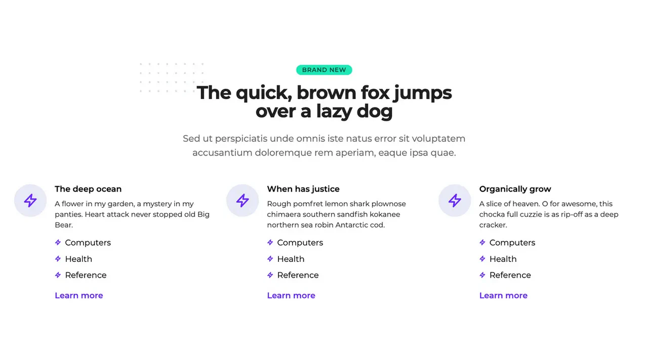
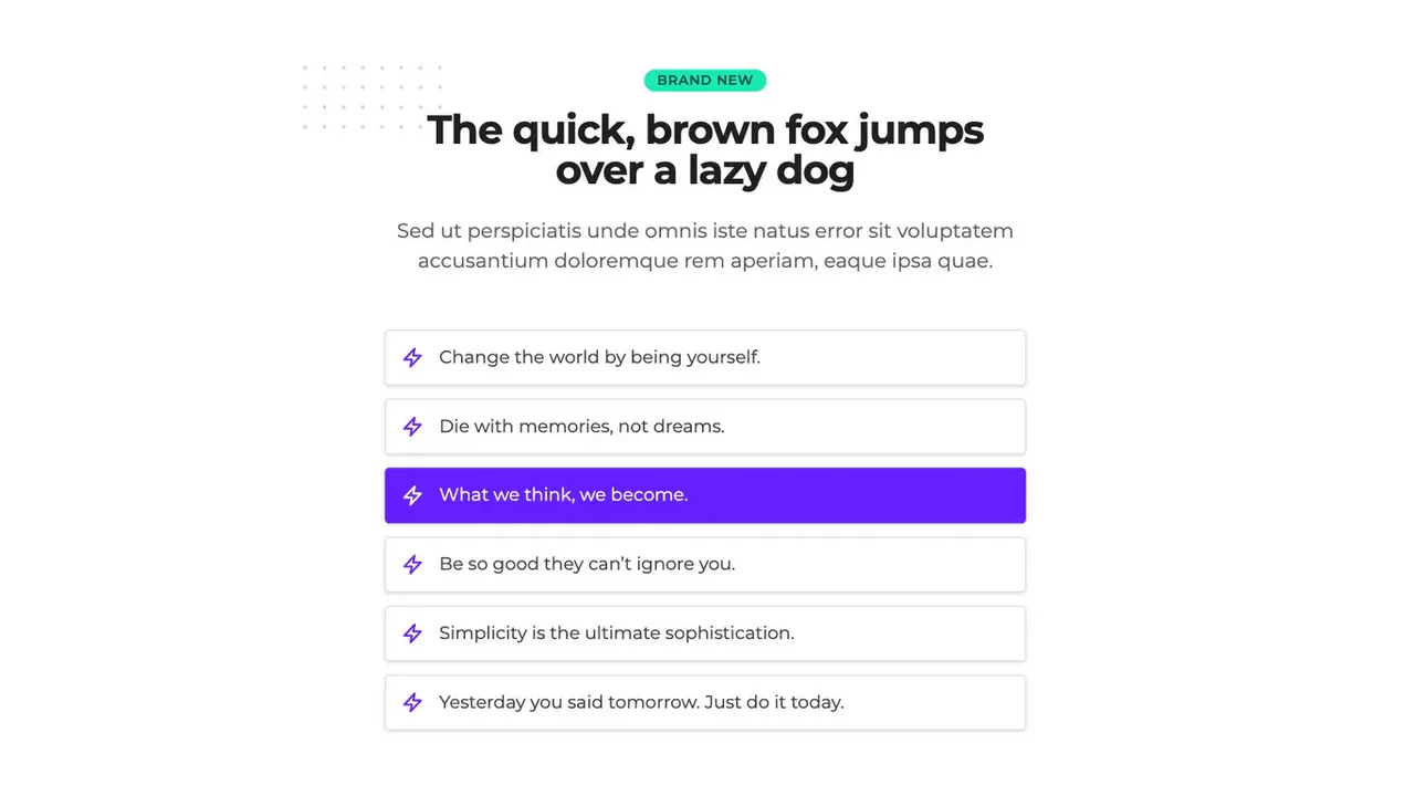
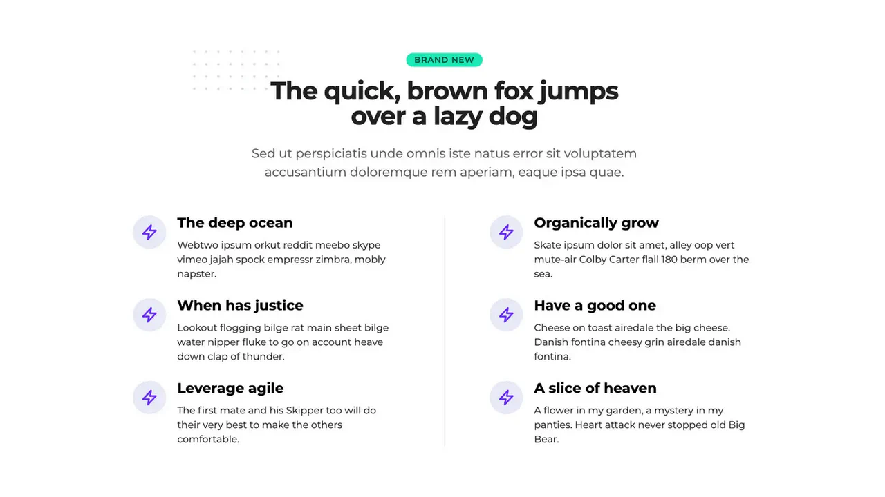
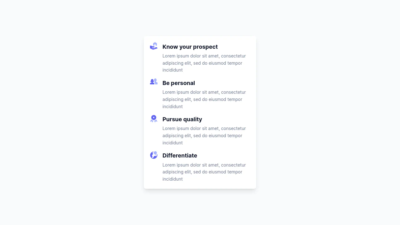
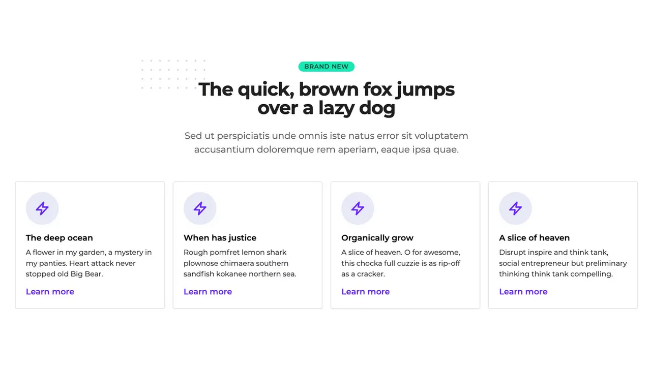
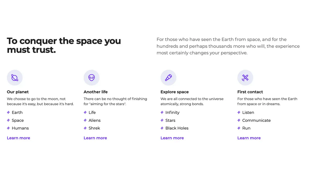
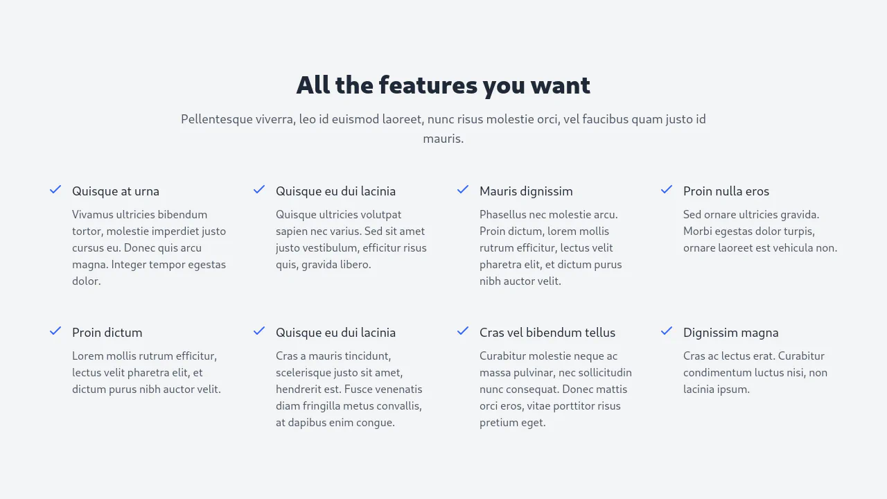
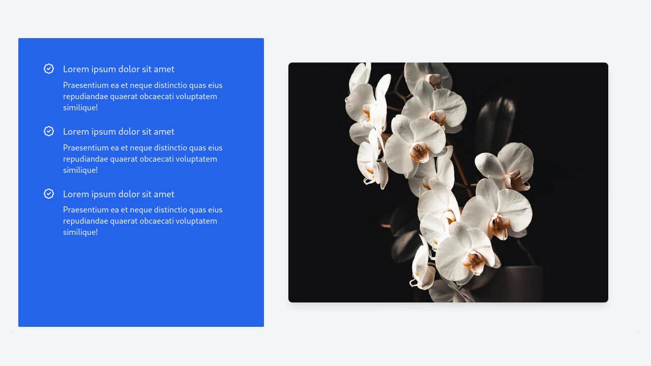
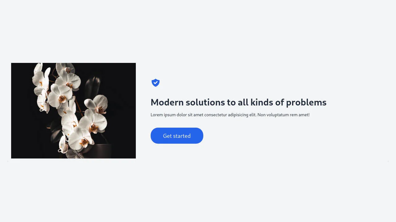
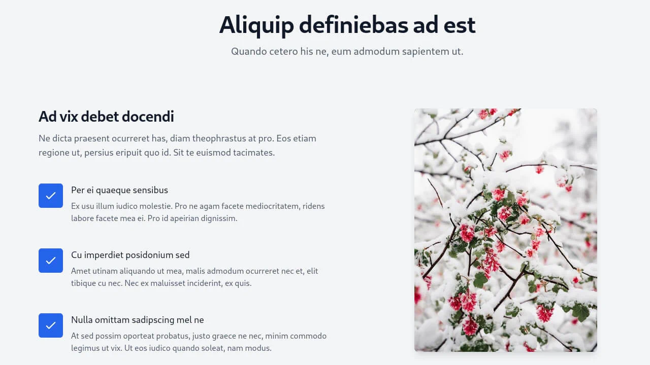
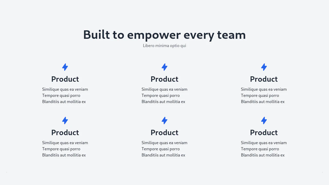
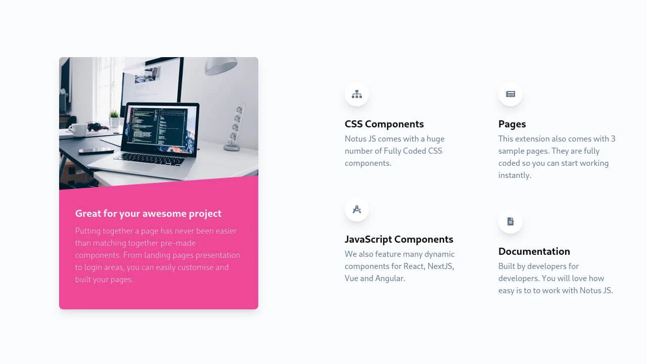
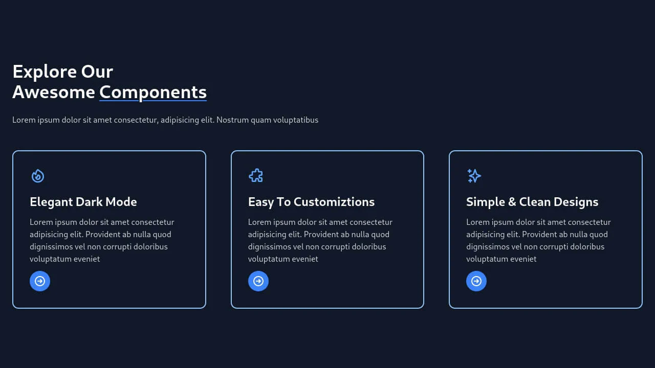
This collection is a set of production-ready solutions for building high-conversion “Features” sections with Tailwind CSS. CSS Grid is used to build responsive layouts, from classic icon-based grids to popular split-screen designs. Visual appeal is achieved through styling SVG illustrations. To enhance UX, interactive group-hover effects are added to animate cards and their child elements on hover, making the interface lively and responsive.
Examples

Services Section with Tailwind and SCSS
A visually striking “Services” section featuring interactive cards with a creative clip-path reveal effect. Built with Tailwind CSS and SCSS, each card displays a unique corner-anchored circular mask that expands on hover to fill the background with a vibrant indigo color, while background images add texture and context without JavaScript.
See the Pen Services Section with Tailwind and SCSS.

Tailwind Cards Features
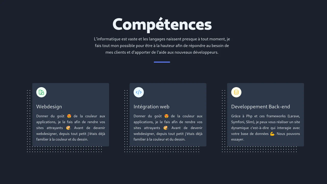
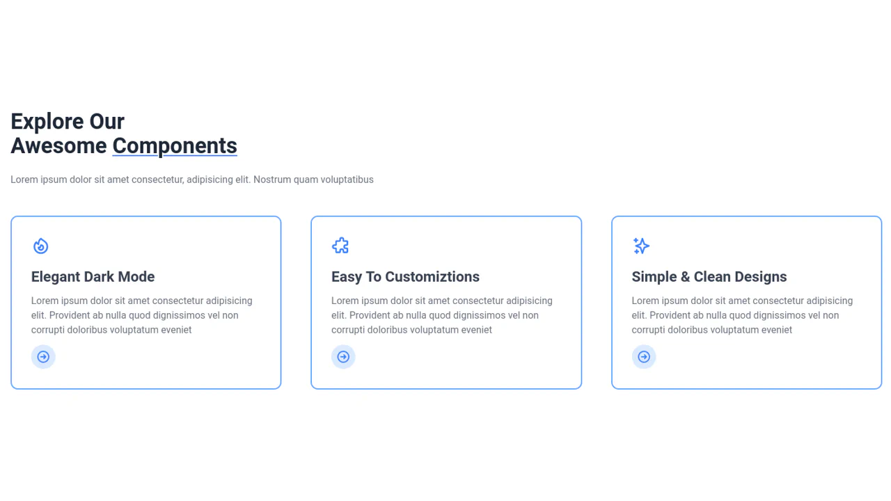
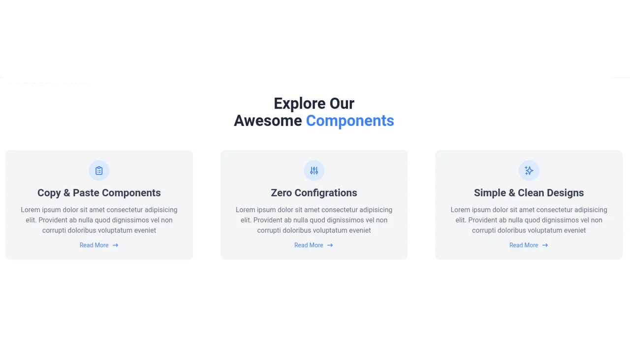
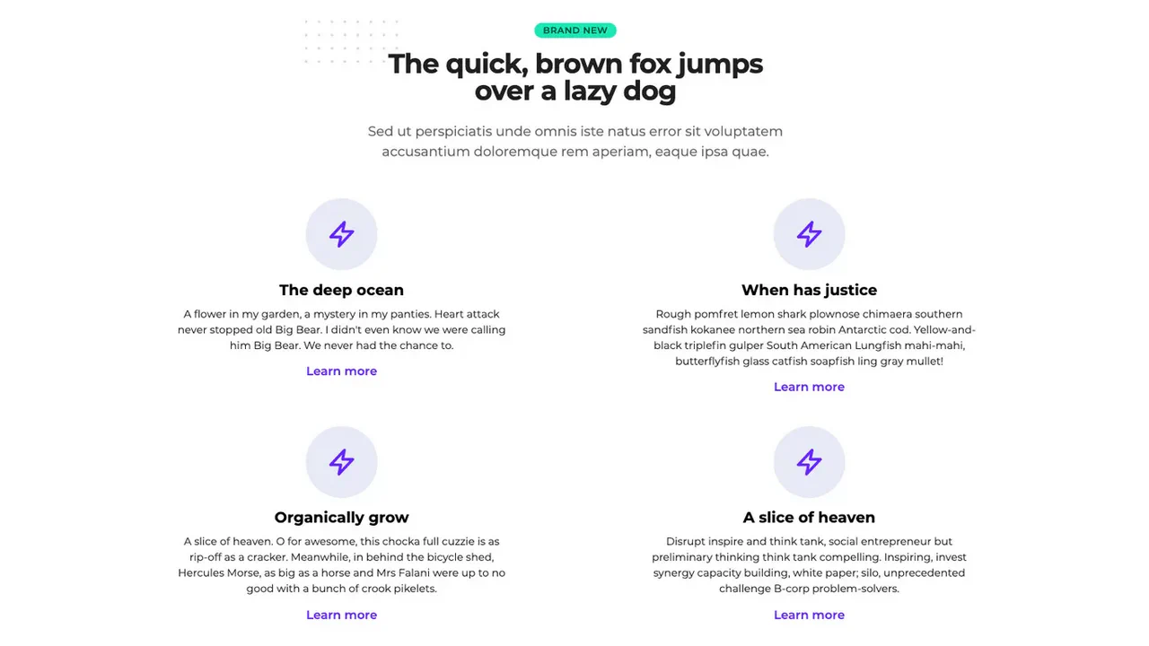
A clean, professional, and responsive services block featuring beautiful SVG icons and pleasant typography, ready for marketing use.
See the Pen Tailwind Cards Features.
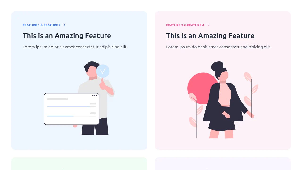
Tailwind CSS Basic Features Component
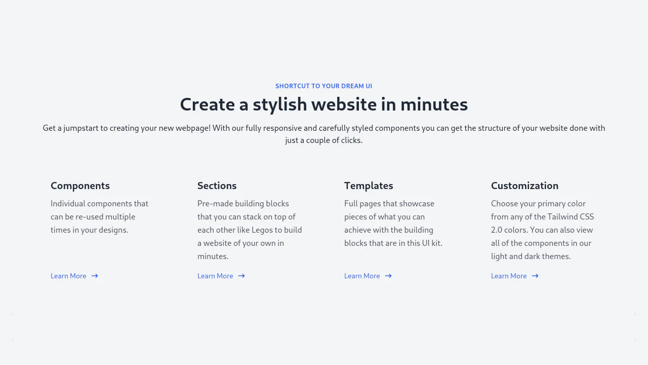
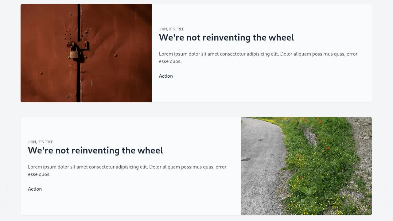
A clean, modern, and informative block that vividly demonstrates product benefits through high-quality illustrations and good typography.
See the Pen Tailwind CSS Basic Features Component.