20+ Tailwind Footers
This collection is a set of production-ready solutions for building modern and responsive footers with Tailwind CSS. CSS Grid is used to build flexible multi-column layouts that transform on mobile devices. The examples include styling for key elements like newsletter signup forms and social media icons, with full Dark Mode support. These are fast, fully customizable templates for any web project.
Examples
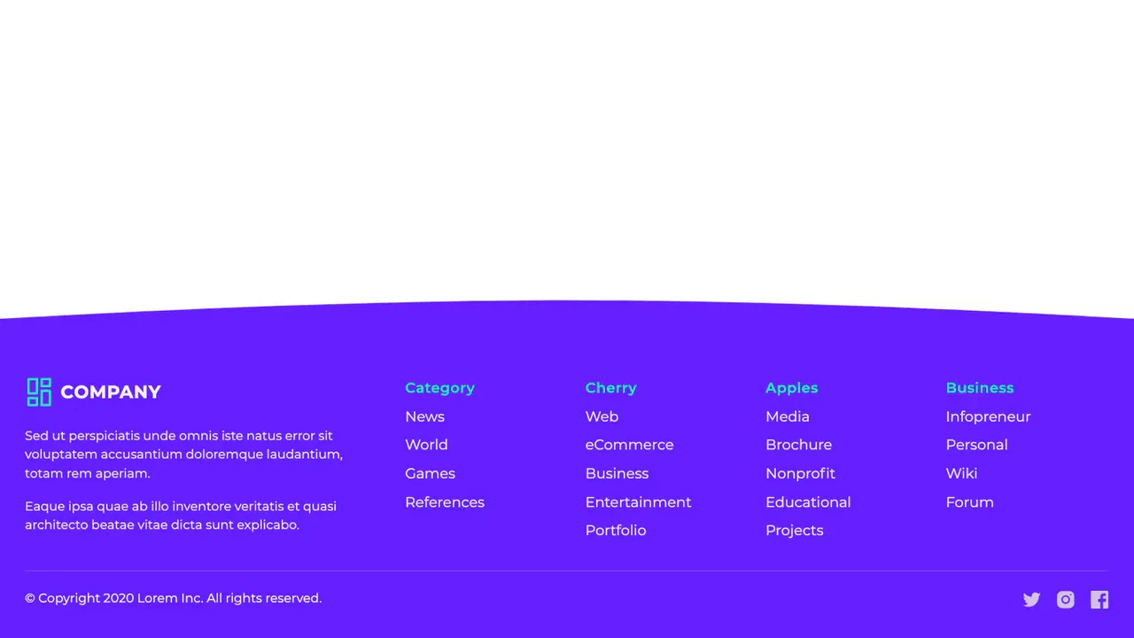
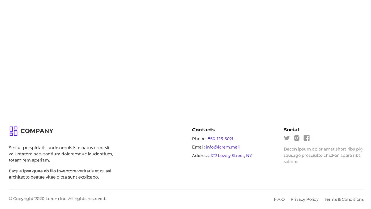
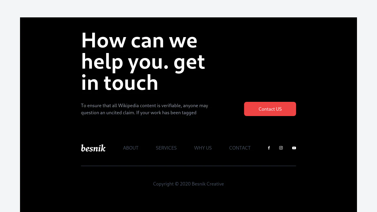
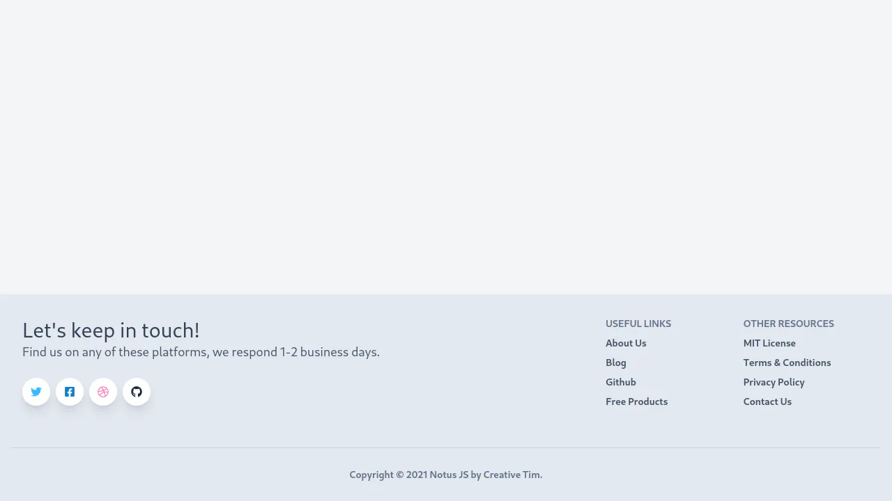
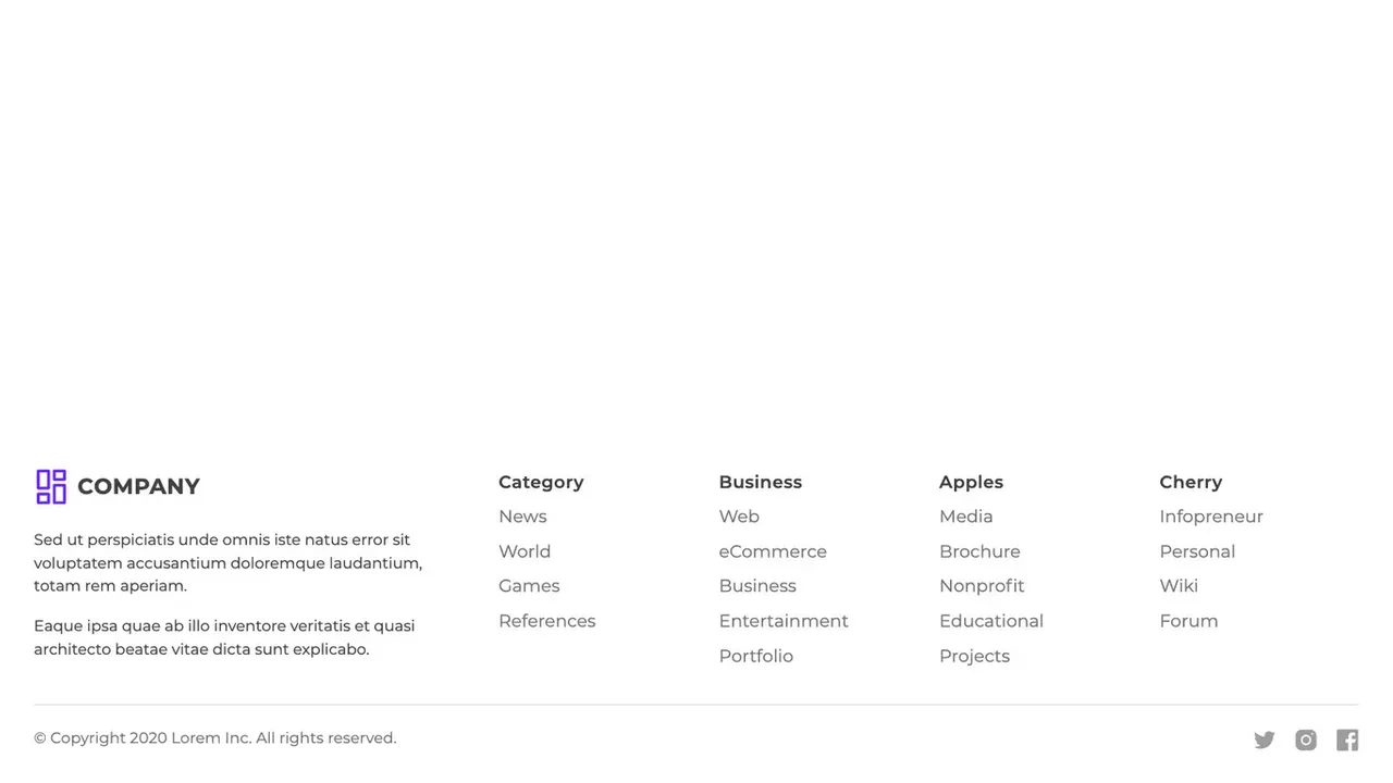
Free Tailwind CSS Footers Component
A fully functional, modern, and responsive footer that looks great on both smartphones and wide-screen monitors.
See the Pen Free Tailwind CSS Footers Component.
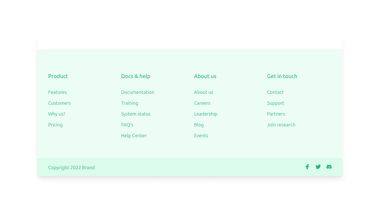
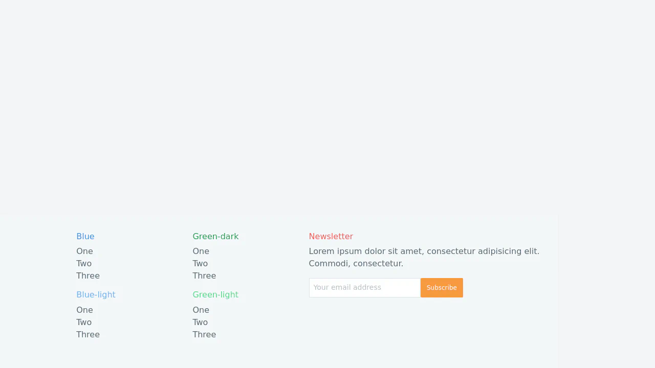
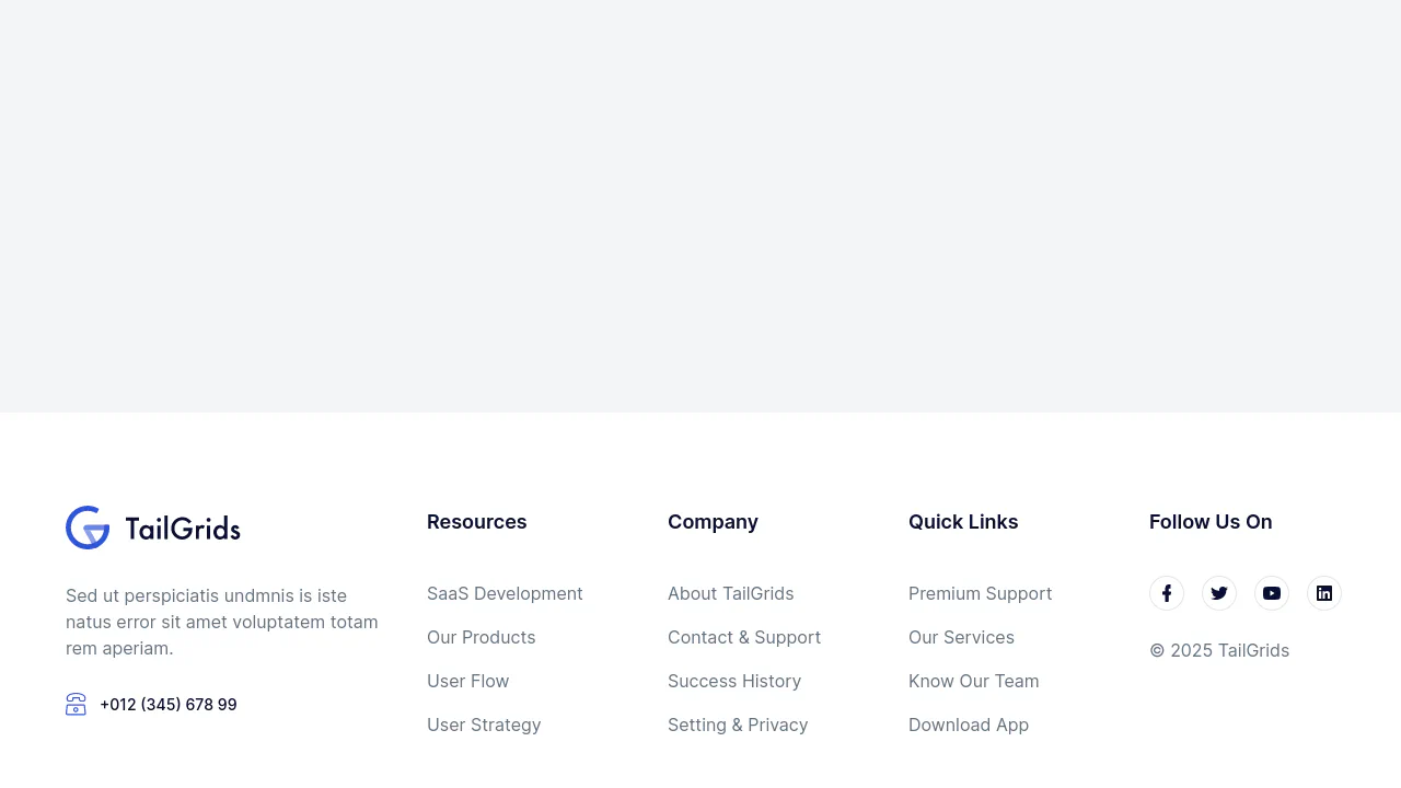
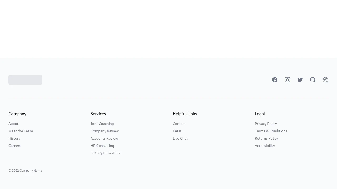
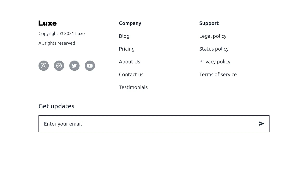
Tailwind CSS Footer - WindUI
A clean, responsive footer component designed for light-themed websites using Tailwind CSS.
See the Pen Tailwind CSS Footer - WindUI.
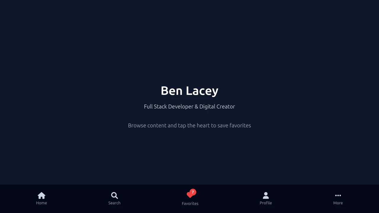
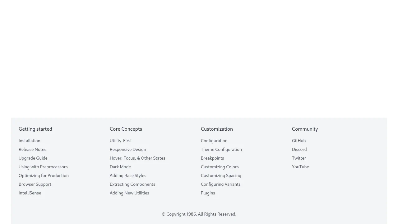
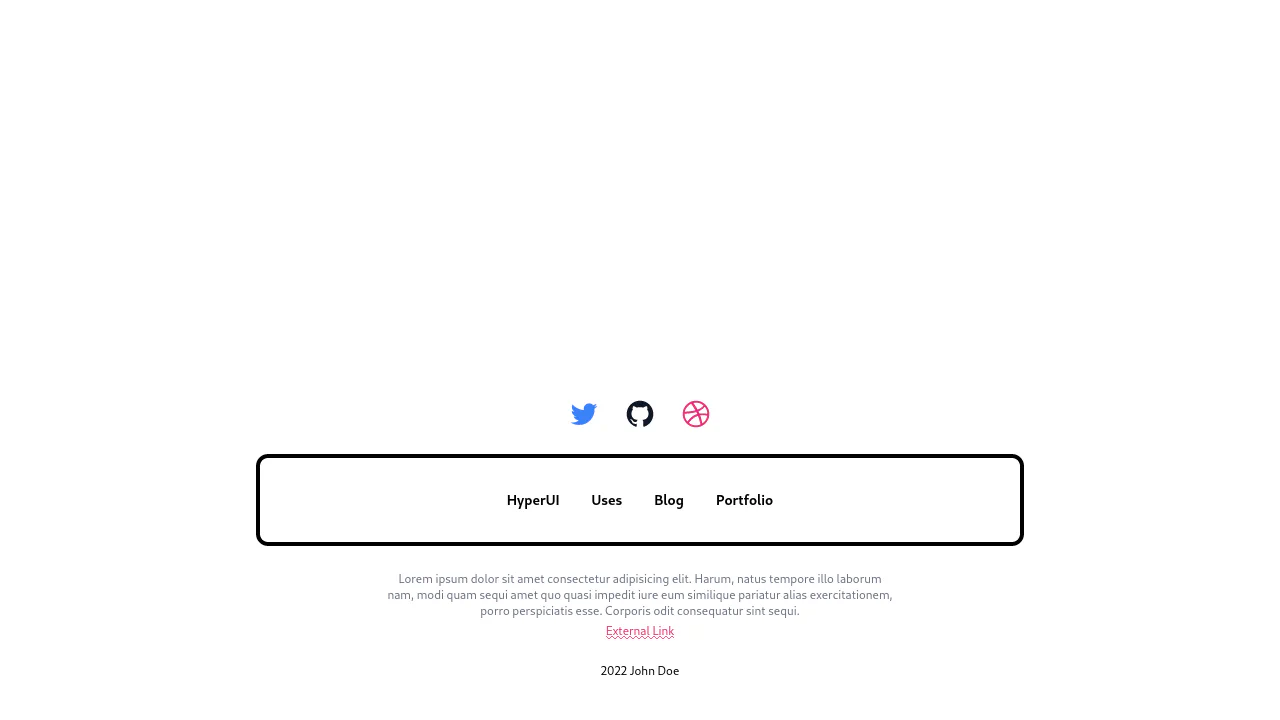
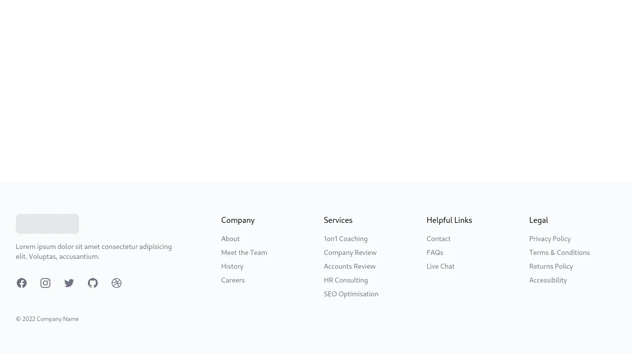
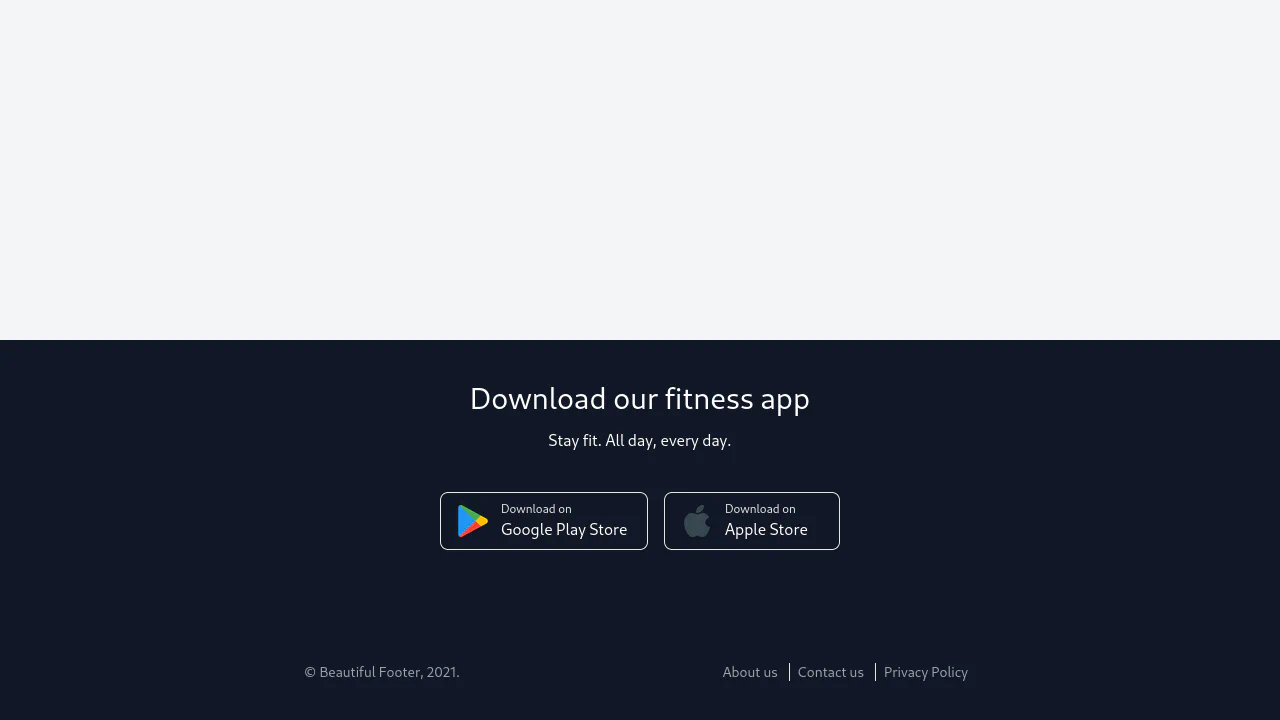
Tailwind Static Footer
A responsive, slide-up “Favorites” panel designed with Tailwind CSS and powered by vanilla JavaScript.
See the Pen Tailwind Static Footer.
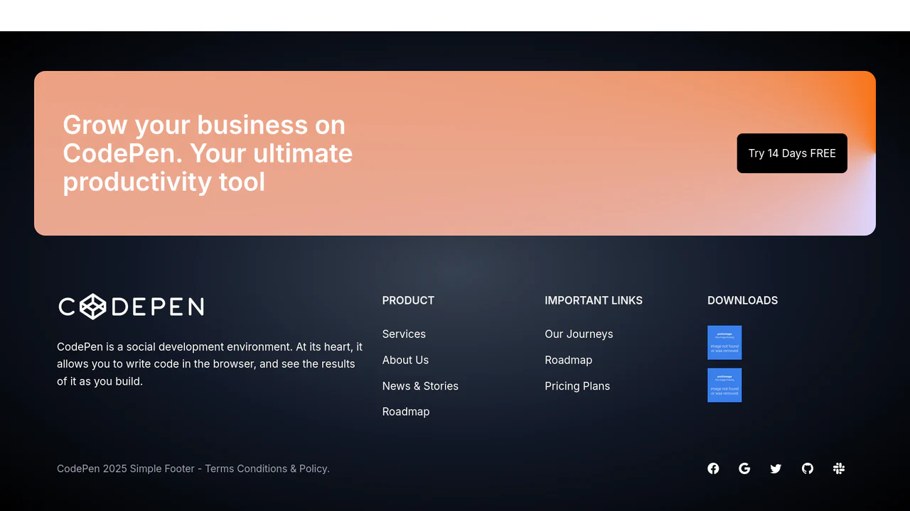
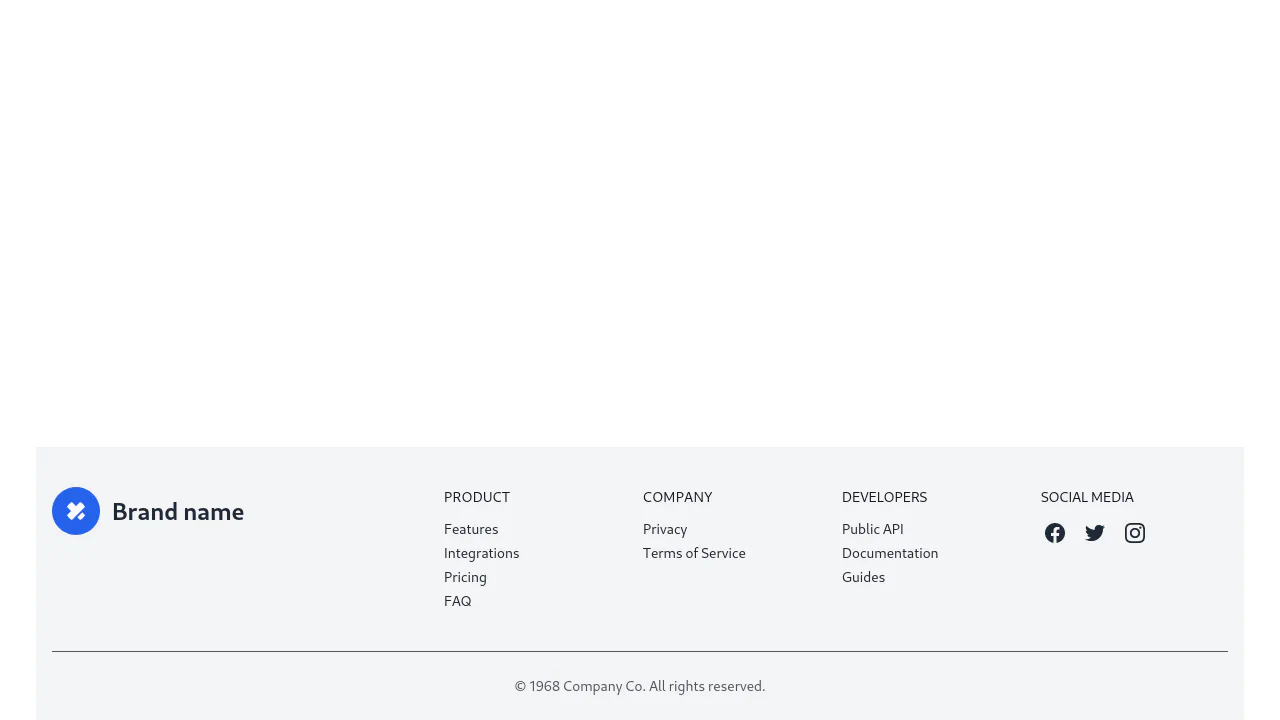
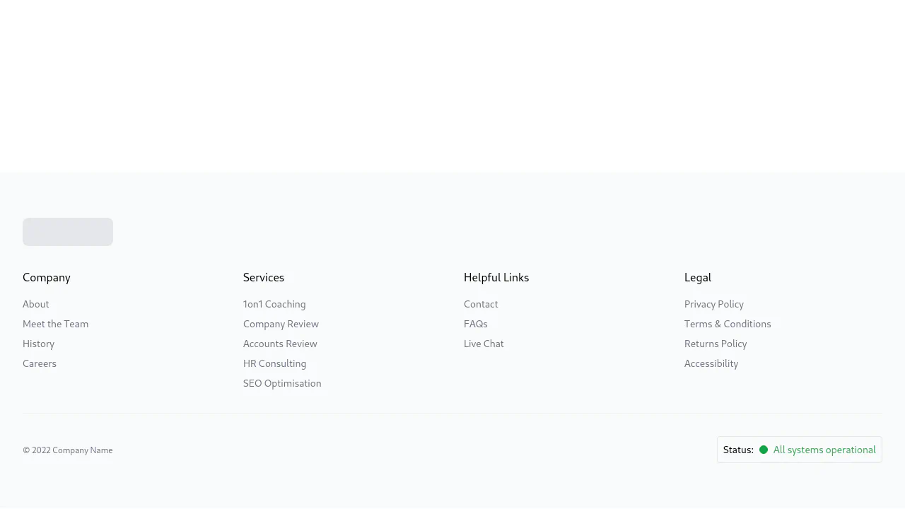
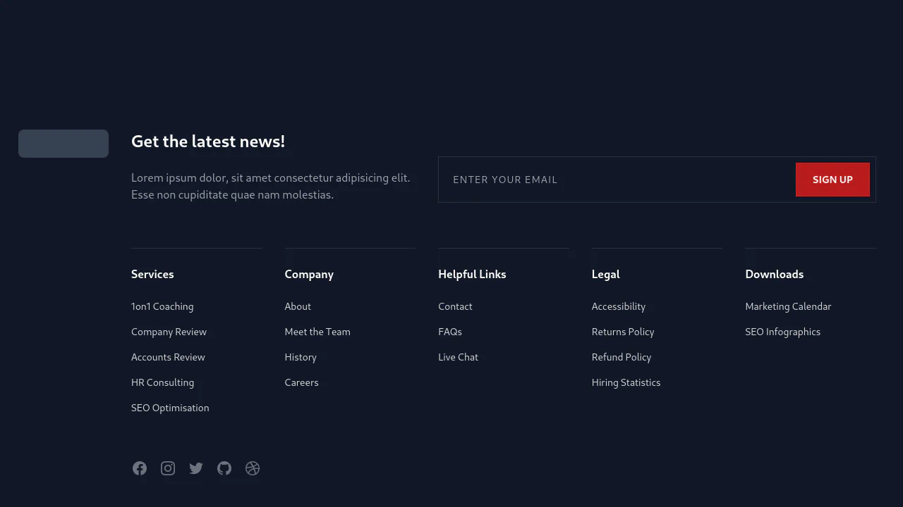
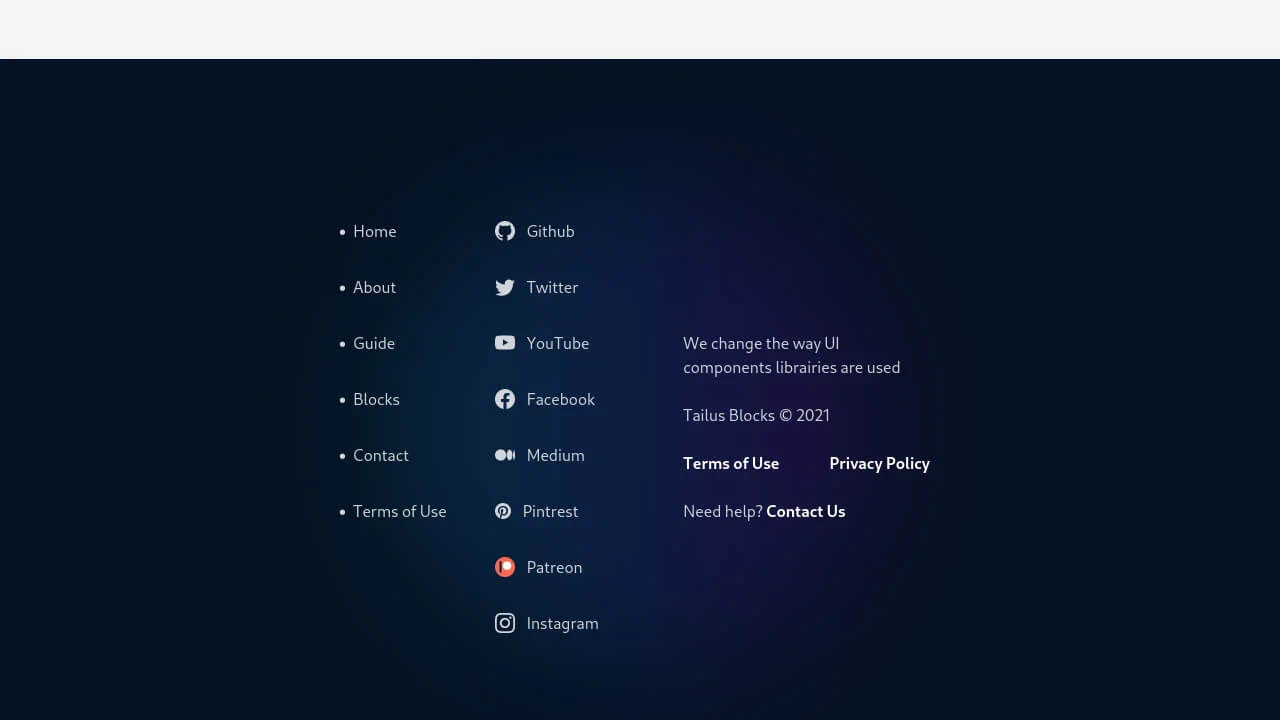
Footer Template
A comprehensive, dark-themed website footer built with Tailwind CSS, featuring a dynamic conic-gradient CTA section and a responsive multi-column layout for product links and download options.
See the Pen Footer Template.