10+ Tailwind Galleries
This collection is your toolkit for creating modern galleries with Tailwind CSS. A utility-first approach is employed for the rapid development of responsive grids using Grid and media query prefixes. For content of varying heights, Masonry layout techniques and aspect-ratio are demonstrated to prevent layout shifts. Interactivity is added via hover: effects like smooth scaling and overlay appearances, all controlled by transition utilities. These are fast, performant, and fully customizable solutions.
Examples
Alpine.js and Tailwind Image Gallery
A beautiful, asymmetrical mosaic of photos that smoothly expands an image to full screen with a dimmed background upon clicking, providing a comfortable viewing experience.
See the Pen Alpine.js and Tailwind Image Gallery.

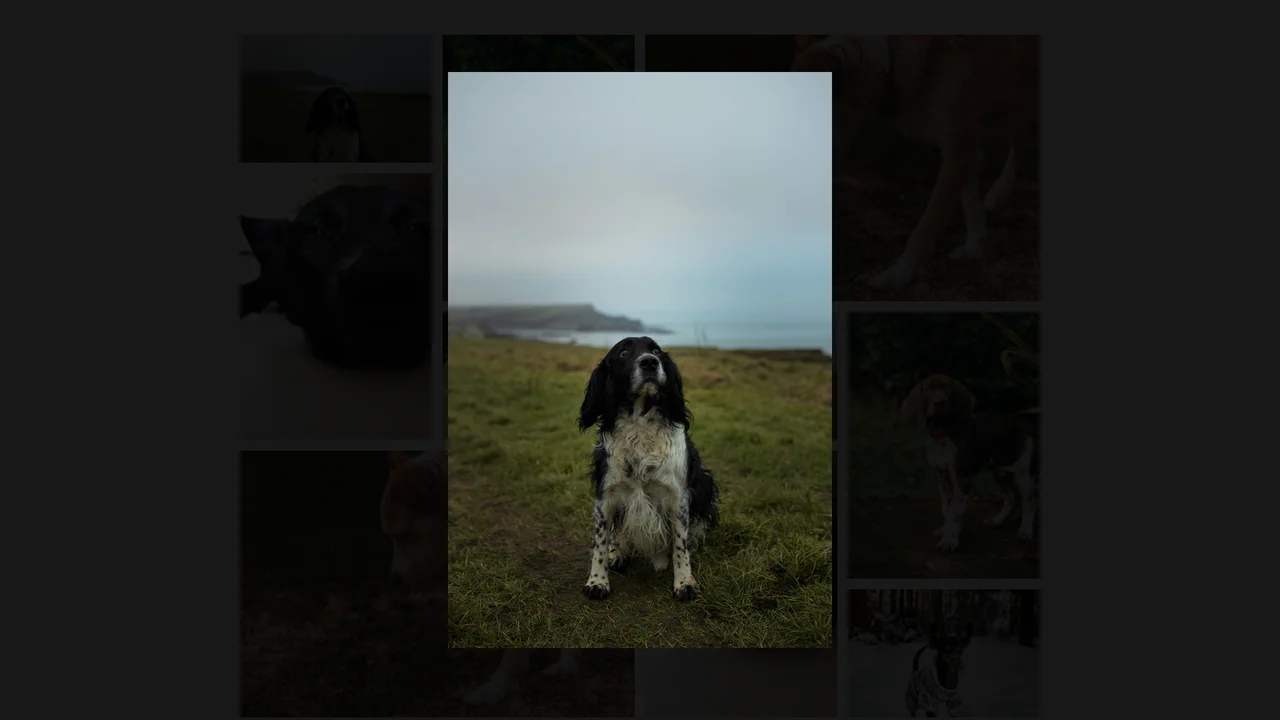
Art Gallery with Tailwind
A strict, geometrically precise gallery in a dark theme that looks professional and modern.
See the Pen Art Gallery with Tailwind.
Card Transition Shift Layout
An impressive, smooth gallery where each thumbnail transforms into a full-container promo image with detailed description, responding dynamically to mouse movements.
See the Pen Card Transition Shift Layout.
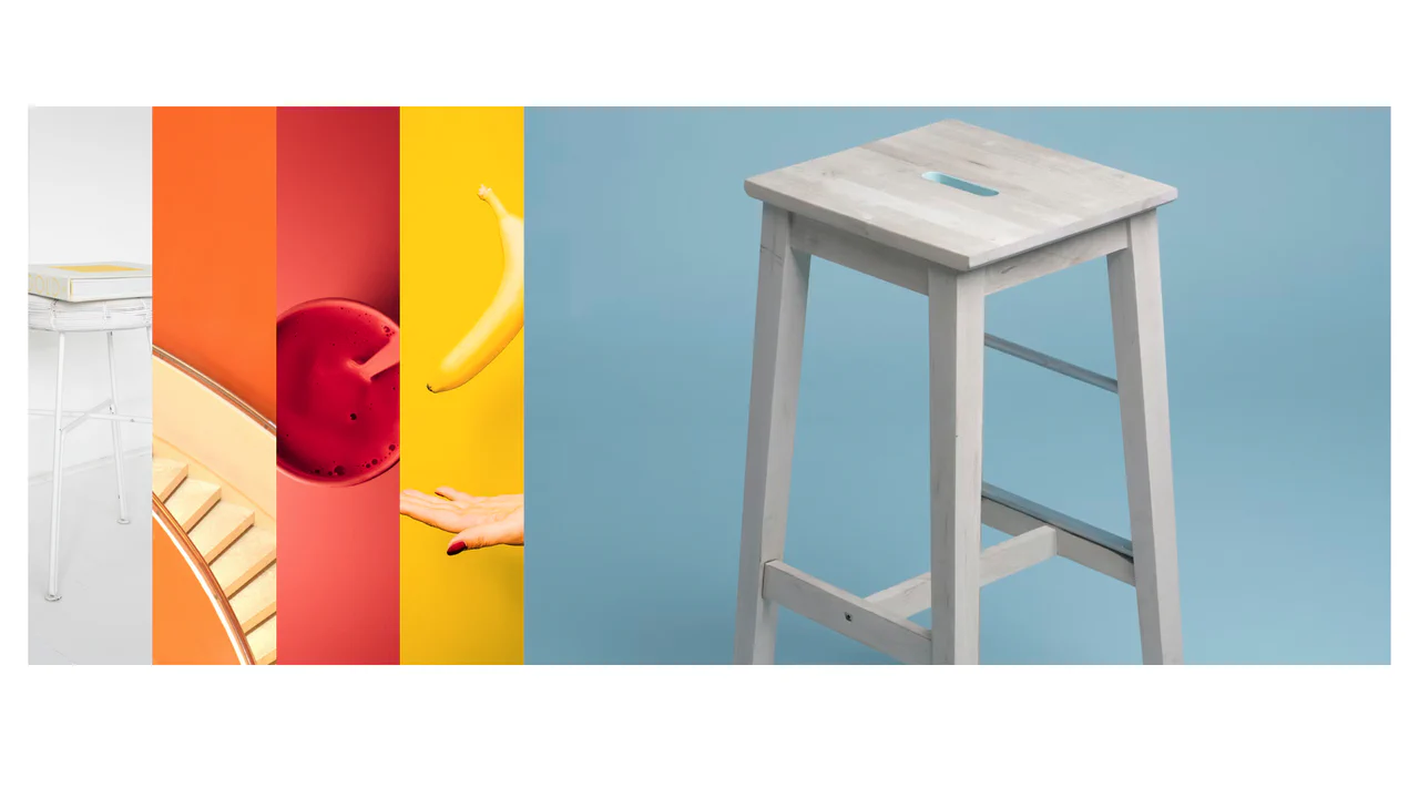
Image Gallery in Tailwind CSS
An elegant gallery where images smoothly slide and expand on hover, allowing the user to focus on the selected photo.
See the Pen Image Gallery in Tailwind CSS.
Image Gallery Page using Tailwind
A beautiful gallery where hovering over an item smoothly zooms the image and reveals details like title, likes, and a save button, creating a “live” interface feel.
See the Pen Image Gallery Page using Tailwind.

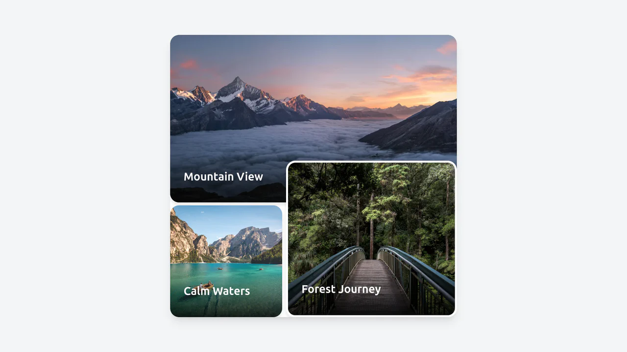
Image Gallery Section with Tailwind CSS
A stylish and modern gallery that interestingly arranges photos of different sizes, creating a dynamic visual sequence while displaying correctly on all devices.
See the Pen Image Gallery Section with Tailwind CSS.

Spine Layout
A unique “book spine” layout gallery combining a fixed vertical sidebar with a horizontal content slider.
See the Pen Spine Layout.
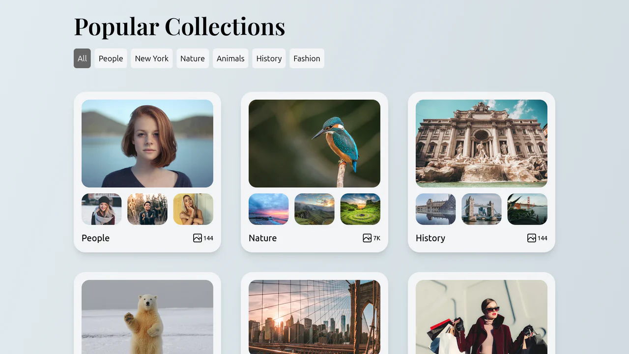
Collections List with Filtering
A convenient and visually appealing gallery where the user can instantly switch between content categories (people, nature, history, etc.) without reloading the page.
See the Pen Collections List with Filtering.

Tailwind Fluid Grid
An impressive, “living” gallery where the active image smoothly expands, pushing neighbors aside, while inactive elements elegantly dim and desaturate, focusing attention on the content.
See the Pen Tailwind Fluid Grid.

Photography Portfolio with Tailwind
A clean, modern photography portfolio layout built with Tailwind CSS, featuring a responsive masonry grid, hover effects, and a dropdown navigation menu.
See the Pen Photography Portfolio with Tailwind.
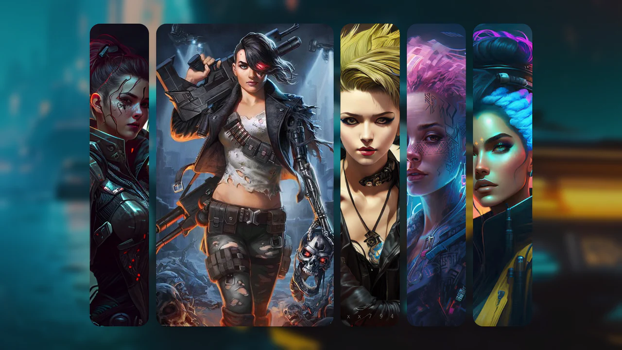
3D Accordion Style Cards with Tailwind
A reactive accordion gallery where Vue.js handles data binding, but the kinetic expansion relies entirely on CSS Flexbox.
See the Pen 3D Accordion Style Cards with Tailwind.

Image Accordion with Tailwind CSS
A kinetic, fluid interface where interacting with one element smoothly reflows the entire layout. The active image remains sharp and vivid, while the others dim and blur, guiding the user’s focus.
See the Pen Image Accordion with Tailwind CSS.