10+ Tailwind Grids
Build complex and responsive grids with Tailwind CSS using these examples. Go beyond simple columns by using col- span-* and row-span-* to construct asymmetric, “magazine-style” layouts. Responsiveness is ensured via media query prefixes (md:, lg:). This is your guide to building visually rich and unique layouts, from Masonry galleries to creative card designs.
Examples
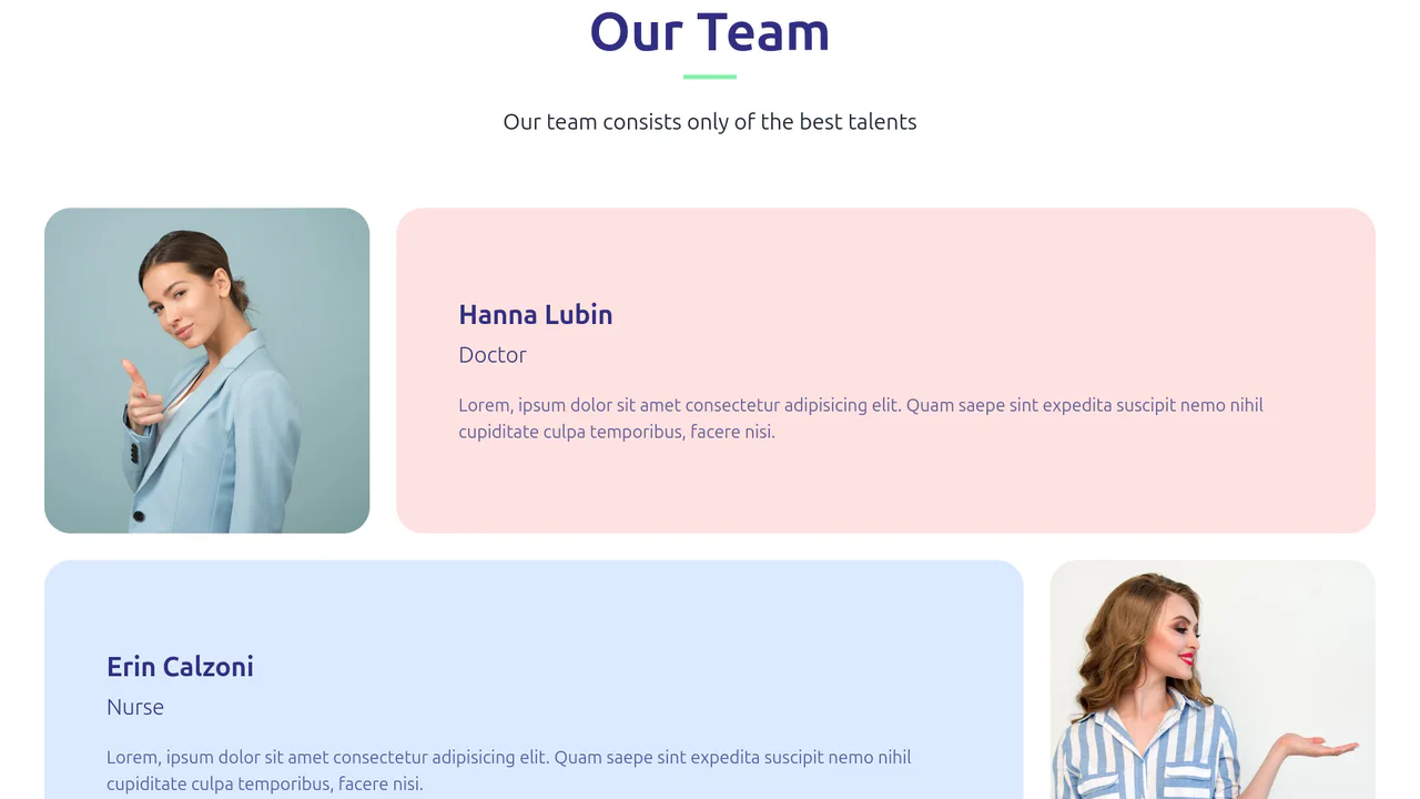
Our Team Section with Tailwind Grid
A professional, clean, and well-organized team layout that is easy to perceive due to the contrast and alternating blocks.
See the Pen Our Team Section with Tailwind Grid.
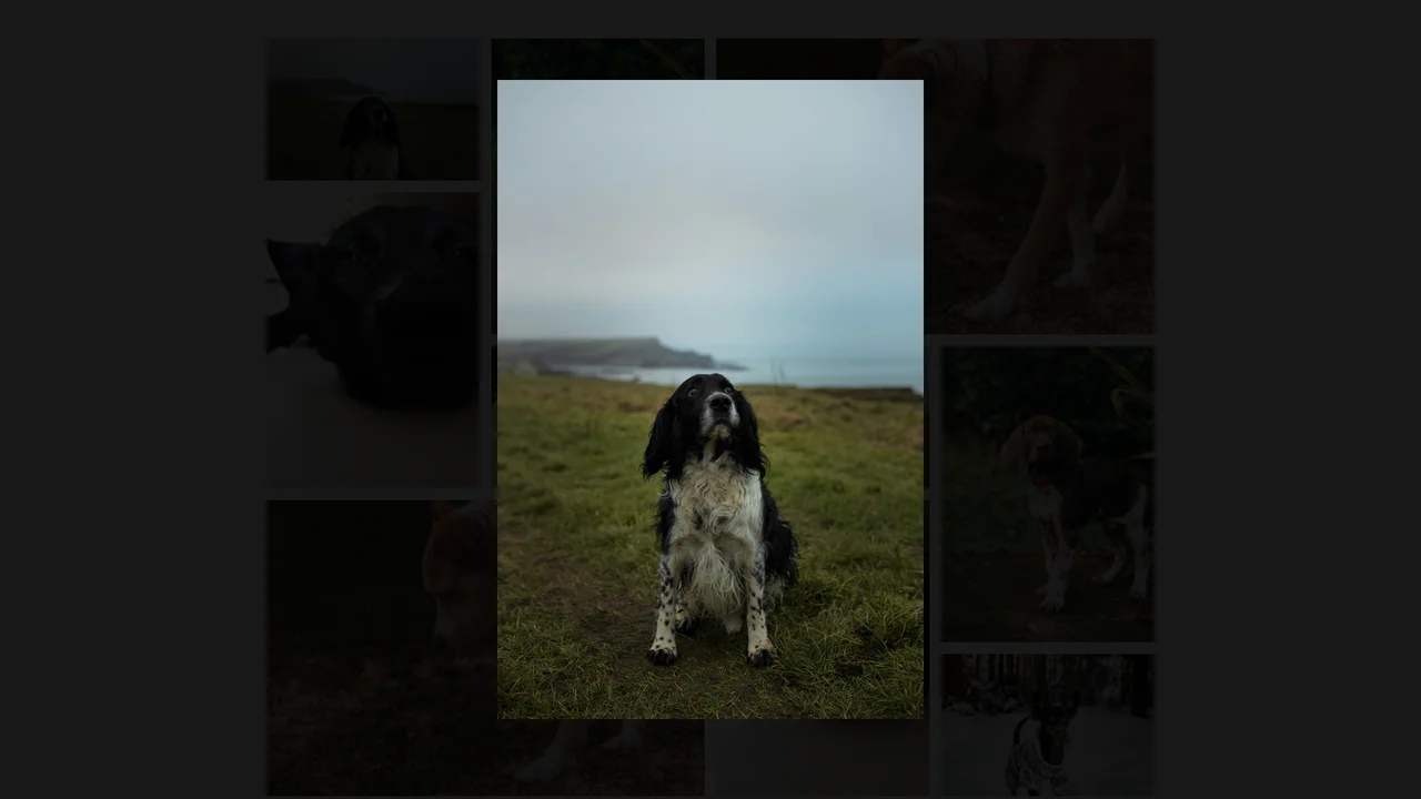
Alpine.js and Tailwind Image Gallery
A beautiful, asymmetrical mosaic of photos that smoothly expands an image to full screen with a dimmed background upon clicking, providing a comfortable viewing experience.
See the Pen Alpine.js and Tailwind Image Gallery.

Art Gallery with Tailwind
A strict, geometrically precise gallery in a dark theme that looks professional and modern.
See the Pen Art Gallery with Tailwind.
Card Transition Shift Layout
An impressive, smooth gallery where each thumbnail transforms into a full-container promo image with detailed description, responding dynamically to mouse movements.
See the Pen Card Transition Shift Layout.
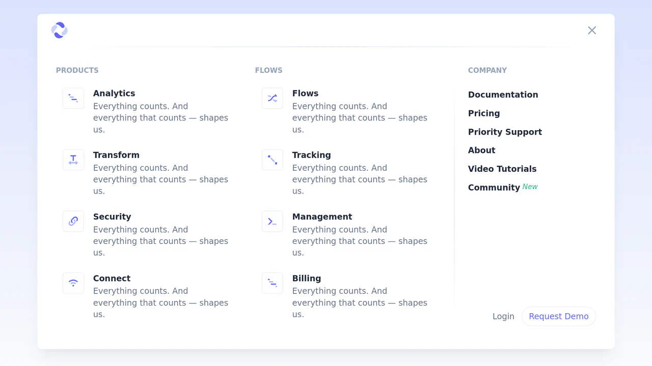
Expandable Header with Tailwind CSS and Alpine.js
A stylish, smooth, and functional menu that “grows” downwards upon opening, offering a rich set of links and categories separated by gradient lines.
See the Pen Expandable Header with Tailwind CSS and Alpine.js.
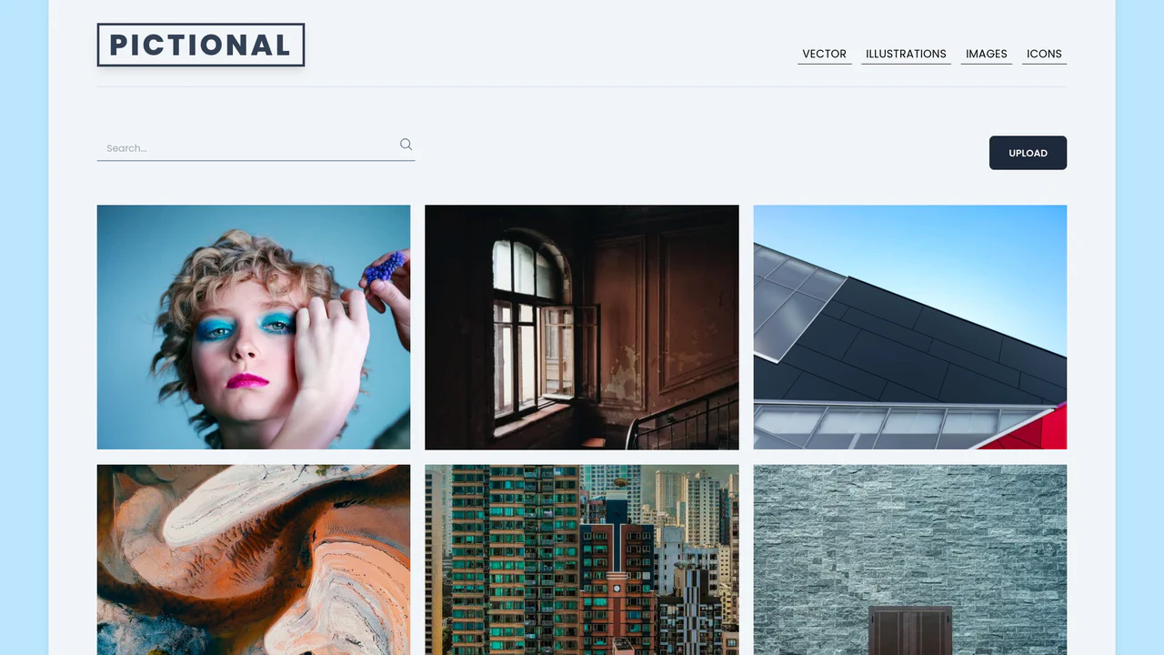
Image Gallery Page using Tailwind
A beautiful gallery where hovering over an item smoothly zooms the image and reveals details like title, likes, and a save button, creating a “live” interface feel.
See the Pen Image Gallery Page using Tailwind.

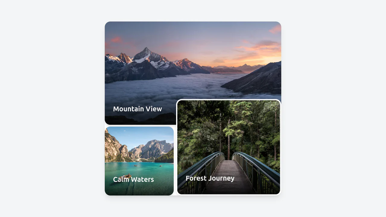
Image Gallery Section with Tailwind CSS
A stylish and modern gallery that interestingly arranges photos of different sizes, creating a dynamic visual sequence while displaying correctly on all devices.
See the Pen Image Gallery Section with Tailwind CSS.
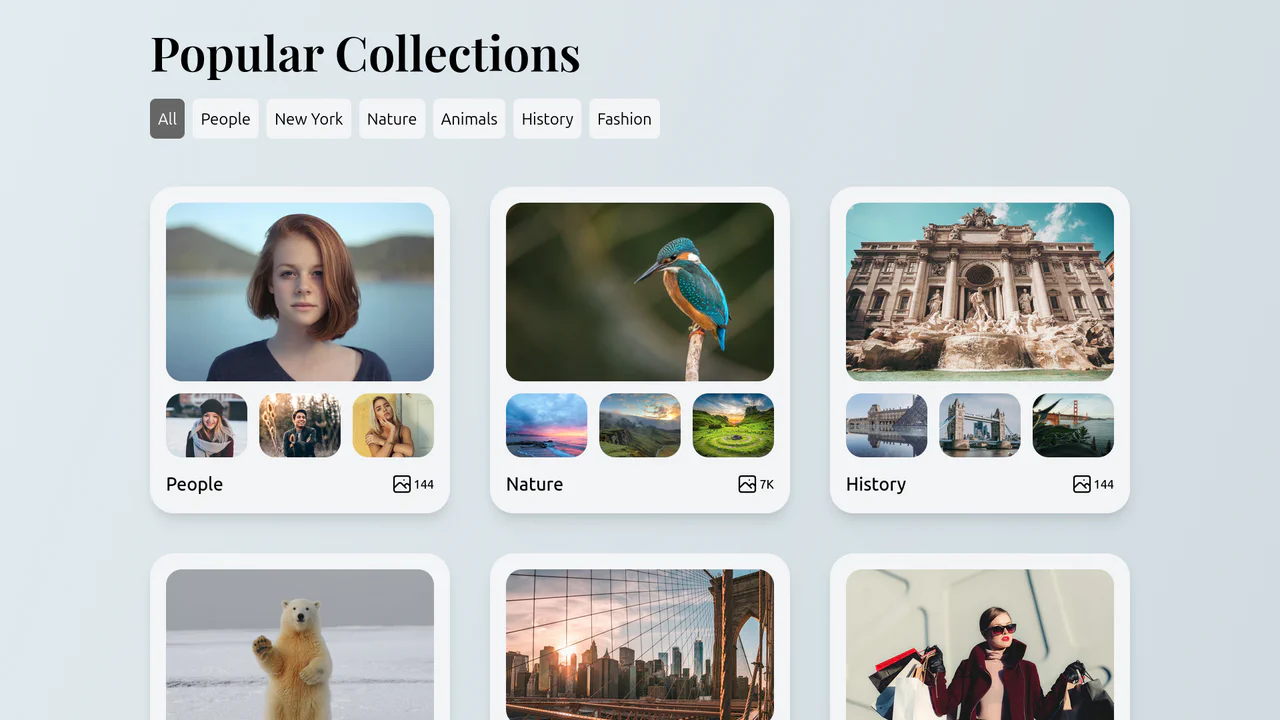
Collections List with Filtering
A convenient and visually appealing gallery where the user can instantly switch between content categories (people, nature, history, etc.) without reloading the page.
See the Pen Collections List with Filtering.
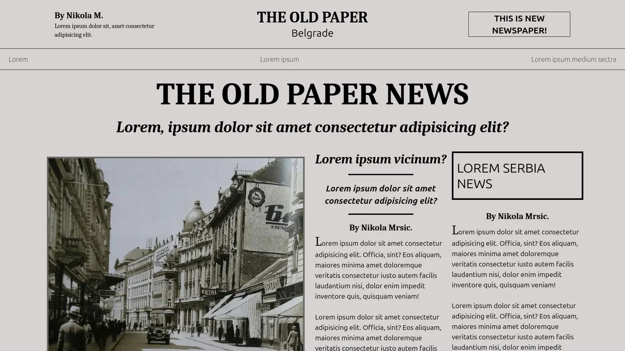
Newspaper Layout with Tailwind CSS
A nostalgic newspaper layout crafted with Tailwind CSS, featuring a multi-column grid and serif typography to mimic traditional print media.
See the Pen Newspaper Layout with Tailwind CSS.

Services Section with Tailwind and SCSS
A visually striking “Services” section featuring interactive cards with a creative clip-path reveal effect. Built with Tailwind CSS and SCSS, each card displays a unique corner-anchored circular mask that expands on hover to fill the background with a vibrant indigo color, while background images add texture and context without JavaScript.
See the Pen Services Section with Tailwind and SCSS.

Tailwind Fluid Grid
An impressive, “living” gallery where the active image smoothly expands, pushing neighbors aside, while inactive elements elegantly dim and desaturate, focusing attention on the content.
See the Pen Tailwind Fluid Grid.
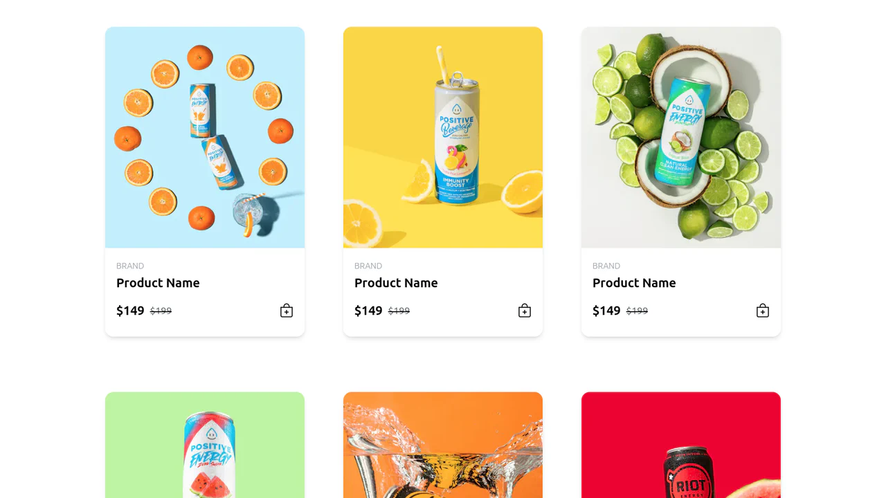
Responsive Product Card Grid with Tailwind CSS
A modern and dynamic product showcase that captures user attention with smooth scaling animations and a clear, screen-adaptive structure.
See the Pen Responsive Product Card Grid with Tailwind CSS.
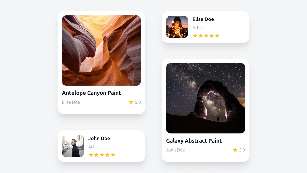
Wall of Cards with Tailwind
An artistic, “magazine-style” layout that breaks the standard grid structure, creating a sense of manual composition and guiding the user’s eye along a specific path.
See the Pen Wall of Cards with Tailwind.
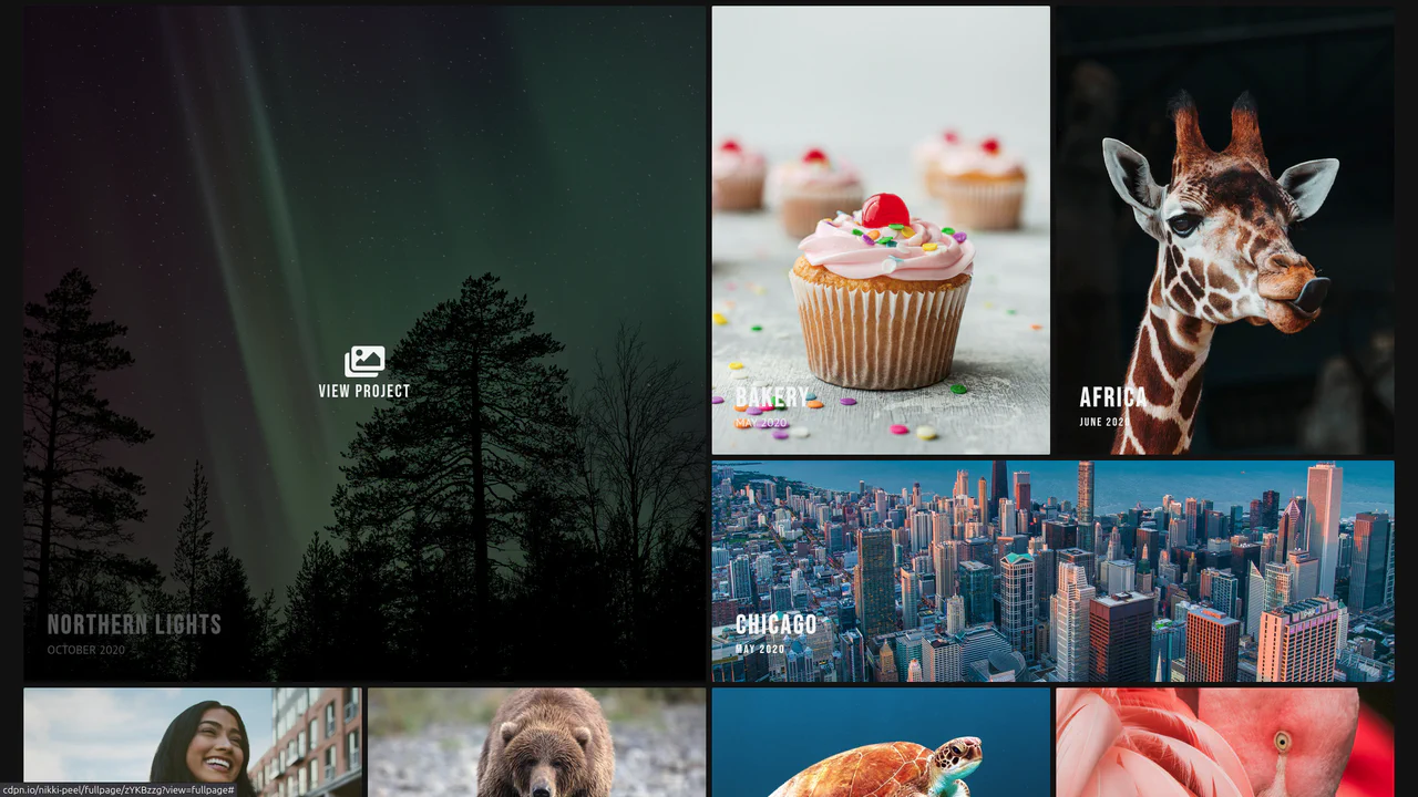
Photography Portfolio with Tailwind
A clean, modern photography portfolio layout built with Tailwind CSS, featuring a responsive masonry grid, hover effects, and a dropdown navigation menu.
See the Pen Photography Portfolio with Tailwind.