10+ Tailwind Hover Effects
This collection is a guide to creating impressive hover effects with Tailwind CSS. It goes beyond simple color changes, demonstrating complex interactions with group-hover that animate multiple elements at once. Advanced techniques like clip-path animation, 3D transforms, and “spotlight” effects are implemented with the JIT compiler. All examples use smooth transitions, turning static interfaces into “living” and tactile experiences.
Examples
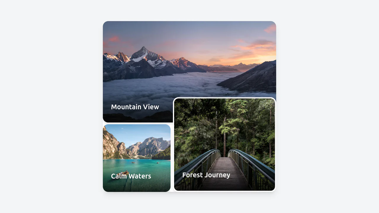
Card Transition Shift Layout
An impressive, smooth gallery where each thumbnail transforms into a full-container promo image with detailed description, responding dynamically to mouse movements.
See the Pen Card Transition Shift Layout.
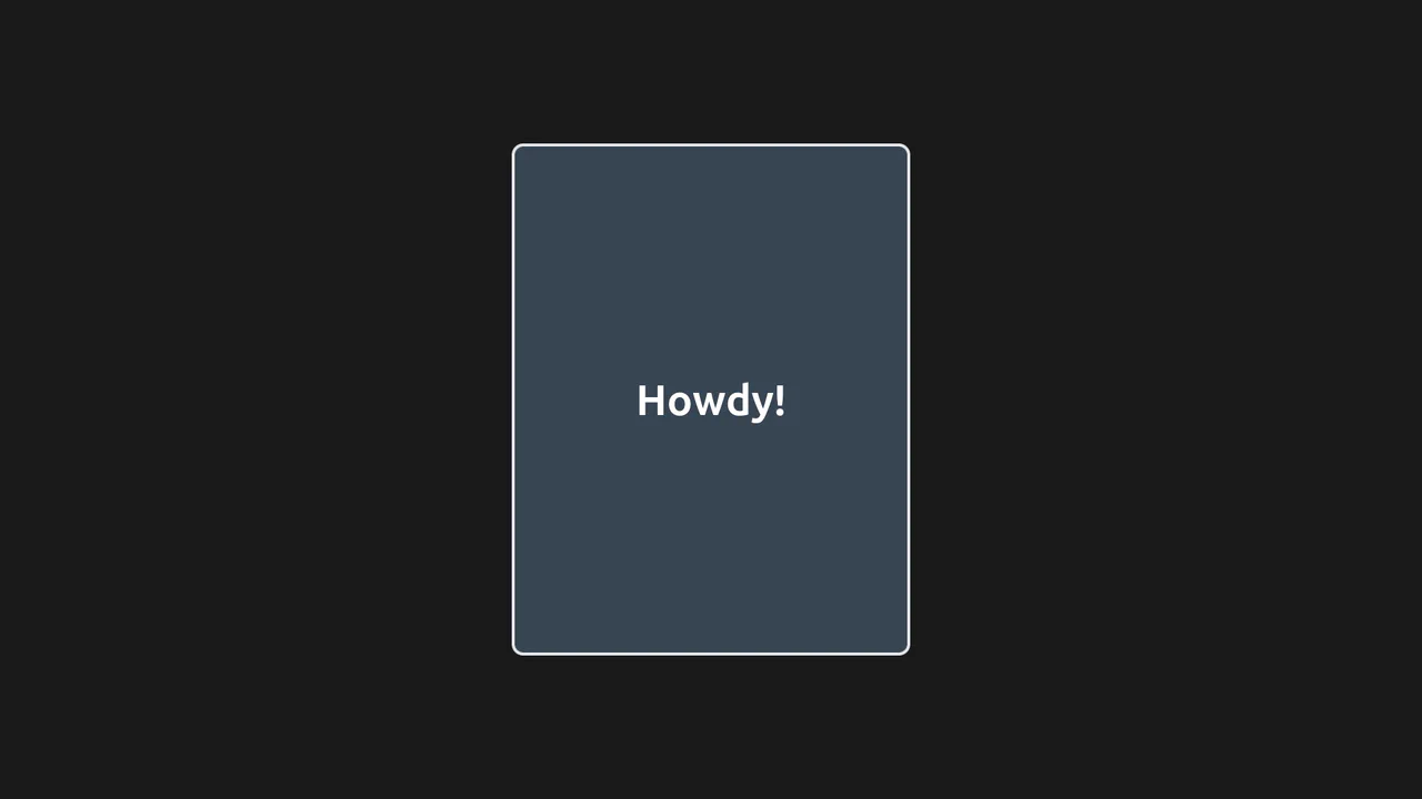
Hover Card with Tailwind
A simple, neat card with a “glass” effect (due to transparency) that reacts to hovering by becoming more transparent.
See the Pen Hover Card with Tailwind.
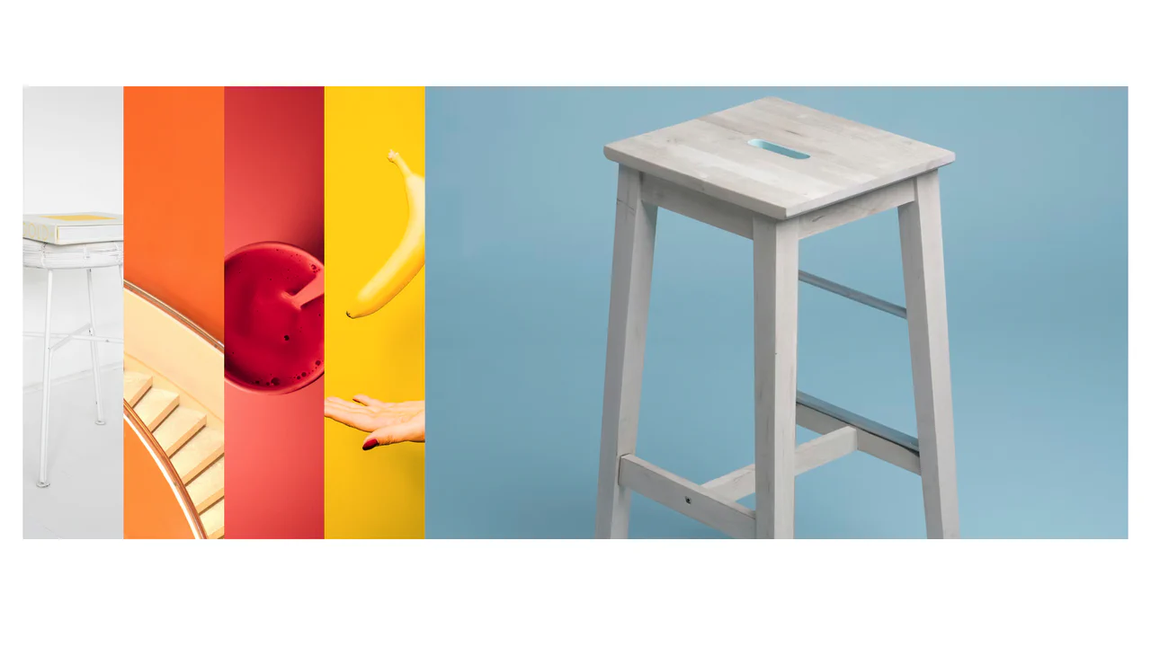
Image Gallery in Tailwind CSS
An elegant gallery where images smoothly slide and expand on hover, allowing the user to focus on the selected photo.
See the Pen Image Gallery in Tailwind CSS.
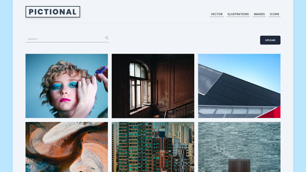
Image Gallery Page using Tailwind
A beautiful gallery where hovering over an item smoothly zooms the image and reveals details like title, likes, and a save button, creating a “live” interface feel.
See the Pen Image Gallery Page using Tailwind.
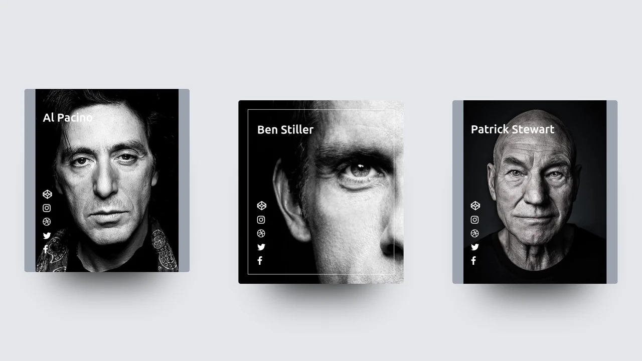
Profile Hover Effect with Tailwind
A visually striking media card component featuring a dramatic hover zoom effect powered solely by CSS transitions.
See the Pen Profile Hover Effect with Tailwind.
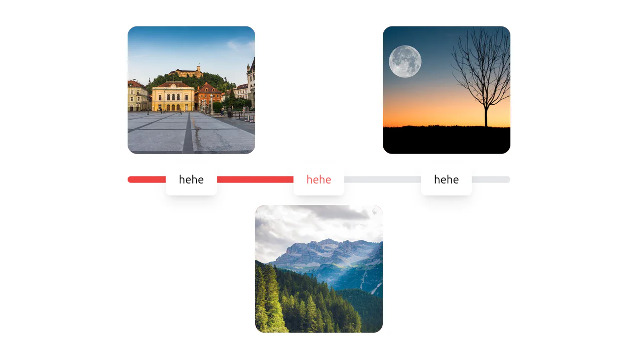
Tailwind Slider Move/Transform on Hover
An unusual, playful interface where interacting with one element visually “activates” connections with others, creating a sense of a continuous chain or path.
See the Pen Tailwind Slider Move/Transform on Hover.
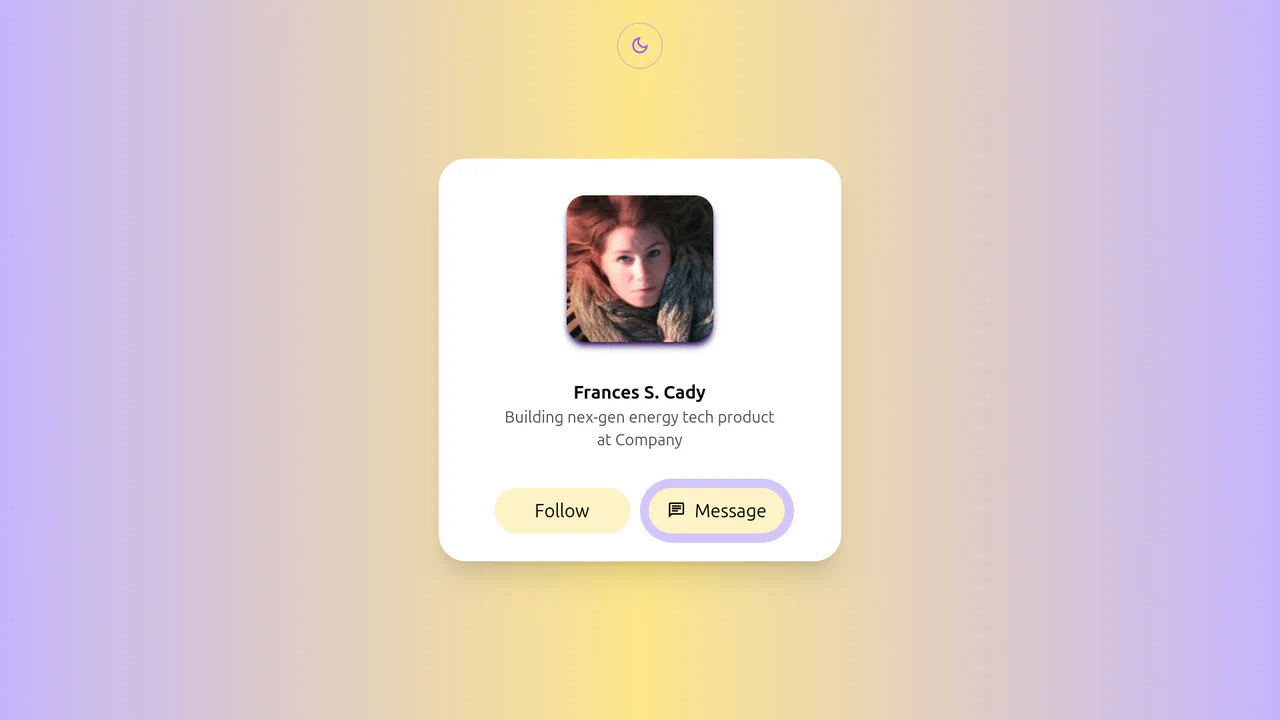
Tailwind Social Profile Light with Theme Toggle
A highly dynamic and visually complex component that uses a combination of advanced CSS selectors and techniques to create a sophisticated, multi-stage UI effect without heavy libraries.
See the Pen Tailwind Social Profile Light with Theme Toggle.

Services Section with Tailwind and SCSS
A visually striking “Services” section featuring interactive cards with a creative clip-path reveal effect. Built with Tailwind CSS and SCSS, each card displays a unique corner-anchored circular mask that expands on hover to fill the background with a vibrant indigo color, while background images add texture and context without JavaScript.
See the Pen Services Section with Tailwind and SCSS.

Tailwind Fluid Grid
An impressive, “living” gallery where the active image smoothly expands, pushing neighbors aside, while inactive elements elegantly dim and desaturate, focusing attention on the content.
See the Pen Tailwind Fluid Grid.

Card Hover Animations with Tailwind CSS
High-tech, dark-themed cards that come to life on hover: the image slightly elevates and “activates,” swapping to a brighter, more detailed version, creating a sense of interactivity and premium quality.
See the Pen Card Hover Animations with Tailwind CSS.

CTA Animation on Hover with Tailwind CSS
An impressive, cinematic interaction experience where hovering over the button dims the background to focus attention, triggers a rotating gradient border, and swaps the static text for a dynamic scrolling marquee.
See the Pen CTA Animation on Hover with Tailwind CSS.

Spotlight Card Hover Effect with Tailwind CSS
A captivating “spotlight” card effect driven by vanilla JavaScript and styled with Tailwind CSS.
See the Pen Spotlight Card Hover Effect with Tailwind CSS.
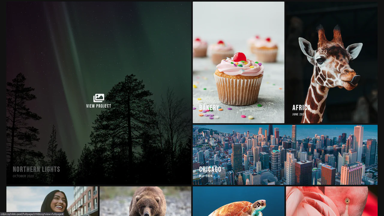
Photography Portfolio with Tailwind
A clean, modern photography portfolio layout built with Tailwind CSS, featuring a responsive masonry grid, hover effects, and a dropdown navigation menu.
See the Pen Photography Portfolio with Tailwind.



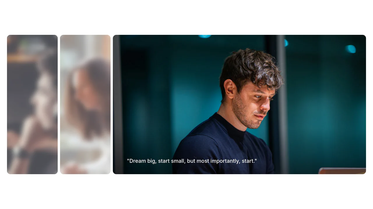
Image Accordion with Tailwind CSS
A kinetic, fluid interface where interacting with one element smoothly reflows the entire layout. The active image remains sharp and vivid, while the others dim and blur, guiding the user’s focus.
See the Pen Image Accordion with Tailwind CSS.