20+ Tailwind Profiles
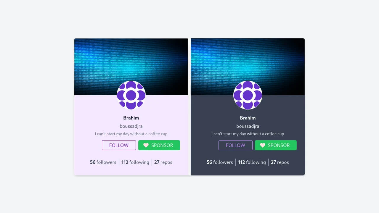
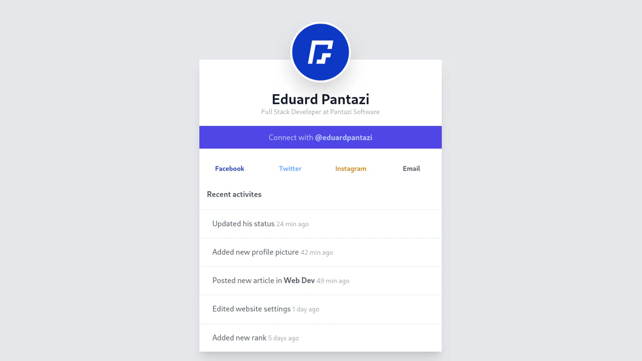
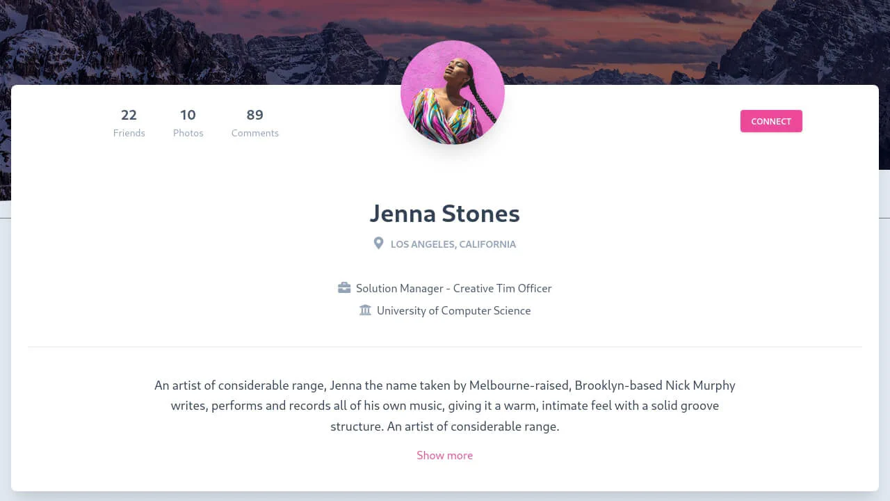
Build modern and interactive profile cards with Tailwind CSS. Go beyond standard layouts by demonstrating 3D transforms and clip-path to create unique visual effects. Interactivity is powered by group-hover for smooth animations and the “checkbox hack” for building complex, multi-stage UIs without JavaScript. All examples use a utility-first approach for fast and responsive development.
Examples
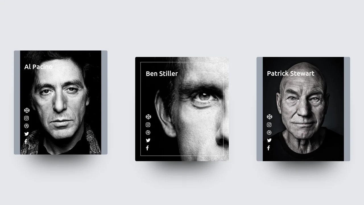
Profile Hover Effect with Tailwind
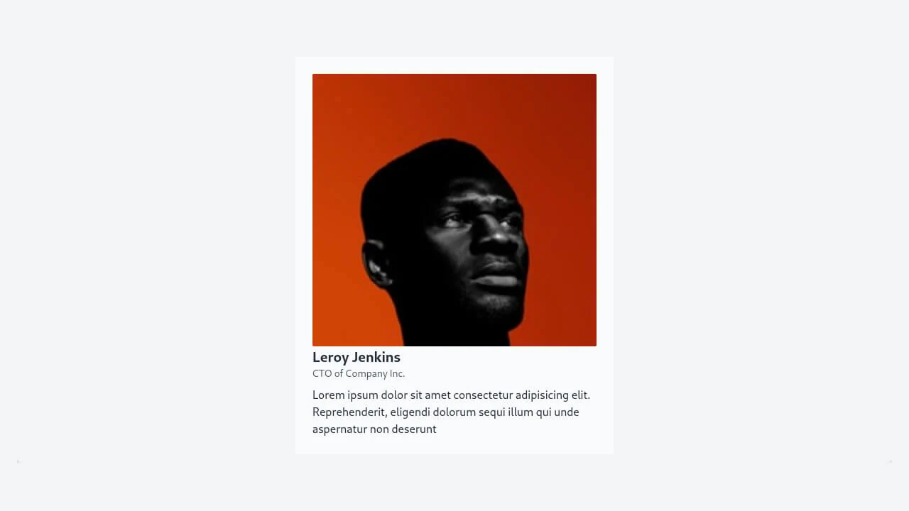
A visually striking media card component featuring a dramatic hover zoom effect powered solely by CSS transitions.
See the Pen Profile Hover Effect with Tailwind.
Tailwind 20s Profile
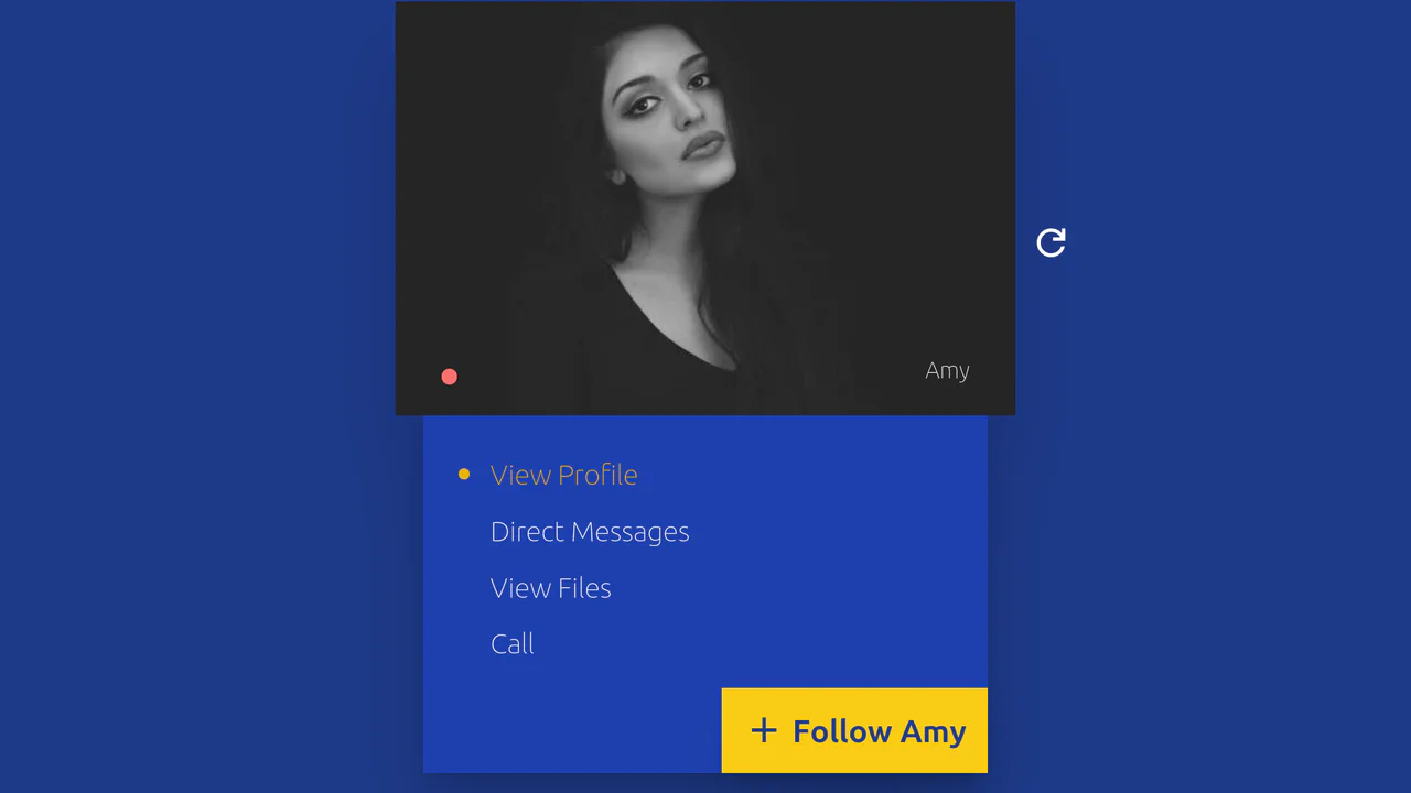
A dynamic and stylish component where each click on the refresh button smoothly transitions the user, and hovering over the card triggers a dramatic 3D expansion effect.
See the Pen Tailwind 20s Profile.

Tailwind Glassy Profile
A highly interactive, visually deep (glassy) component where the user can reveal two different layers of information (data and social media) or switch to a fullscreen content mode using only CSS triggers.
See the Pen Tailwind Glassy Profile.
Tailwind Profile Card
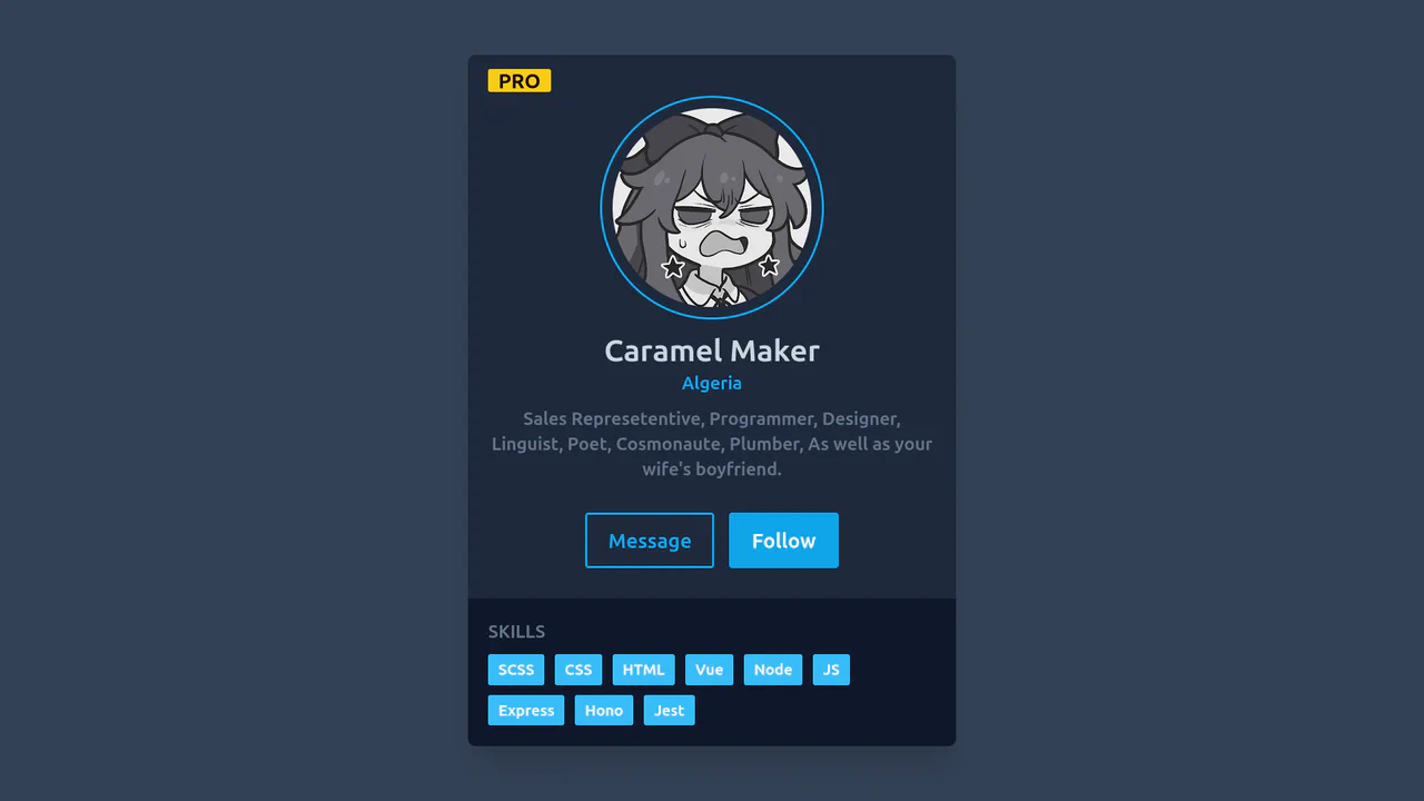
A clean and professional, yet striking, dark-themed profile that immediately draws attention to skills and call-to-action buttons.
See the Pen Tailwind Profile Card.
Tailwind Profile Card 2
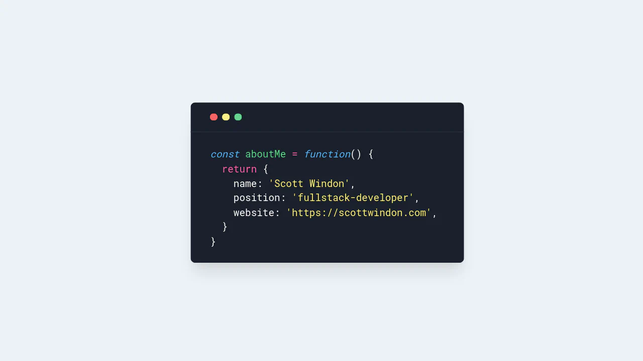
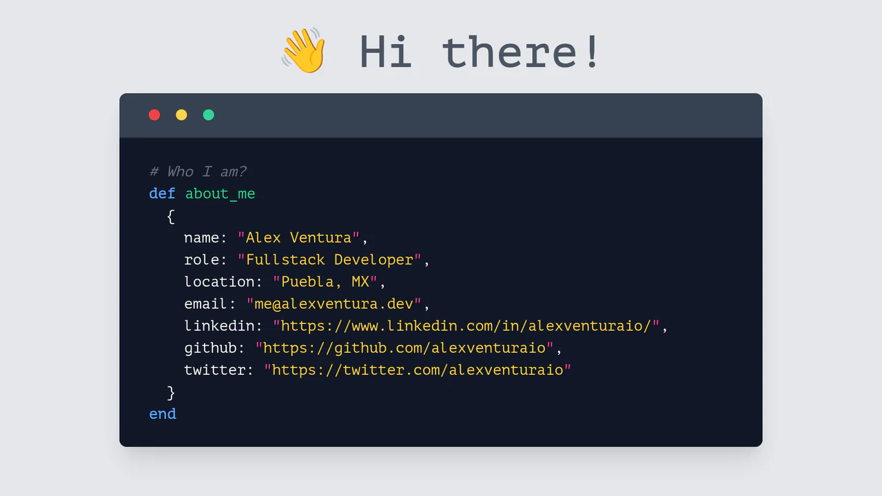
A static “About Me” profile designed to mimic a code editor or terminal UI. The aesthetic relies heavily on the PT Mono monospace font and extensive use of Tailwind color utilities for manual syntax highlighting, with indentation managed via HTML entities.
See the Pen Tailwind Profile Card 2.

Tailwind Social Profile Light with Theme Toggle
A highly dynamic and visually complex component that uses a combination of advanced CSS selectors and techniques to create a sophisticated, multi-stage UI effect without heavy libraries.
See the Pen Tailwind Social Profile Light with Theme Toggle.
Tailwind CSS Profile Cards
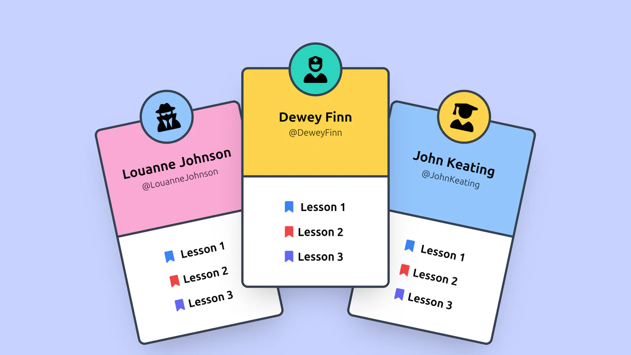
A fun, informal card design that is well-suited for educational platforms, gaming interfaces, or social networks.
See the Pen Tailwind CSS Profile Cards.

Tailwind Profile Card
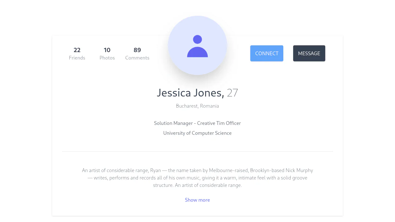
A modern user profile card styled with Tailwind CSS, featuring a distinctive diagonal cut on the profile image created via the clip-path property.
See the Pen Tailwind Profile Card.