3 Tailwind Range Sliders
The Tailwind Range Sliders collection features ready-to-use, responsive components for dynamic data input. The core focus is on seamless customization using Tailwind utilities, allowing developers to easily restyle the slider’s track, thumb, and active range. Demos showcase how CSS variables enable granular styling control, alongside patterns for implementing dual-thumb sliders and real-time value display.
Examples

Pricing Table with Range Slider (Tailwind and Alpine.js)
A high-end, data-driven pricing component where a range slider dynamically updates tiered costs. It combines Alpine.js state management with CSS-variable-powered masking to deliver a fluid, reactive UI.
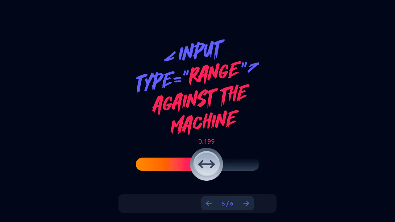
Range Against the Machine with Tailwind and Alpine.js
A highly interactive and visually rich component demonstrating the limits of modern CSS capabilities combined with declarative state management, allowing designers to create non-standard input forms with kinetic feedback.
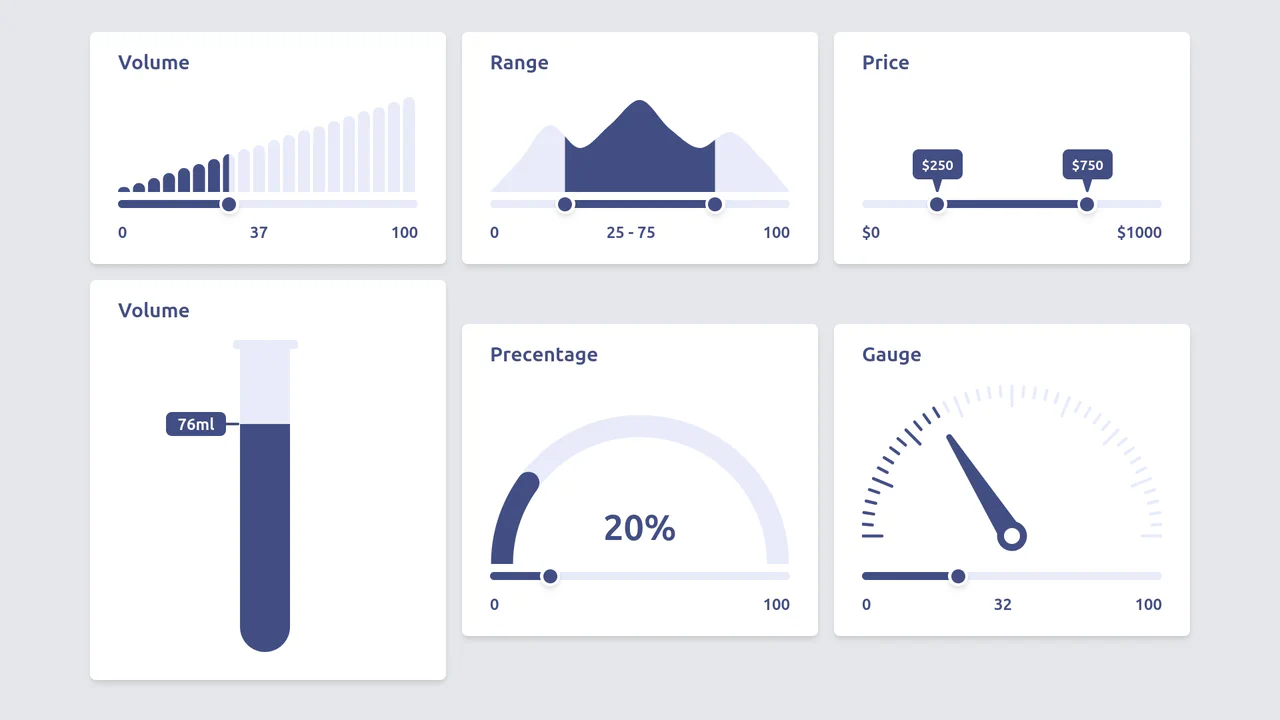
Diverse Custom Range Sliders in React with SVG and Tailwind
A showcase of diverse, custom range input styling achieved by hiding the native thumb and track, and then overlaying React/Tailwind elements and SVG graphics controlled by the component’s state.