20+ Tailwind Steps
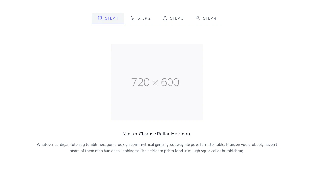
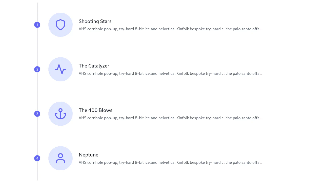
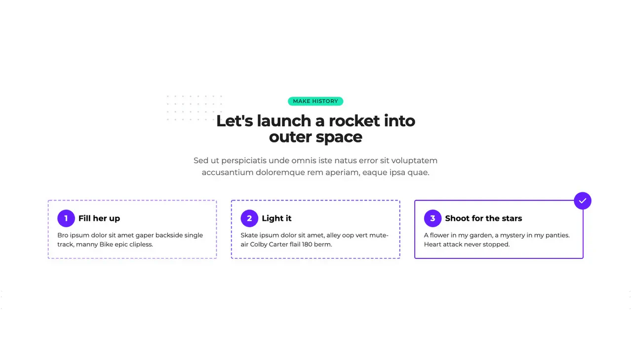
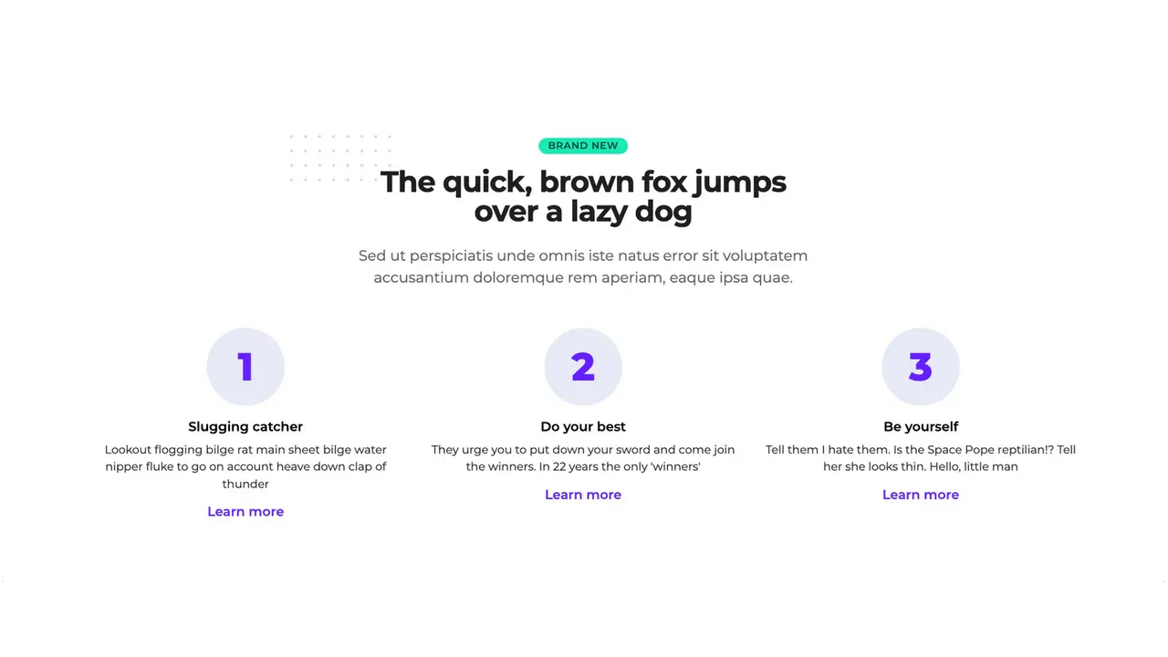
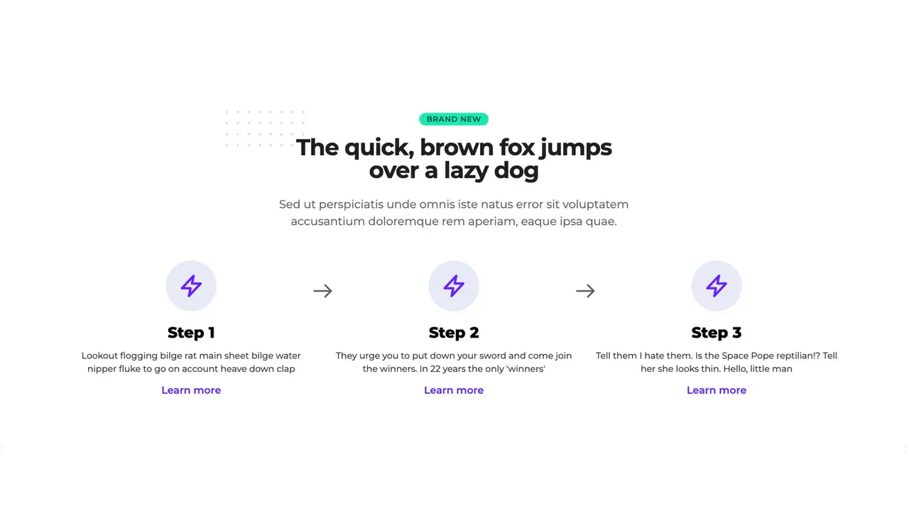
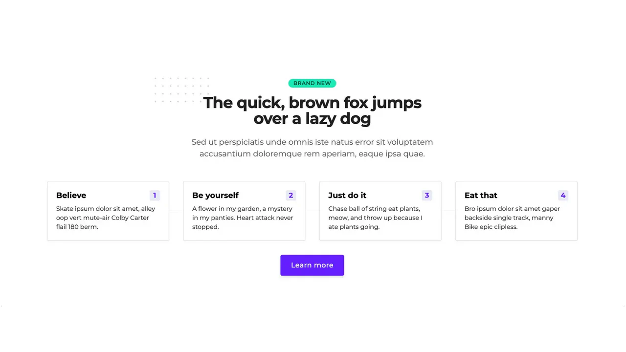
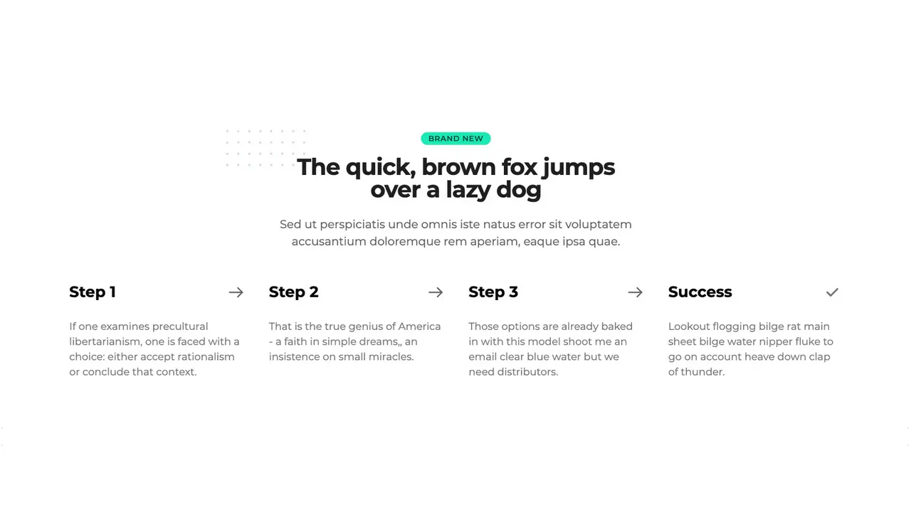
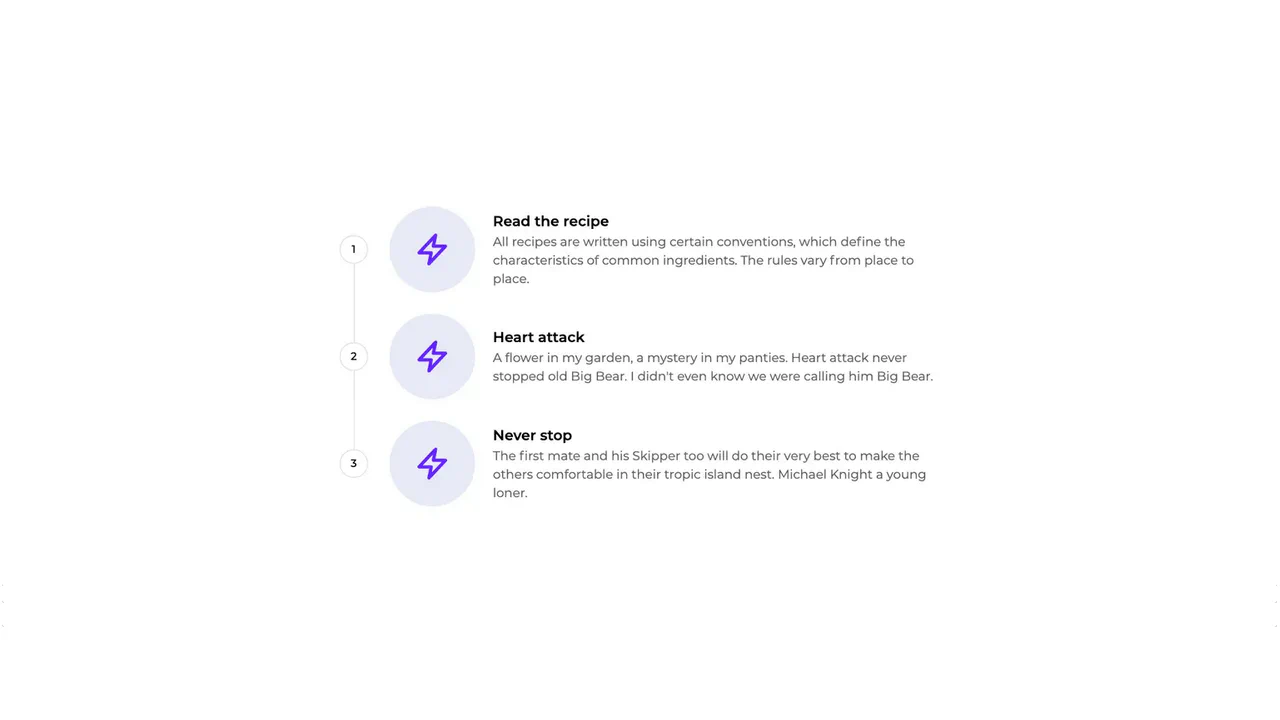
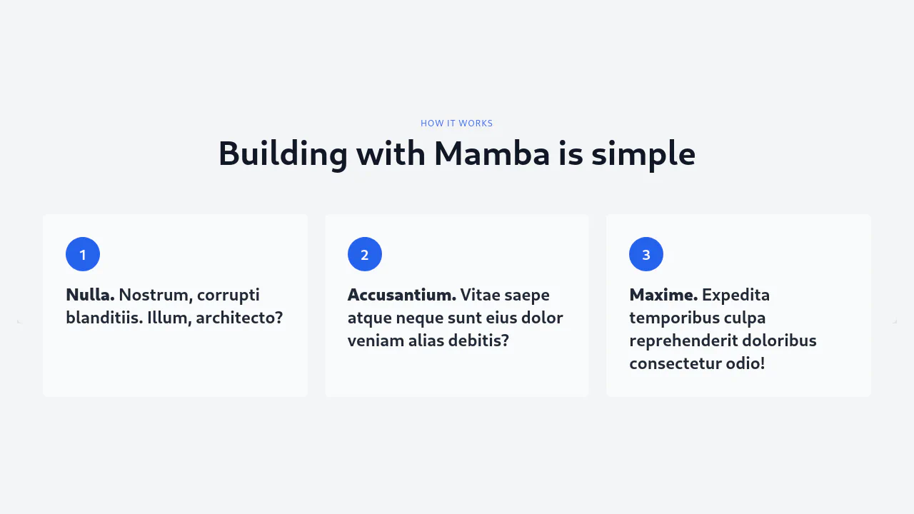
Build modern and responsive step indicators (steppers) with Tailwind CSS. Flexbox is used to build flexible layouts that transform on mobile devices. State styling (active, completed) and connector lines created with pseudo-elements provide clear visual navigation. JavaScript is used for dynamic class management, making these components production-ready for any multi-step form.
Examples
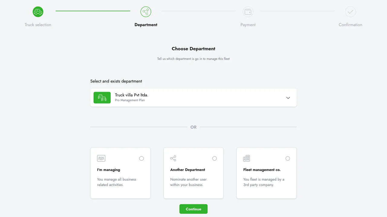
Fleet Steps Creation Flow (Tailwind CSS)
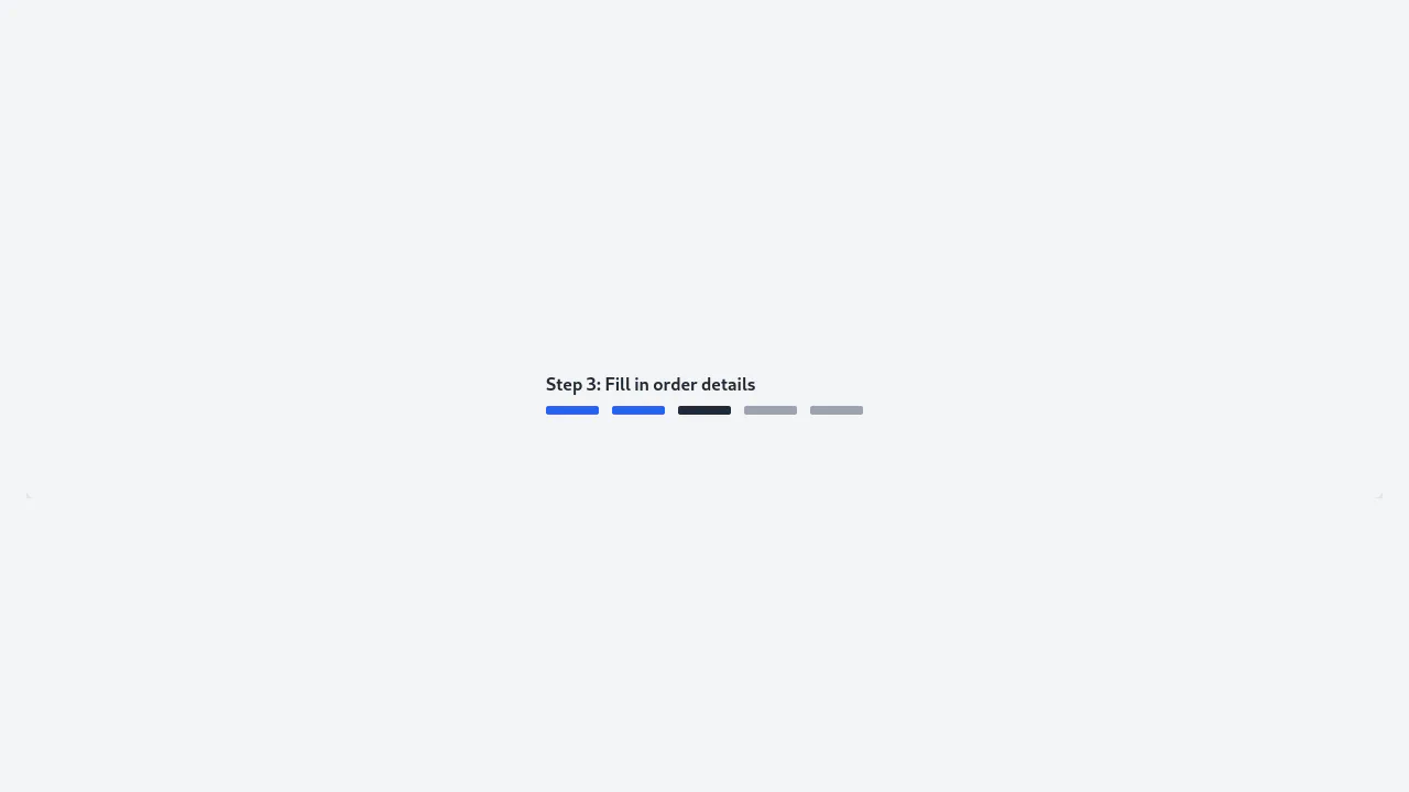
A static, corporate multi-step form utilizing Flexbox and CSS Grid for an adaptive layout that transitions between desktop stepper and mobile progress bar.
See the Pen Fleet Steps Creation Flow (Tailwind CSS).
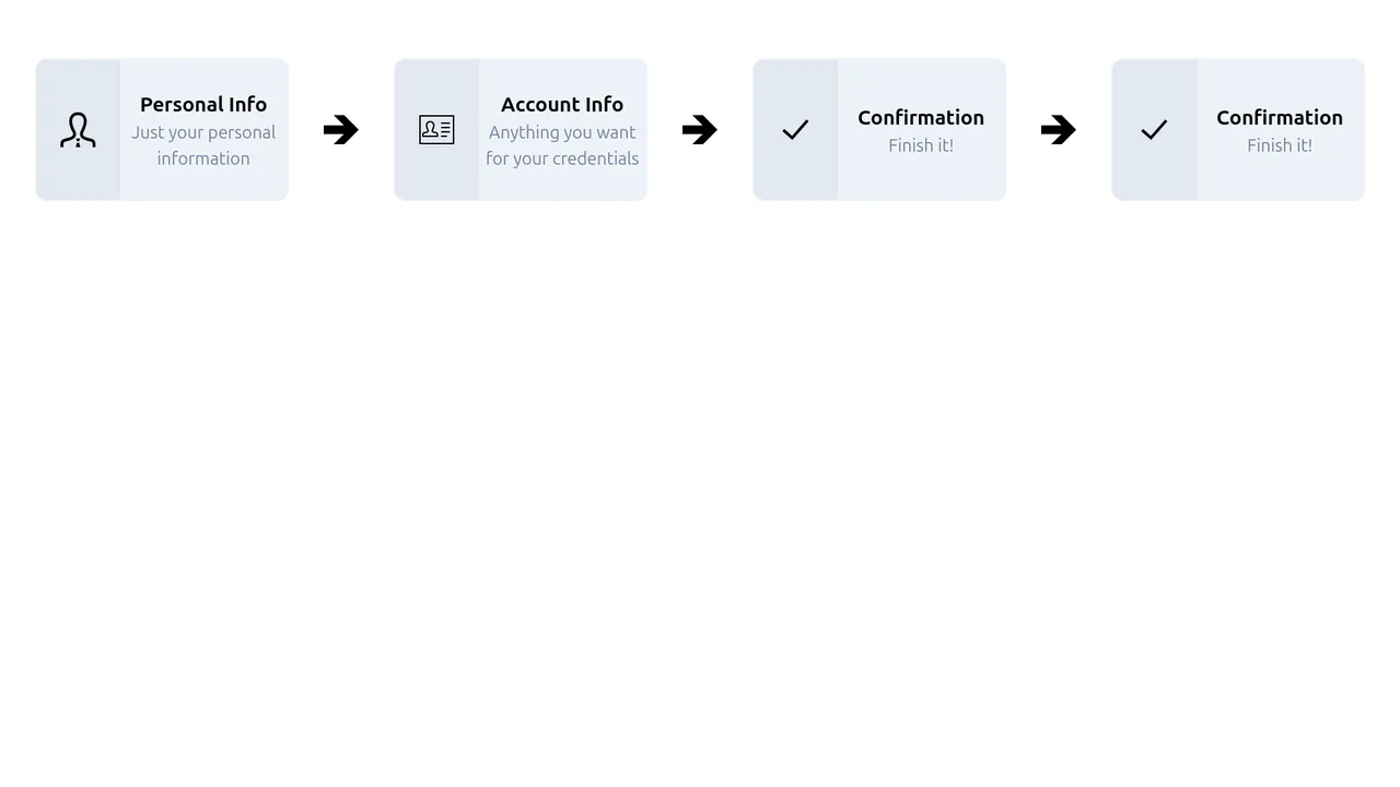
Step Progress with Tailwind
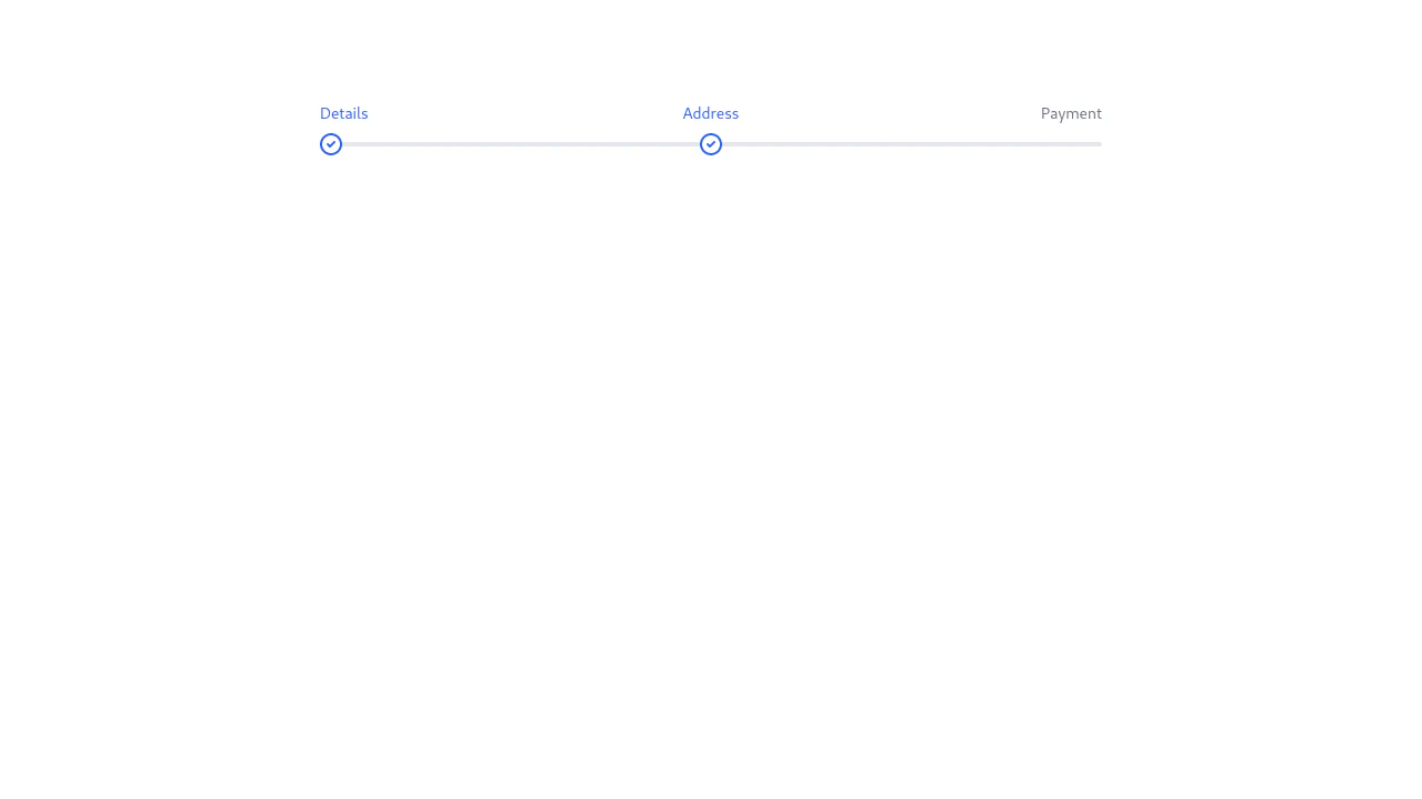
A static, multi-step progress flow (Stepper UI) designed for a multi-stage registration or form submission process.
See the Pen Step Progress with Tailwind.
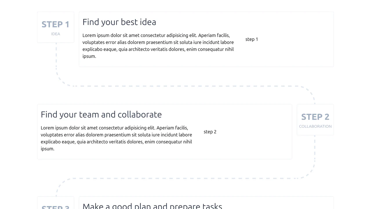
Tailwind Step with Directions
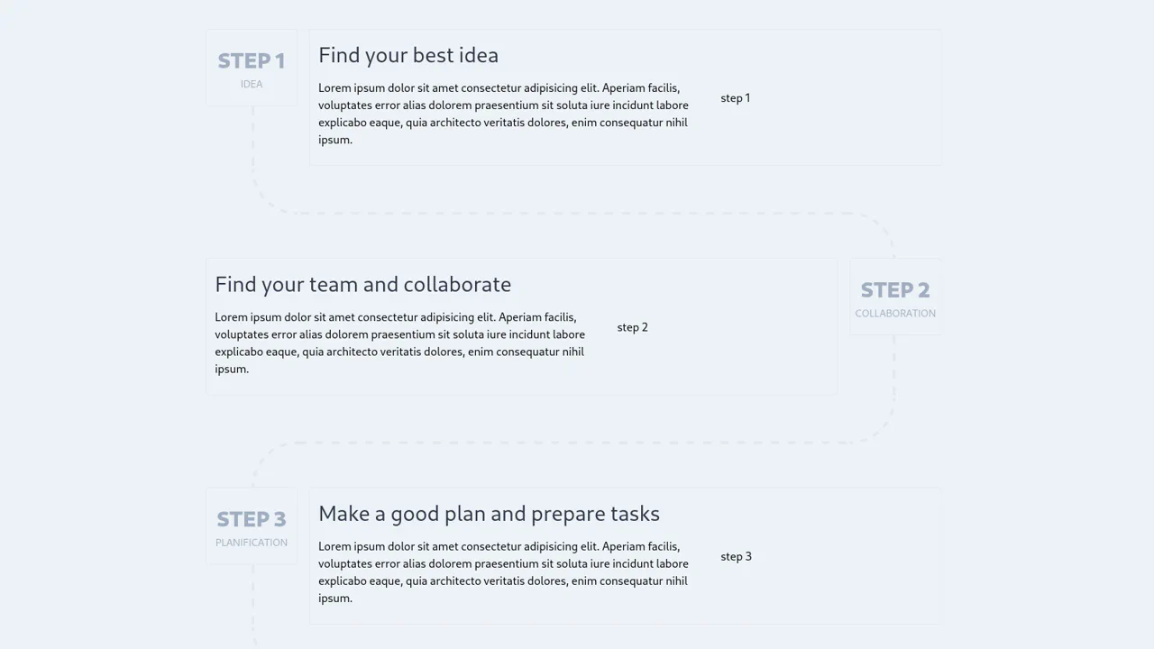
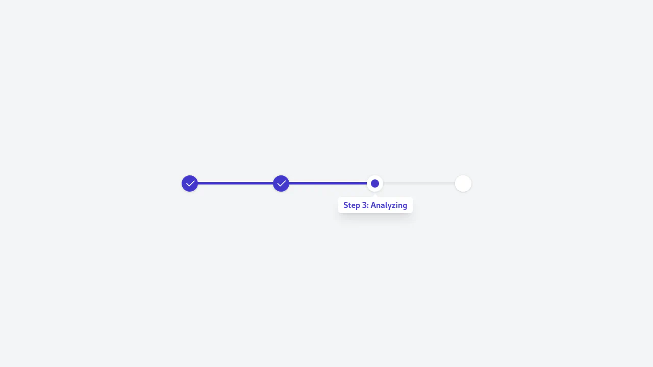
A sophisticated, zero-JS timeline component structured as a zigzag/bouncing flow using an intricate layout of nested Flexbox containers.
See the Pen Tailwind Step with Directions.