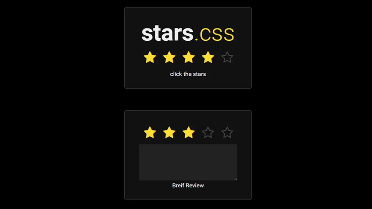
30+ CSS Star Ratings
Feedback systems prioritize user honesty. This updated collection of CSS Star Rating snippets removes visual noise between intent and data. Clear UI design ensures the interaction remains transparent, allowing the rating to dictate the form. Using curated snippets provides a direct path to a functional interface without unnecessary decoration.
Logic relies on semantic HTML and the radio input hack for state management. Transitions utilize hardware acceleration, animating properties like transform and color to ensure 60fps performance on the compositor thread. This approach maintains high layout stability and eliminates script-induced latency by offloading tasks to the GPU. Minimalist styling prevents expensive repaints, keeping the interaction fast.
Every free demo is responsive and cross-browser compatible. Users can instantly download the raw code or fork an updated project on CodePen.
Examples
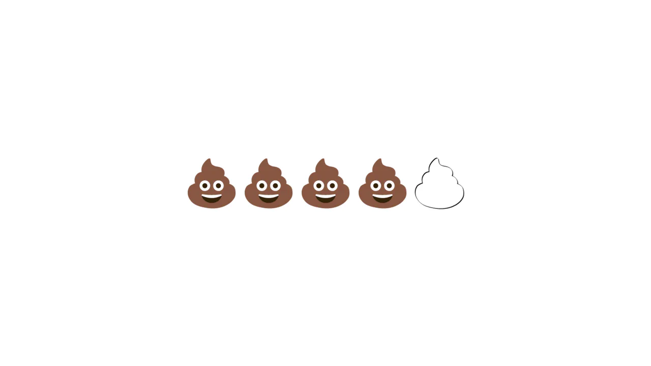
Emoji Poop Rating Component
A humorous take on the classic 5-star rating component, replacing stars with poop emojis. The layout utilizes flex-direction: row-reverse combined with the CSS general sibling combinator (~) to highlight all preceding emojis on hover or selection without JavaScript. Inactive emojis are styled using filter: contrast(0) brightness(2) to appear as blank outlines.
 Chrome 53+
 Edge 79+
 Firefox 35+
 Safari 9.1+
See the Pen Emoji Poop Rating Component.

Bursting Animated SVG Star Rating
The Bursting Animated SVG Star Rating is an explosive feedback component for user reviews. It replaces standard instantaneous state changes with a multi-layered animation sequence consisting of a ring expansion, radial line “sparks,” and an elastic fill. Its function is to provide high-fidelity tactile validation for user input within forms.
Chrome 80+
Edge 80+
Firefox 63+
Safari 13.1+
See the Pen Bursting Animated SVG Star Rating.

Modern CSS Star Rating Component
This Modern CSS Star Rating Component represents a major shift in UI development, moving complex logic from JavaScript to pure CSS. It utilizes the powerful :has() selector to track sibling states, allowing the UI to highlight stars both before and after the interaction point. The stars themselves are created using clip-path instead of bulky SVG icons, resulting in a lightweight, scalable, and highly performant rating system.
Chrome 105+
Edge 105+
Firefox 121+
Safari 15.4+
See the Pen Modern CSS Star Rating Component.

Star Rating with CSS :has()
A fully functional rating widget that responds to hover and click events, illuminating the appropriate number of stars and updating the digit on the right, creating a dynamic interface feel without a single line of JS.
See the Pen Star Rating with CSS :has().

Feedback Reactions (Pure CSS)
Pure CSS custom properties and SVG for a neat, interactive feedback rating; see how variable-driven styling creates smooth state transitions and subtle 3D transforms.
See the Pen Feedback Reactions (Pure CSS).
This demo utilizes the classic “Image Sprite” technique for an efficient, high-performance animation. All reaction icons are contained in a single image, and the active icon is displayed by shifting the background-position, which is a more performant alternative to swapping multiple image src attributes.

Pure CSS Star Rating from 0 to 8 with Colored Points of the Star
This star rating component is a showcase of static state management using a modular, class-based system. The rating is set by applying classes like .one and .half to the main container, which then declaratively styles the individual points of the star without any JavaScript or form inputs.

Pure CSS star rating via radio inputs. Stars colored via cascade: on select, all following stars turn grey, on hover — orange. Half-star support via separate labels with negative margin. “No rating” option via separate radio.

CSS star rating component with fractional value support. SCSS mixin generates SVG backgrounds for star quarters based on data attribute. Supports two modes: clickable and representative. Icons embedded via encoded SVGs.
Three-layer rating system: empty, average, and user. First layer — grey stars, second — blue, filled proportionally to votes. Third — radio buttons for rating. On hover, yellow highlight. All values via CSS variables.
Rating with emoji switcher. On star selection, vertical emoji slider shifts, showing corresponding mood. Stars colored via CSS selectors. SVG emojis stacked in column and shifted via transform.
Star rating with scale animation on select. Stars as emoji controlled via variable. On select, star scales up, others turn grey. Hover highlights. Uses @extend for style reuse.
Two CSS star rating versions. First uses radio buttons and float:right for reverse order. Second uses links and direction:rtl. On hover/focus, stars turn orange via ~ selector.

Star rating with color differentiation. Each star on select/hover has its own color (green, yellow, orange, red, dark orange). :before and :after pseudo-elements create overlay effect. direction: rtl for correct order.
Interactive feedback with animated emojis. Five emotions (angry, sad, ok, good, happy) with unique eye and mouth animations. On select, emoji shakes, changes colors, tears appear, etc. CSS variables control colors and transforms.
Star rating with scale effect on hover. Stars (FontAwesome) scale up and turn gold on hover. Via ~ selector, all previous stars also highlight. direction: rtl for correct order.

Star rating with FontAwesome icons. On star select, all following become empty via :before character swap. On container hover, all stars fill; on specific star hover, following become empty. Radio inputs hidden.