20+ CSS background-clip Examples
Typography dictates digital hierarchy. The CSS background-clip examples in this updated collection remove visual barriers between media and text. Modern UI design requires raw, dynamic typography. Utilizing these curated snippets replaces heavy image assets with native text masking. Form follows function.
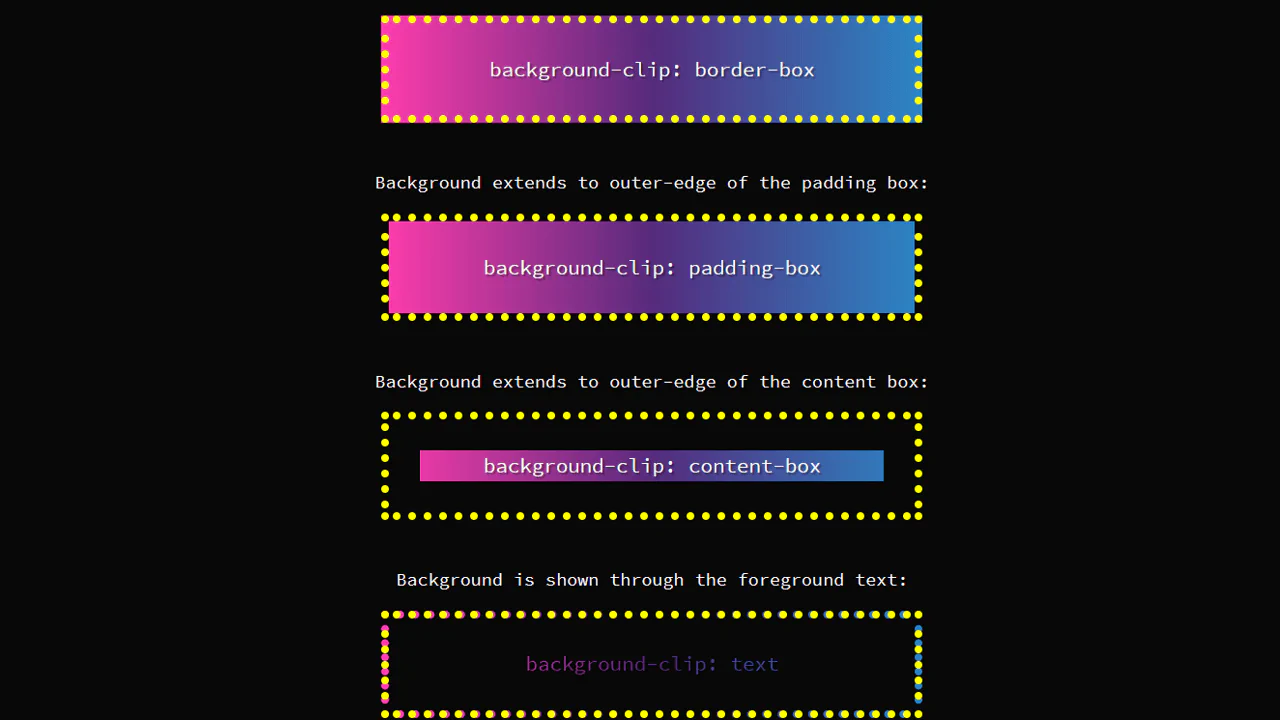
The architecture relies strictly on the background-clip: text property paired with transparent text colors. The code utilizes hardware acceleration to process pixel calculations on the GPU, ensuring smooth 60fps animations for background shifts. The HTML structure remains strictly semantic, maintaining absolute layout stability without triggering costly browser repaints or layout shifts when gradients or images intersect text.
Every free demo is fully responsive and cross-browser compatible. Users can instantly download the raw code or fork a specific layout on CodePen. These assets are strictly optimized for accessibility, delivering a fast, frictionless experience across all modern mobile and desktop devices.
Examples
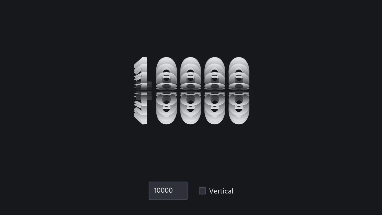
3D Spinning Typography Cylinder
An interactive 3D typography cylinder constructed using CSS preserve-3d and staggered keyframe animations. The cylinder is formed by 18 text sectors, each offset by a negative animation-delay to create a continuous spinning loop. The text features a background-clip gradient mask for a metallic sheen, while a checkbox dynamically rotates the entire assembly 90 degrees to toggle between horizontal and vertical orientations.
 Chrome 36+
 Edge 12+
 Firefox 16+ (partial)
 Safari 9+
See the Pen 3D Spinning Typography Cylinder.

Pure CSS Retro Arcade Machine
This is a Pure CSS Retro Arcade Machine. It constructs a highly detailed, nostalgic gaming cabinet entirely out of HTML nodes and CSS styling. Its function is to showcase the power of CSS as an illustrative medium, replacing static raster images or SVGs with resolution-independent, scalable code.
Chrome 69+
Edge 79+
Firefox 83+
Safari 12.1+
See the Pen Pure CSS Retro Arcade Machine.

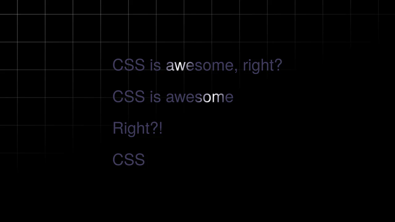
Sparkling Gradient Text Highlight
Typography on the web often suffers from a lack of vitality. We treat words as static information, ignoring their potential to convey wonder. This component injects a sense of “magic” into the reading experience. By combining a kinetic gradient with a randomized particle system, we create a focal point that breathes. It is not just a highlight; it is a celebration of the message, designed to captivate the user’s peripheral vision without overwhelming the content.
Chrome 84+
Edge 84+
Firefox 79+
Safari 14+
See the Pen Sparkling Gradient Text Highlight.
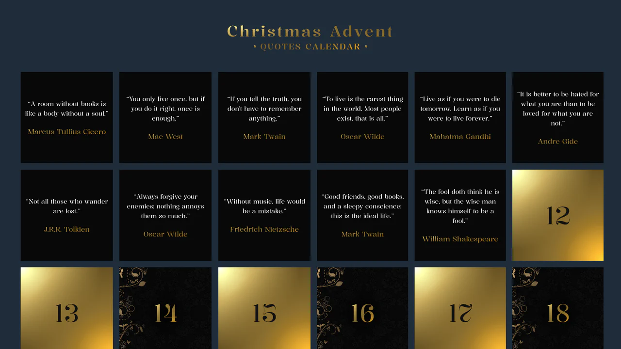
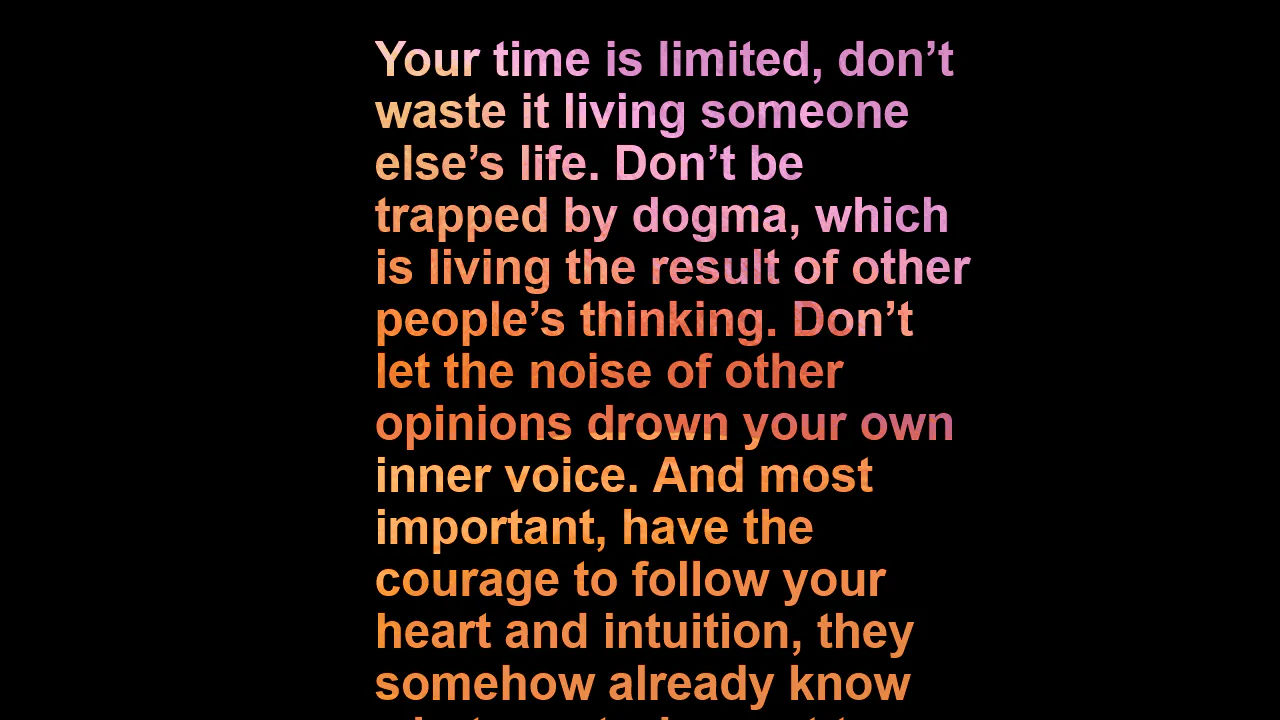
Advent Calendar with Quotes
An interactive Advent Calendar featuring 25 flip-cards generated via JavaScript.
See the Pen Advent Calendar with Quotes.

List Styles
An aesthetically pleasing, modern todo list featuring a vibrant gradient theme and an intuitive hierarchy creation function without complex control buttons.
See the Pen List Styles.
Text Shimmer Lines Effect
A text shimmer effect, where all parameters - from gradient angle to animation speed - are configured in real-time via Tweakpane. The smooth theme change is implemented using the latest View Transitions API, and the effect itself is built on background-clip: text and CSS variables.
See the Pen Text Shimmer Lines Effect.

Color Clipping Effect with CSS Gradients and GSAP
A sleek text hover and intro animation, implemented using GSAP to smoothly transition CSS gradient stops via modern CSS variables, ensuring high performance and clean, maintainable code.
See the Pen Color Clipping Effect with CSS Gradients and GSAP.
Animated Gradient Text
Shimmering text animation via gradient shifting. Linear gradient moves across background position, background-clip: text restricts it to letter shapes. color: transparent reveals gradient. Forced-colors media query maintains readability.
See the Pen Animated Gradient Text.
Push Button (CSS 3D Button)
A skeuomorphic 3D button created with multi-layered box-shadow and linear-gradient to simulate volume, highlights, and shadows. On :hover, the box-shadow styles are animated, creating a “pressed” effect.
See the Pen Push Button (CSS 3D Button).

Cosmic 404 Page
A modern, atmospheric interface that transforms a standard error into a pleasant visual experience, where content gently floats above a deep, iridescent cosmic background.
See the Pen Cosmic 404 Page.
Typographic composition utilizing CSS background-clip: text to apply a diagonal pattern to the text shadow. The animation effect is achieved by shifting the background gradient, simulating a shimmering texture without raster assets.
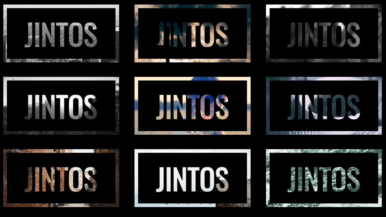
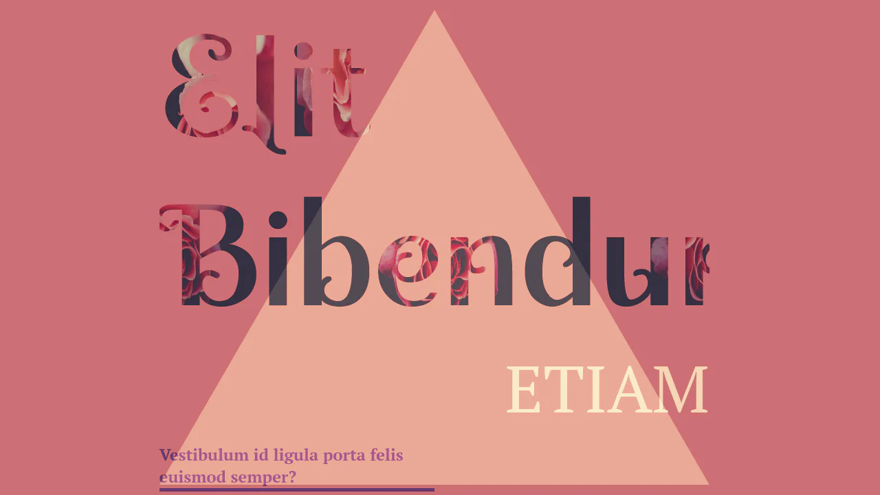
Text mask implementation using background-clip: text. The visual effect is achieved by clipping a background image to the text layer with a transparent fill, while additional pseudo-elements provide granular control over the “black zone” and texture alignment. This technique offers high aesthetic detail without requiring external graphic editors.
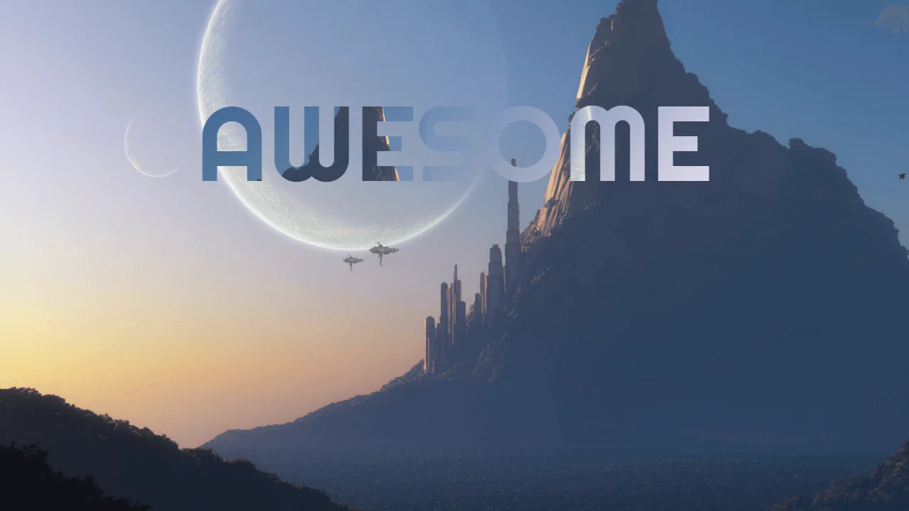
Typographic composition utilizing background-clip: text to mask an image layer within characters. The animation effect is achieved by shifting background-position via keyframes, creating the illusion of dynamic texture filling the text. Layered effects and shadows establish a sense of dimensionality without the need for JavaScript.
Typographic mask effect utilizing background-clip: text. Interactivity is implemented via smooth CSS transitions for transform and background-position properties, creating a parallax texture shift on hover. The structure relies on semantically clean blocks with independent background fills for each element.
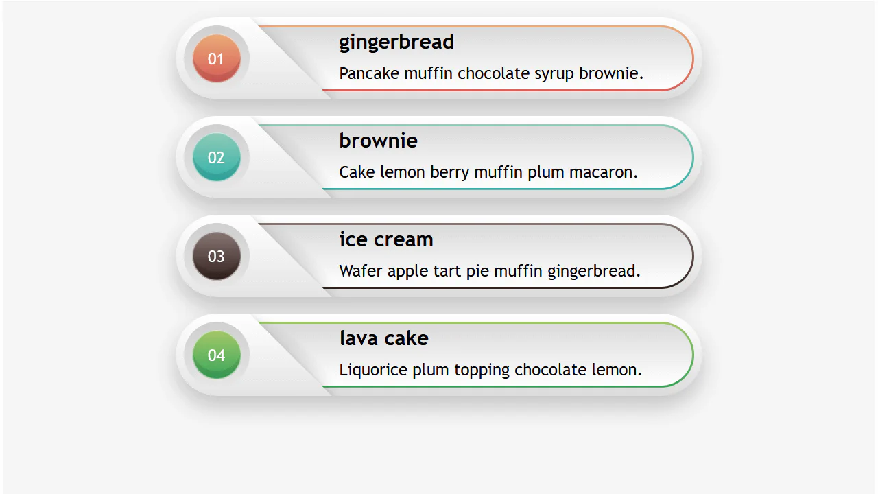
Responsive Infographic
A highly responsive list component utilizing a CSS variable switch technique to toggle layout states.
See the Pen Responsive Infographic.
Gradient Hover Animated Ghost Button
The button animation uses SVG rect elements and CSS stroke-dasharray and stroke-dashoffset properties to create a sophisticated, drawing border effect that transitions smoothly on hover, highlighting the call-to-action.
See the Pen Gradient Hover Animated Ghost Button.
CSS Text Filling with Water
The key technical trick is the use of the modern background-clip: text property for masking, allowing the animated wave background to shine through the text outline.
See the Pen CSS Text Filling with Water.